
Radio Button
A Radio Button component allows users to select one option from a set of predefined choices, ensuring clear, mutually exclusive selections with immediate feedback.

- Overview
- Specs
- Guidelines
- Mobile
Component
A Radio Button is a UI element used for selecting a single option from a set of mutually exclusive choices. Visually represented by a small circular button that can be filled or unfilled, Radio Buttons offer clear access and immediate feedback to users.
When selected, the button is filled in, providing a visual confirmation of the user’s choice. To ensure accessibility, Radio Buttons should be navigable using keyboard inputs and properly labeled for screen readers, which helps convey the available options and the current selection to visually impaired users.
Keyboard navigation should be supported, allowing users to navigate and toggle Radio Buttons using keys such as Tab and Spacebar.

- Radiobutton
- Add-On
- Label
- Tooltip

Used for:
Single selection from multiple options
Radio Buttons are ideal when users need to select a single option from a list of mutually exclusive choices. This ensures that only one option can be selected at a time.
Visibility of all options
Radio Buttons are appropriate when it’s important for users to see all available options at once. This visibility helps users make informed decisions quickly without having to navigate through drop-down menus.
Immediate selection feedback
Use Radio Buttons when it’s beneficial to provide immediate feedback upon selection. This is useful in scenarios where the selection triggers immediate changes or updates in the UI.
Contextual relevance
When the context requires a single choice that directly impacts the user’s experience or the application’s behavior, Radio Buttons provide a clear and precise way to capture the user’s selection.
Don’t use for:
Multiple selections needed
Radio Buttons are designed for single selections from a group of options. They are not suitable when users need to select multiple options simultaneously. For such cases, checkboxes are more appropriate.
Dynamic and complex selections
In scenarios where the options are numerous, dynamically changing, or hierarchical, Radio Buttons can become unwieldy and clutter the interface. Drop-down menus or other advanced selection controls can better handle complex selections.
Infrequent or optional choices
When the selection is optional or infrequent, a checkbox might be more appropriate. Radio buttons imply that a choice must be made from the options displayed, thus, for optional selections, using a checkbox or a different control can reduce user confusion.

Demo
Access the Figma file and inspect the element using Dev Mode.

Last Update


- Added new tab for the mobile version of the component.
Variations
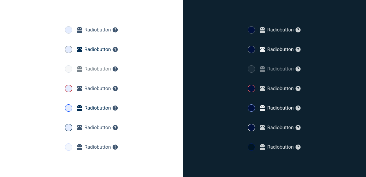
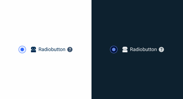
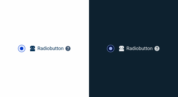
Resting
Enabled

.enabled {
  radio-bg: var(--grey-1);
  radio-stroke: var(--grey-5);
  icon: var(--grey-8);
  label: var(--grey-8);
  tooltip: var(--grey-8);
}
Hover

.hover {
  radio-bg: var(--theme-10);
  radio-stroke: var(--grey-6);
  icon: var(--grey-9);
  label: var(--grey-9);
  tooltip: var(--grey-8);
}
Error

.error {
  radio-bg: var(--grey-1);
  radio-stroke: var(--error-100);
  icon: var(--grey-8);
  label: var(--grey-8);
  tooltip: var(--grey-8);
}
Disabled
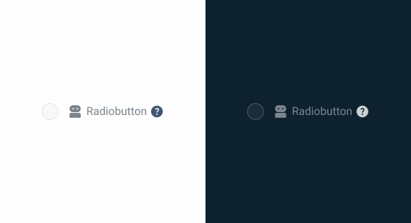
.disabled {
  radio-bg: var(--grey-2);
  radio-stroke: var(--grey-4);
  icon: var(--grey-6);
  label: var(--grey-6);
  tooltip: var(--grey-8);
}
Pressed
.pressed {
  radio-bg: var(--theme-10);
  radio-stroke: var(--theme-100);
  icon: var(--grey-9);
  label: var(--grey-9);
  tooltip: var(--grey-8);
}
Focus

.focus {
  radio-bg: var(--grey-1);
  radio-stroke: var(--theme-100);
  icon: var(--grey-8);
  label: var(--grey-8);
  tooltip: var(--grey-8);
}
Read Only
.read_only {
radio-bg: var(--grey-3);
radio-stroke: var(--theme-20);
icon: var(--grey-8);
label: var(--grey-8);
tooltip: var(--grey-8);
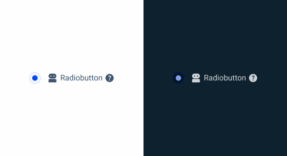
}Active
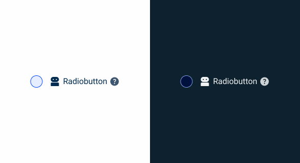
Enabled

.enabled {
  radio-active: var(--theme-100);
  radio-bg: var(--grey-1);
  radio-stroke: var(--theme-100);
  icon: var(--grey-8);
  label: var(--grey-8);
  tooltip: var(--grey-8);
}
Hover
.hover {
  radio-active: var(--theme-80);
  radio-bg: var(--theme-10);
  radio-stroke: var(--theme-80);
  icon: var(--grey-8);
  label: var(--grey-8);
  tooltip: var(--grey-8);
}
Error

.error {
  radio-bg: var(--grey-1);
  radio-stroke: var(--error-100);
  icon: var(--grey-8);
  label: var(--grey-8);
  tooltip: var(--grey-8);
}
Disabled

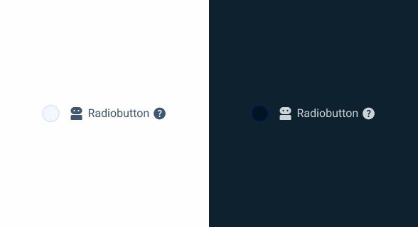
.disabled {
  radio-active: var(--theme-60);
  radio-bg: var(--grey-1);
  radio-stroke: var(--theme-60);
  icon: var(--grey-6);
  label: var(--grey-6);
  tooltip: var(--grey-8);
}
Pressed
.pressed {
  radio-active: var(--theme-highlight);
  radio-bg: var(--theme-10);
  radio-stroke: var(--theme-highlight);
  icon: var(--grey-9);
  label: var(--grey-9);
  tooltip: var(--grey-8);
}
Focus

.focus {
  radio-active: var(--theme-100);
  radio-bg: var(--grey-1);
  radio-stroke: var(--grey-9);
  icon: var(--grey-8);
  label: var(--grey-8);
  tooltip: var(--grey-8);
}
Read Only
.read_only {
  radio-active: var(--theme-100);
  radio-bg: var(--grey-3);
  radio-stroke: var(--theme-20);
  icon: var(--grey-8);
  label: var(--grey-8);
  tooltip: var(--grey-8);
}
Size
Small

.small {
  radio: 16px, var(--rounded);
  gap: var(--spacing-12);
  gap-content: var(--spacig-4);
  icon: 16px;
  label: var(--label-small);
}
Regular

.regular {
  radio: 20px, var(--rounded);
  gap: var(--spacing-12);
  gap-content: var(--spacig-4);
  icon: 20px;
  label: var(--label-regular);
}
Large

.large {
  radio: 24px, var(--rounded);
  gap: var(--spacing-12);
  gap-content: var(--spacig-4);
  icon: 24px;
  label: var(--label-large);
}
Useful links

Consult our figma file to access our assets and inspect them in dev mode.

This component is or will be provided by the Polygon framework. See its documentation to learn more.

This element is in line with the guidelines of the CDS (Cegid Design System). Find out more.
Behavior
Exclusive Selection
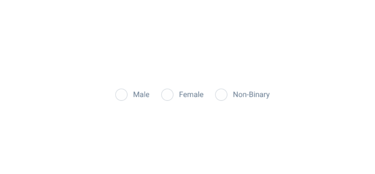
Exclusive selection means that selecting a Radio Button in a group automatically deselects any previously selected option in the same group. This ensures that the user can only select one option at a time, making Radio Buttons ideal for scenarios where a single choice is required. For example, when asking users to select their gender (Male, Female, Other), the use of Radio Buttons ensures that only one option can be chosen.
- Single Choice Enforcement: When a user selects a Radio Button, any other previously selected Radio Button in the same group is automatically deselected. This enforcement prevents multiple selections and ensures clarity in the user’s choice.
- Immediate Feedback: Upon selecting a Radio Button, the interface provides immediate visual feedback by filling in the chosen option. This instant response confirms the user’s action and clearly indicates the selected option.
Radio Buttons must have an associated label, except in situations where there is a clear context.
Don’t use a Radio Button to choose from more than three options. In that case, a select box must be used.
Voice-Over
For general guidelines on screen reader compatibility, see the following blog post on best practices: Designing the Invisible: How to Make Your Interfaces Work Without a Screen.
Clearly announce that only one option can be selected, so that the user knows that by clicking on that option, they will automatically deselect the others.
Keep radio buttons that belong to the same group/question together so that they are read one after the other.
Explain the reference before listing the options. Make sure users hear what they are deciding before reading the radio button options. For example, announce “Choose your preferred payment method” before listing the options the user can choose from.
Mix Radio Buttons with other controls, such as links, since this confuses users and makes them unsure about what is an option and what is not.
Use Radio Buttons for multiple choices, as this may give users the impression that they can only choose one option, when in fact they can choose several. Use a checkbox, for example.
Reading Order

| Reading Order | Element | Screen Reader Reading |
| 1 | Group description | City, radio group, 3 options. |
| 2 | Lisboa option | Lisboa, radio button, unchecked, 1 of 3. |
| 3 | Tooltip | Information, [tooltip content]. |
| 4 | Coimbra option | Lisboa, radio button, checked, 2 of 3. |
| 5 | Porto option | Porto, radio button, unchecked, 3 of 3. |
Case Studies

Handling Background Tasks

Read Mode: Making Content Feel Effortless and Understandable

A Visual Recap of 2025: how we enhanced chatbot communication
References
What Changes?
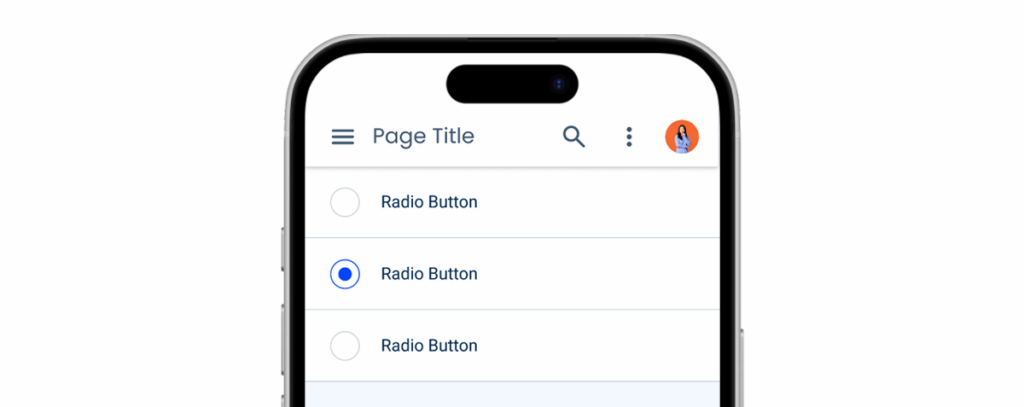
In order to become better suited for the mobile user experience, the Radio Button component receives some changes to its size, as well as some adjustments to its states.
The Radio Button also doesn’t come with a label on mobile as it can be simply inserted in a List Item, as shown in the image below.
Demo
Access the Figma file and inspect element using Dev Mode.
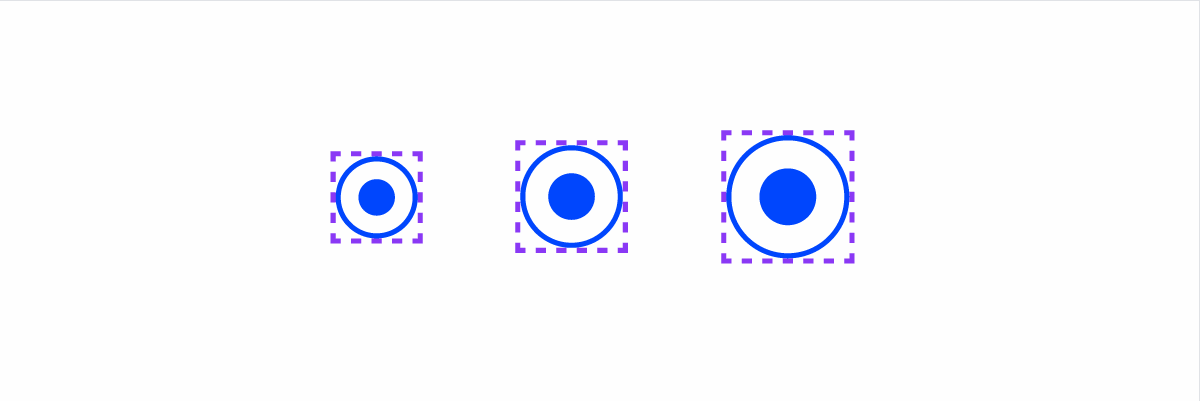
Size & Touch Area
Just like other similar components made for mobile, the Radio Button has received an increase in size. Additionally, all variations were placed in containers, in order to ensure the touch area is at least 44×44 px no matter where they’re placed.
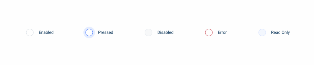
States
The Focus and Hover states were not included in the mobile version of the Radio Button as those two behaviors aren’t applicable.
The Pressed state was updated with the goal of providing feedback to users even if they cover the Radio Button with their thumb. Now, we change the color of the container instead of the component.
Case Studies
Handling Background Tasks
Read Mode: Making Content Feel Effortless and Understandable