
Progress Bar
Progress Bars provide users with real-time feedback on the status of ongoing operations
- Overview
- Specs
- Guidelines
- Mobile
Component
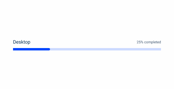
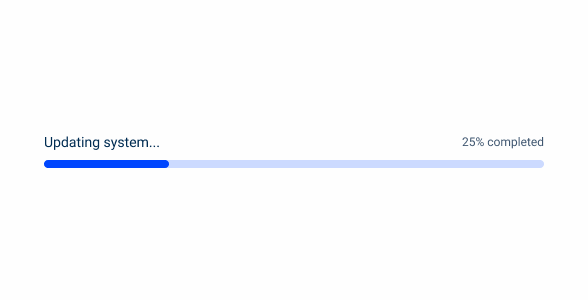
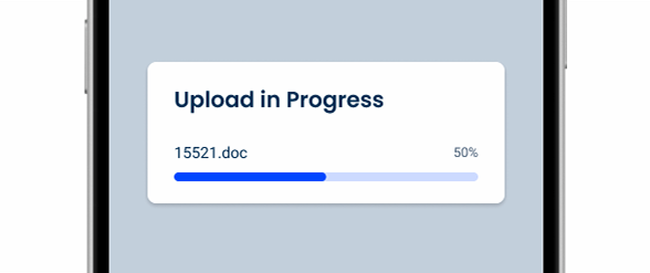
A Progress Bar is a graphical UI element that visually represents the completion status of a task, process, or action. It typically consists of a horizontal bar that fills up gradually as the task progresses, accompanied by textual or visual indicators of the completion percentage.

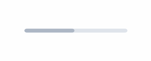
A – Progress Variation
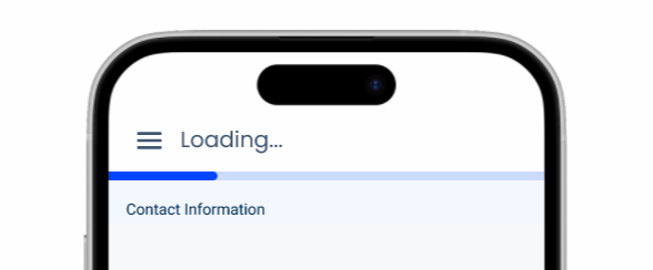
B – Loading Variation
1 – Title
2 – Progress Bar
3 – Additional information

Used for:
Task progress tracking
Progress Bars are ideal for indicating the completion status of tasks or processes that take a measurable amount of time, such as file downloads;
Real-time feedback
They provide users with real-time feedback on the progress of ongoing operations, helping them understand how much work has been completed;
Complex processes
For multi-step processes or workflows, Progress Bars break down the overall task into smaller, more manageable chunks, helping users track their progress through each stage;
Configurators
Progress Bars help users estimate the remaining time required to complete a task, allowing them to more effectively plan their activities and manage their expectations.
Don’t use for:
Instantaneous processes
Avoid using Progress Bars for tasks or actions that are completed almost instantaneously, as they can create unnecessary visual clutter and may not provide meaningful information to the users;
Indeterminate processes
For tasks with unpredictable durations or indeterminate completion times, such as search operations or background tasks, Progress Bars may not be suitable, but you can use the loading variation in these cases;
Non-sequential processes
Progress Bars are not suitable for tasks that do not follow a linear or sequential order, where progress cannot be quantified in a meaningful way;
Visual distraction
Avoid using Progress Bars if they draw excessive attention away from the main content or disrupt the user’s focus, especially in contexts where users need to concentrate on other tasks or activities.

Demo
Access the Figma file and inspect the element using Dev Mode.

Last Update
- Added new tab for the mobile version of the component.
Variations

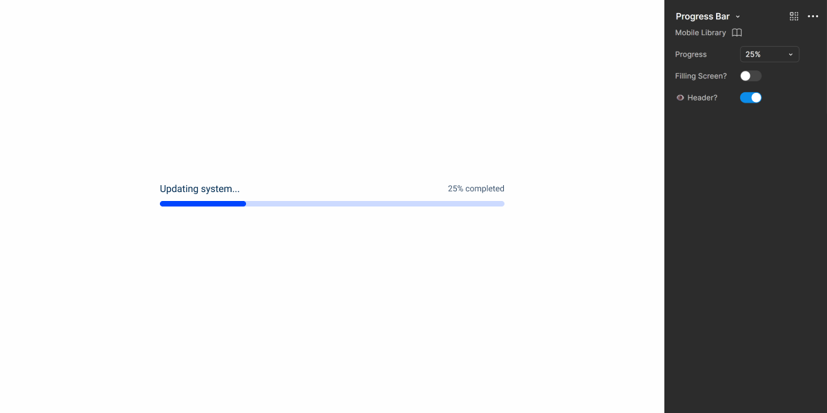
Determinate
Without Progress

.withoutProgress {
  progress-bar-background: var(--theme-20);
  label-color: var(--grey-9);
  indicator-color: var(--grey-8);
}
With Progress

.withProgress {
  progress-bar-background: var(--theme-20);
  progress-bar: var(--theme-100);
  label-color: var(--grey-9);
  indicator-color: var(--grey-8);
}
Indeterminate
Loading

.Loading {
  progress-bar-background: var(--theme-20);
  progress-bar: var(--theme-100, --rounded);
  label-color: var(--grey-9);
  indicator-color: var(--grey-8);
}
Size
Unique Size

.uniqueSize {
  progressBar-width: 500px;
  progressbar-height: 8px;
  label-title: var(--label-regular);
  label-indicator: var(--label-small);
}
Useful links

Consult our Figma file to access our assets and inspect them in dev mode.

This component is or will be provided by the Polygon framework. See its documentation to learn more.

This element is in line with the guidelines of the CDS (Cegid Design System). Find out more.
Behavior
Responsive
Depending on the view, the progress must be responsive to be used in different scenarios, such as uploading a file or image and even in a cell of a data grid. For that , the Progress Bar itself must be able to change sizes according to the usage.

The Progress Bar should always have a label.
Labels should be short.
Case Studies

Read Mode: Making Content Feel Effortless and Understandable

A Visual Recap of 2025: how we enhanced chatbot communication
Designing the Invisible: How to Make Your Interfaces Work Without a Screen
What Changes?
The mobile version of the Progress Bar is nearly identical to its desktop counterpart, with only font size adjustments.
It also has two variations: one suitable for small containers (such as modals) and another designed to span the entire width of the screen.
Labels are not mandatory on mobile.
Demo
Access the Figma file and inspect the element using Dev Mode.
Case Studies
Read Mode: Making Content Feel Effortless and Understandable
A Visual Recap of 2025: how we enhanced chatbot communication