
Picker
Pickers are used to present one or more lists from which users can make a single selection.

Overview
The Picker is a component that allows users to make a selection from one or more lists. It can serve a similar purpose to others such as the Select Box, Date Picker and Color Picker and can even be used as an alternative to them.
Its main quality is that it creates an intuitive and isolated experience, suitable for medium to long lists, allowing users to make their selection with just one gesture.

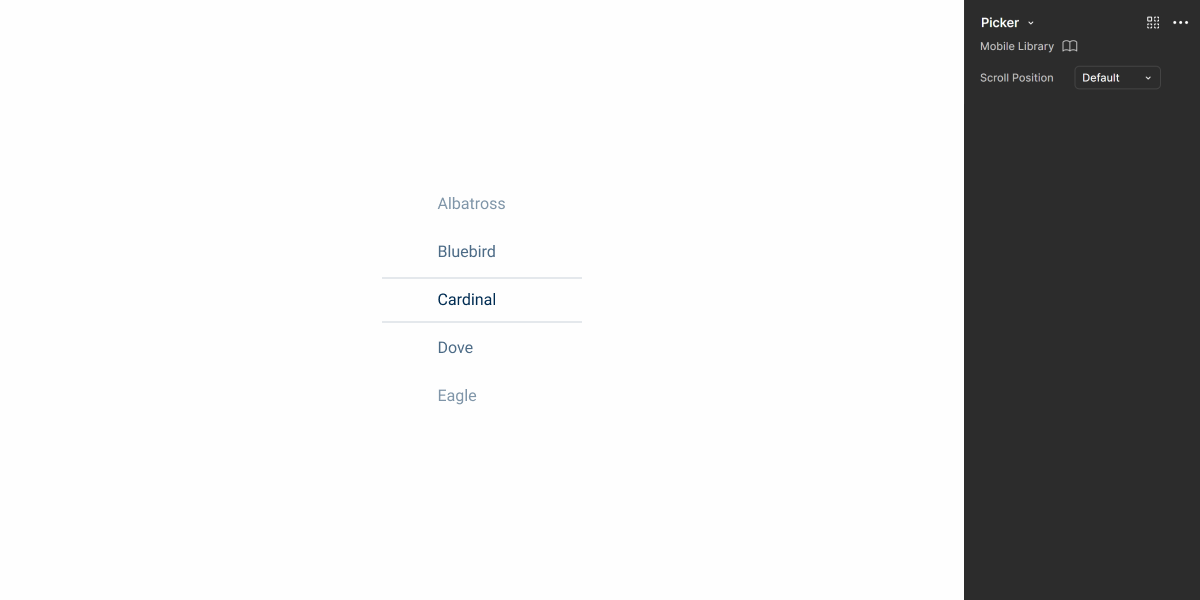
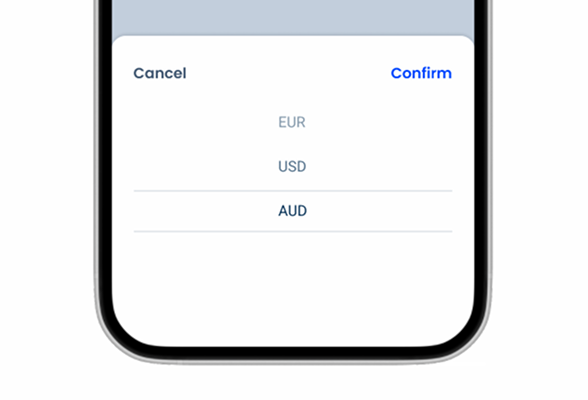
1: Currently selected item
2: Previous items in the list
3: Next items in the list
Demo
Access the Figma file and inspect element using Dev Mode.
Guidelines
As mentioned in the Overview section, the Picker can be an alternative to other components, mainly the Select Box. However, it is important understand how to use it and its advantages, as it will not always be the most appropriate solution.
Usage
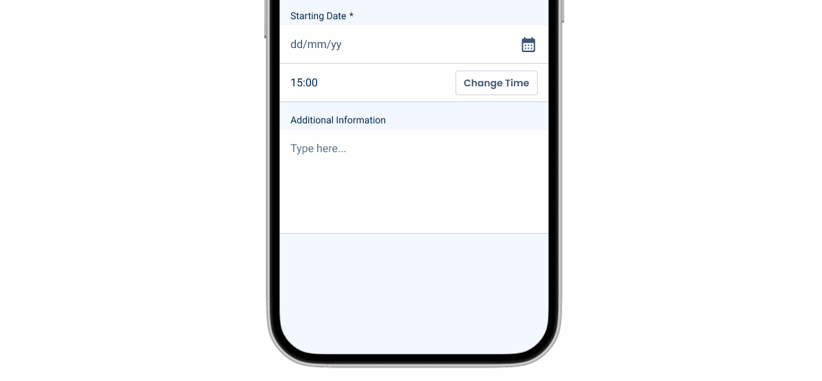
Users navigate through Pickers by swiping or tapping in the direction they want to move. Therefore, they need to be isolated from other interface elements to prevent accidental scrolling or triggering unwanted actions. For this reason, Pickers should always be inserted into a Modal, as shown in the image below.
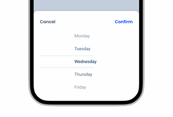
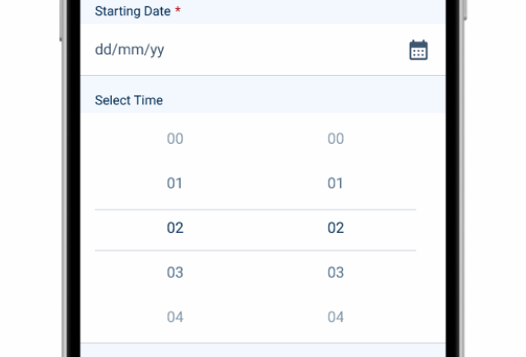
Pickers can also be used when one wants users to make more than one selection. However, there are no variations that support this behavior. Instead, a new Picker is added.
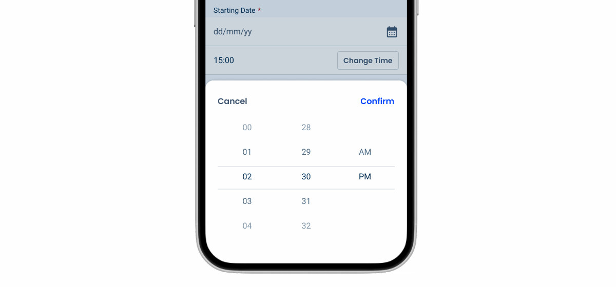
The image below shows several Pickers being used to select the time, which is one of the most common use cases.
Order items in a predictable manner, as a significant number of them will be hidden. If this is not possible, do not use this component.
Use Pickers for small lists. In such cases, consider using a Select Box instead.
Insert Pickers in complex interfaces, as this will make scrolling difficult. Use a Modal instead.

Use more than three Pickers at the same time.
Last Update
- Added component to Design System.