
Overflow Menu
An overflow menu is a UI component that houses secondary options or actions.

- Overview
- Specs
- Guidelines
Component
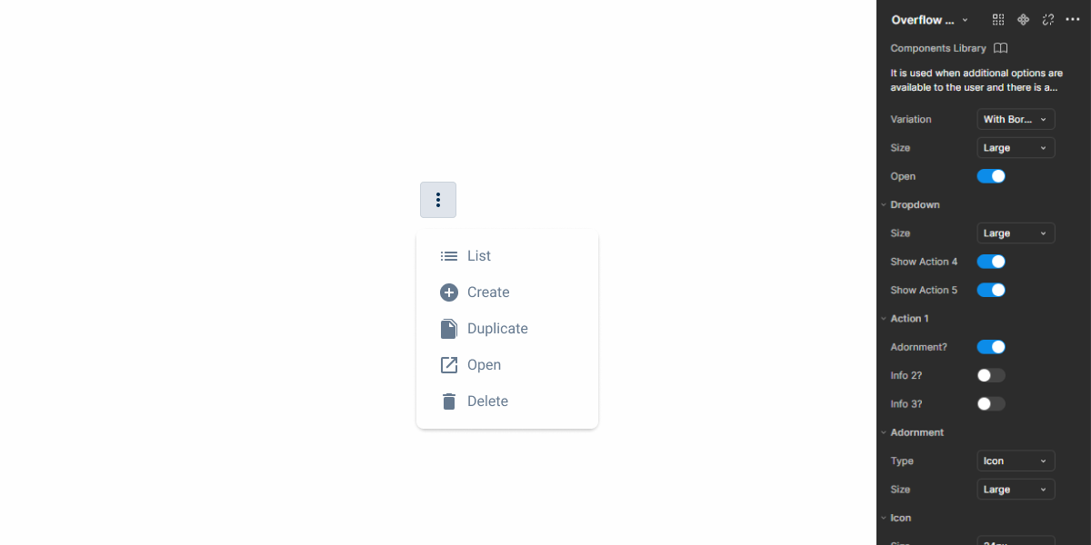
The Overflow Menu allows you to provide the user with a set of additional actions when carrying out a task.
The Overflow Menu icon indicates that more options are available. Clicking it reveals a dropdown with additional options or actions.

A: Borderless Overflow Menu
B: Overflow Menu with borders
1: Drop-down
2: Action/option icon
3: Action/option label
4: Divider

Used for:
Less important actions
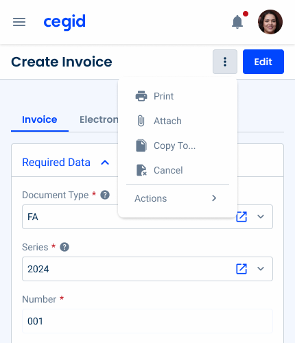
For additional and less important actions such as “List” and “Duplicate”, the Overflow Menu prevents the design from becoming too “crowded”;
Destructive actions
As destructive actions must not be clicked on unintentionally, it is recommended to display the “delete” option in an Overflow Menu;
Complex interfaces
In interfaces and products with multiple functions in the same view, it’s recommended to use an Overflow Menu;
Contextual actions
In cases where certain actions are available under specific conditions for certain views, the Overflow Menu must be used;
Consistent navigation
To maintain consistency in certain component patterns, the Overflow Menu serves as a standard location for secondary actions across the product;
Don’t use for:
Frequently used actions
For frequently used actions, such as “Save”, it’s best to prioritize the action within the main actions, often represented as a button;
Minimal actions
When the view has only a few actions or options that can fit without cluttering the interface, an Overflow Menu may not be necessary;
Consistent visibility
In interfaces where maintaining consistent visibility of all actions is crucial for user engagement or task completion, hiding actions behind an Overflow Menu may hinder user interaction and lead to reduced usability;
Limited user control
If users expect to have direct control over all available actions without needing to navigate through menus, an Overflow Menu might limit their control of the interface.

Demo
Access the Figma file and inspect element using Dev Mode.
Last Update


- Added border version;
- Added divider for dropdown options;
Related
Variations

Closed

.closed {nbackground-color: var(u002du002dgrey-1);ncolor: var(u002du002dgrey-8);n}Closed w/border

.closedWithBorder {
background-color: var(--grey-1);
border-color: var(--grey-5);
color: var(--grey-8);
}
Open

.opened {nbackground-color: var(u002du002dgrey-4);ncolor: var(u002du002dgrey-9);n}Size
Small

.small {
  padding: var(--spacing-4);
  border-radius: var(--x-small-radius);
  icon: icon: 20px;
  }
Regular

.regular {
  padding: var(--spacing-8);
  border-radius: var(--x-small-radius);
  icon: icon: 20px;
  }
Large

.large {
  padding: var(--spacing-8);
  border-radius: var(--x-small-radius);
  icon: icon: 24px;
  }
Useful links

Consult our Figma file to access our assets and inspect them in dev mode.

This component is or will be provided by the Polygon framework. See its documentation to learn more.

This element is in line with the guidelines of the CDS (Cegid Design System). Find out more.
Behavior
Labels
Ideally, for good UX practice, in dropdown menus, the options/actions label should be concise and short, since the dedicated space is limited. This label should also be straightforward so that the user can understand the action and decide more quickly.


Texts should be clear and concise.

Whenever possible, incorporate iconography alluding to the action.
Position
The position of the overflow dropdown menu must fit the available space, so that the dropdown menu is visible in all situations. The dropdown menu can then be aligned to the left or right of the button icon.
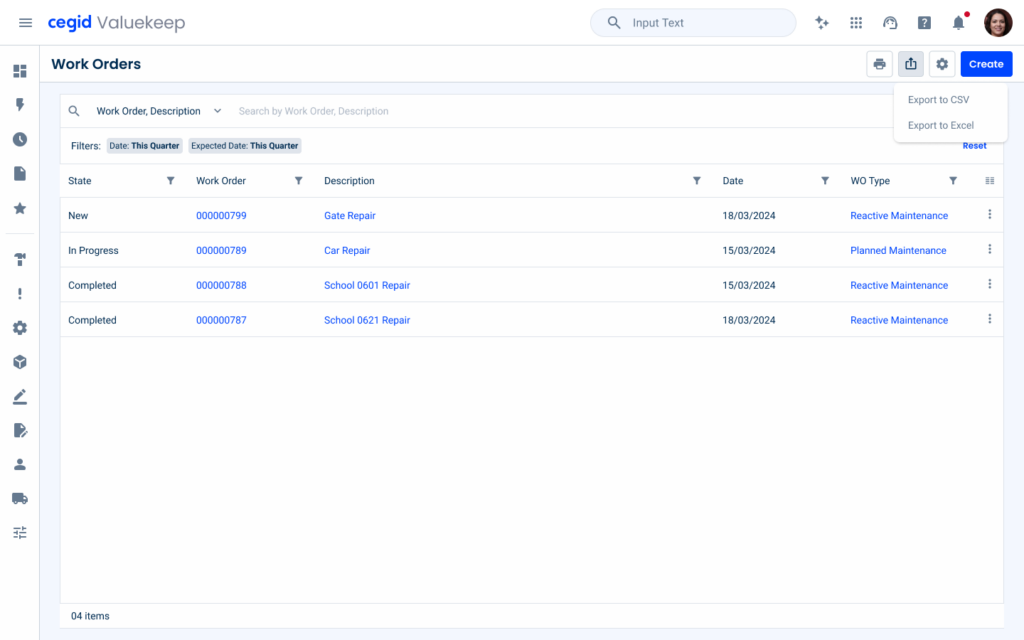
Grouping Actions
If all the menu actions share a common purpose, the default overflow icon can be replaced with an icon that represents the group.
For example, when the menu contains export options, such as Export list to CSV and Export list to Excel, an export icon can be used instead.

If a menu item is disabled, it must be visually comprehensible.
Dropdown
Divider
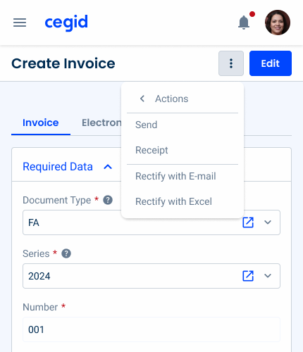
The overflow menu has been improved to support multiple levels, allowing for better organization of nested options and better navigation in complex menus.
Additionally, it has been optimized for mobile devices, including tablets and smartphones, ensuring a seamless and responsive experience on different screen sizes.
Voice-Over
For general guidelines on screen reader compatibility, see the following blog post on best practices: Designing the Invisible: How to Make Your Interfaces Work Without a Screen.
Ensure that the screen reader clearly and unambiguously announces that the button opens an Overflow Menu.
List actions in a logical, predictable order.
Use clear action verbs for each menu item.
Announce the total number of items and the current position in the menu.
Overload the menu with too many items, as this may confuse users and make navigation difficult.
Group unrelated actions in the same menu.
Hide essential actions in the Overflow Menu. Users should not be required to perform extra work to locate primary actions.
Allow the screen reader to read menu items that are disabled. Ensure that the screen reader skips these items.
Reading Order

| Reading Order | Element | Screen Reader Reading |
| 1 | Button | More options, button, collapsed. |
| 2 | Button [once activated] | More options, button, expanded. |
| 3 | List menu item | List, menu item 1 of 4. |
| 4 | Create menu item | Create, menu item 2 of 4. |
| 5 | Duplicate menu item | Duplicate, menu item 3 of 4. |
| 6 | Open menu item | Open, menu item 4 of 4. |
Case Studies

Handling Background Tasks

Read Mode: Making Content Feel Effortless and Understandable
