
Numeric
A numeric component is an input field specifically designed for entering numeric values in a user interface.

- Overview
- Specs
- Guidelines
Component
A numeric component is an input field tailored for entering numeric values into a user interface. It enables users to input numerical data, like integers or decimal numbers, using various input methods such as keyboard entry.
The component typically offers features such as validation to accept only numeric characters, as well as options for formatting, such as specifying decimal places or setting value limits.
Numeric components find frequent use in forms, calculators, and applications requiring precise numerical input.

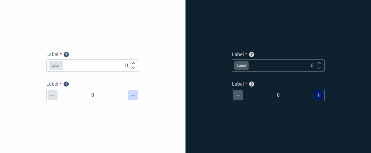
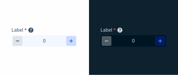
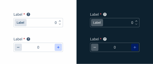
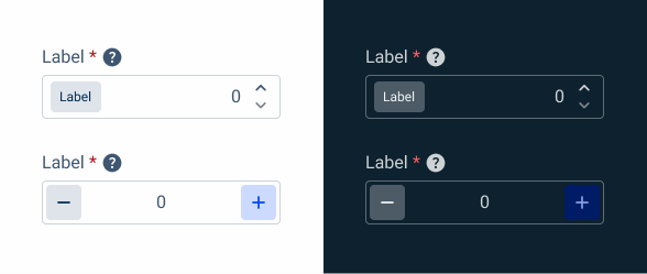
A: Big Amounts Variation
B: Small Amounts Variation
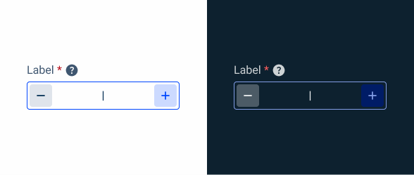
1: Label
2: Chip
3: Spinners
4: Value

Used for:
Forms
When numeric values are expected, such as a price or a discount percentage on invoices, the numeric component is the one to use;
Efficiency
They streamline data entry by providing a dedicated input field specifically designed for numeric values, enhancing user productivity;
Clarity
Numeric components clearly communicate the expected input type, reducing ambiguity and improving user understanding;
Accessibility
They enhance accessibility by providing a clear and intuitive interface for users with different abilities to input numerical data.
Don’t use for:
Non-numeric data
If the input requires non-numeric data, such as text or dates, a numeric input component would not be suitable and could lead to user confusion or errors;
Complex data entry
For scenarios where data entry involves complex numeric calculations or requires additional context beyond simple numerical values, a dedicated numeric input component may not provide sufficient functionality;
Dynamic data entry
If the input requirements are dynamic and may change frequently based on user interactions or contextual factors, a static numeric input component may not be adaptable enough to accommodate these variations.

Demo
Access the Figma file and inspect the element using Dev Mode.

Last Update


- Updated typography;
- Updated icon font;
- Removed unnecessary variations;
Variations
Big Amounts
Enabled

.enabled {
  label: var(--grey-8);
  field-border: var(--grey-5);
  field-background: var(--grey-1);
  value: var(--grey-8);
  spinner-up: var(--grey-8);
  spinner-down: var(--grey-6);
}
Hover

.hover {
  label: var(--grey-8);
  field-border: var(--grey-6);
  field-background: var(--grey-1);
  value: var(--grey-8);
  spinner-up: var(--grey-8);
  spinner-down: var(--grey-6);
}
Focus

.focus {
  label: var(--grey-8);
  field-border: var(--theme-100);
  field-background: var(--grey-1);
  insert: var(--grey-9);
  spinner-up: var(--grey-8);
  spinner-down: var(--grey-6);
}
Read-only

.readOnly {
label: var(--grey-8);
field-border: var(--grey-1);
field-background: var(--grey-3);
value: var(--grey-8);
spinner-up: var(--grey-8);
spinner-down: var(--grey-6);
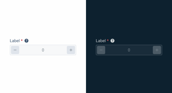
}Disabled

.disabled {
label: var(--grey-8);
field-border: var(--grey-4);
field-background: var(--grey-2);
value: var(--grey-6);
spinner-up: var(--grey-6);
spinner-down: var(--grey-6);
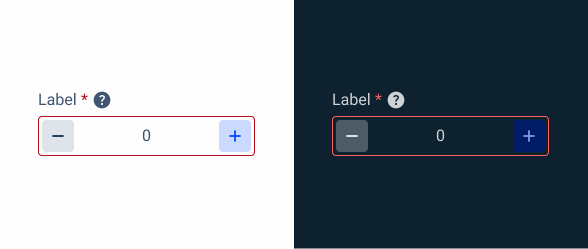
}Error
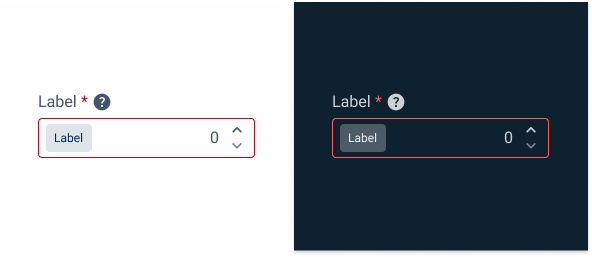
.error {
  label: var(--grey-8);
  field-border: var(--error-100);
  field-background: var(--grey-1);
  value: var(--grey-8);
  spinner-up: var(--grey-9);
  spinner-down: var(--grey-6);
}
Small Amounts
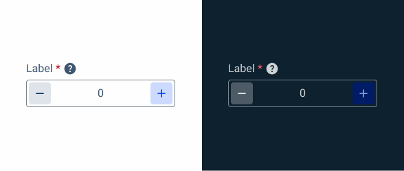
Enabled
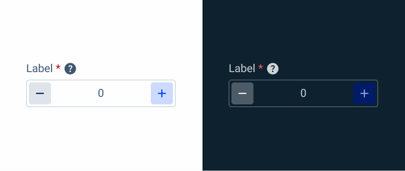
.enabled {
  label: var(--grey-8);
  field-border: var(--grey-5);
  field-background: var(--grey-1);
  value: var(--grey-8);
  leftIndicator-background: var(--grey-4);
  leftIndicator: var(--grey-9);
  rightIndicator-background: var(--theme-20);
  rightIndicator: var(--theme-100);
}
Hover
.hover {
  label: var(--grey-8);
  field-border: var(--grey-6);
  field-background: var(--grey-1);
  value: var(--grey-8);
  leftIndicator-background: var(--grey-4);
  leftIndicator: var(--grey-9);
  rightIndicator-background: var(--theme-20);
  rightIndicator: var(--theme-100);
}
Focus
.focus {
  label: var(--grey-8);
  field-border: var(--theme-100);
  field-background: var(--grey-1);
  insert: var(--grey-9);
  leftIndicator-background: var(--grey-4);
  leftIndicator: var(--grey-9);
  rightIndicator-background: var(--theme-20);
  rightIndicator: var(--theme-100);
}
Read-only
.readonly {
  label: var(--grey-8);
  field-border: var(--grey-1);
  field-background: var(--grey-3);
  value: var(--grey-8);
  leftIndicator-background: var(--grey-4);
  leftIndicator: var(--grey-9);
  rightIndicator-background: var(--theme-20);
  rightIndicator: var(--theme-100);
}
Disabled
.disabled {
  label: var(--grey-8);
  field-border: var(--grey-4);
  field-background: var(--grey-2);
  value: var(--grey-6);
  leftIndicator-background: var(--grey-4);
  leftIndicator: var(--grey-6);
  rightIndicator-background: var(--grey-4);
  rightIndicator: var(--grey-6);
}
Error
.error {
  label: var(--grey-8);
  field-border: var(--error-100);
  field-background: var(--grey-1);
  value: var(--grey-8);
  leftIndicator-background: var(--grey-4);
  leftIndicator: var(--grey-9);
  rightIndicator-background: var(--theme-20);
  rightIndicator: var(--theme-100);
}
Size
Small

.small {
  label: var(--label-small);
  gap: 4px;

  Field {
    gap: 4px;
    padding: var(--spacing-4, 0);
    button-icons: var(--small-secondary-grey, --small-secondary-theme);
    value: var(--label-small);
  }
}
Regular
.regular {
  label: var(--label-regular);
  gap: 4px;

  Field {
    gap: 8px;
    padding: var(--spacing-4, 0);
    button-icons: var(--regular-secondary-grey, --regular-secondary-theme);
    value: var(--label-regular);
  }
}
Large
.large {
  label: var(--label-large);
  gap: 4px;

  Field {
    gap: 8px;
    padding: var(--spacing-4, 0);
    button-icons: var(--large-secondary-grey, --large-secondary-theme);
    value: var(--large-large);
  }
}
Useful links

Consult our Figma file to access our assets and inspect them in dev mode.

This component is or will be provided by the Polygon framework. See its documentation to learn more.

This element is in line with the guidelines of the CDS (Cegid Design System). Find out more.
Behavior
Position
Input-type components must always be placed on grey-1 backgrounds (white) for optimal usability.
Avoid using them on grey-3 backgrounds (grey), as this can compromise the visibility of disabled and read-only states.
If placement on grey-3 backgrounds is necessary, ensure that disabled or read-only states are not utilized in these scenarios.
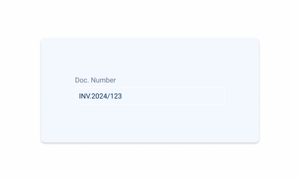
Avoid placing input-type components on grey-3 backgrounds to maintain optimal visibility and accessibility.
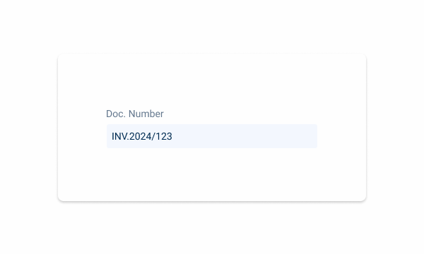
Input-type components should be placed over grey-1 backgrounds for optimal visibility and usability.
Minimum Width
By default, numeric components tend to be narrower than the other inputs, such as text fields or select boxes, so it is necessary to apply a minimum width to the component, which is applied by size:
- Small: 100px min-width;
- Regular: 120px min-width;
- Large: 140px min-width.


Using chips, tooltip and label at the same time, simplifying information is ideal.
Validation
In order to avoid user frustration, there is an built-in validation inside the numeric that allows for real-time feedback, which is given when the user leaves the focus state.
This feedback is provided for the following cases:
- Range of values;
- Positive values;
- Positive and negative values;
- Minimum value;
- Maximum value.


Small amounts variation with decimal places.

Change the button position.
Voice-Over
For general guidelines on screen reader compatibility, see the following blog post on best practices: Designing the Invisible: How to Make Your Interfaces Work Without a Screen.
Clearly indicate the expected type of input, e.g., units like currency or weights.
Keep the structure predictable form field to field to guarantee consistency and make it predictable for the users.
Inform users if there are any limits, for example, reaching a maximum or minimum limit.
Reading Order
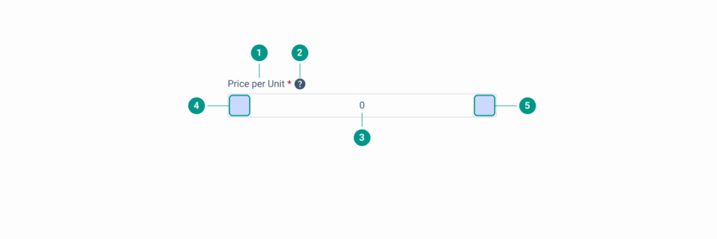
| Reading Order | Element | Screen Reader Reading |
| 1 | Field name | Price per unit, required field. |
| 2 | Tooltip | Information, [tooltip content]. |
| 3 | Body | Edit text, numeric, 0. |
| 4 | Custom action 1 | [Describe the action, e.g. “decrease value”], icon. |
| 5 | Custom action 2 | [Describe the action, e.g. “increase value”], icon. |
Case Studies

Creating Context-Aware Notifications for a Better Experience

Read Mode: Making Content Feel Effortless and Understandable
