
Menu
The Menu is a flexible component that’s designed to fit in various small interfaces and allows the listing of items users can interact with.

Overview
A Menu is a list of items users can interact with. As one of the primary ways of enabling navigation between pages, it is a key component when developing digital products.
The Menu was designed with three different variations that aim to adapt it to any interface that requires it.
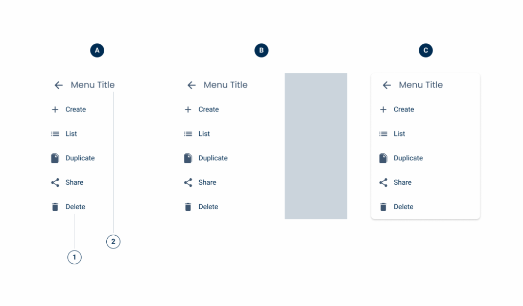
A: Default Menu
B: Overlay Variation
C: Overflow Variation
1: List Item
2: Menu Title
Demo
Access the Figma file and inspect element using Dev Mode.

Guidelines
The Menu is a flexible and universal component. Its main difference from other lists is that it is triggered by users interacting with an element, such as a Button Icon. Additionally, it provides easy access to actions without cluttering the interface, which is a major advantage when working with small displays.
When choosing how to apply it to an interface, its important to pick the most appropriate variation.
Overflow variation
This variation behaves similarly to the Overflow Menu that was designed for desktop. It is ideal for cases where a menu with just a few items is needed and there is no need to disrupt the user’s current task.
Users should be able to close it by tapping on the element that triggered it or by simply tapping outside of it.

Overlay Variation
As the name suggests, this variation places a menu in a significant part of interface. Unlike the Overflow variation, this one aims to capture the user’s attention by partially covering the screen (a backdrop can be used to reinforce this effect).
This behavior makes it a perfect fit for important navigation menus, such as those on home pages.
Last Update
- Added component to Design System.
Related

