
Input Mask
An Input Mask, in UX, guides users by providing a predefined format or structure.

- Overview
- Specs
- Guidelines
Component
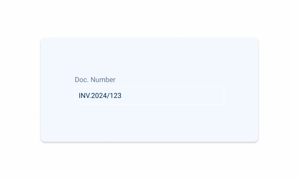
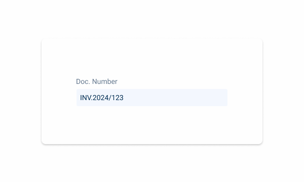
An input mask, in UX, refers to a design element that guides users in entering data by providing a predefined format or structure for input. It serves to improve data accuracy and consistency by visually representing the required format for input.
By enforcing a specific format, Input Masks enhance usability and reduce errors, particularly for complex or unfamiliar data types.
They contribute to a smoother user experience by providing clear guidance and feedback during data entry tasks this component can be used for.

A: Hyphen Variation
B: Slash Variation
C: None Variation
1: Label
2: Adornment
3: Placeholder/Input
4: Divider

Used for:
Credit cards
In cases where it is necessary to insert a credit card, for example when renewing a subscription, an Input Mask would be the component used;
Phone numbers
In cases where it is necessary to insert a phone number, for example when creating a client, an Input Mask would be the component used;
Postal code
In cases where it is necessary to insert a postal code, for example when creating a client, an Input Mask would be the component used;
IBAN code
In cases where it is necessary to insert an IBAN code, for example when creating an employee, an input mask would be the component used.
Don’t use for:
Flexibility
Input Masks may restrict user input, making it difficult for users to enter data that deviates from the predefined format;
Complex data
For data types that vary widely in format or require dynamic input, such as free-form text or user-generated content, Input Masks may be too rigid and impractical;
Task complexity
For simple data input tasks that do not require strict formatting or validation, Input Masks may introduce unnecessary complexity.

Demo
Access the Figma file and inspect the element using Dev Mode.

Last Update


- Updated dividers’ color;
- Updated large text box size;
States
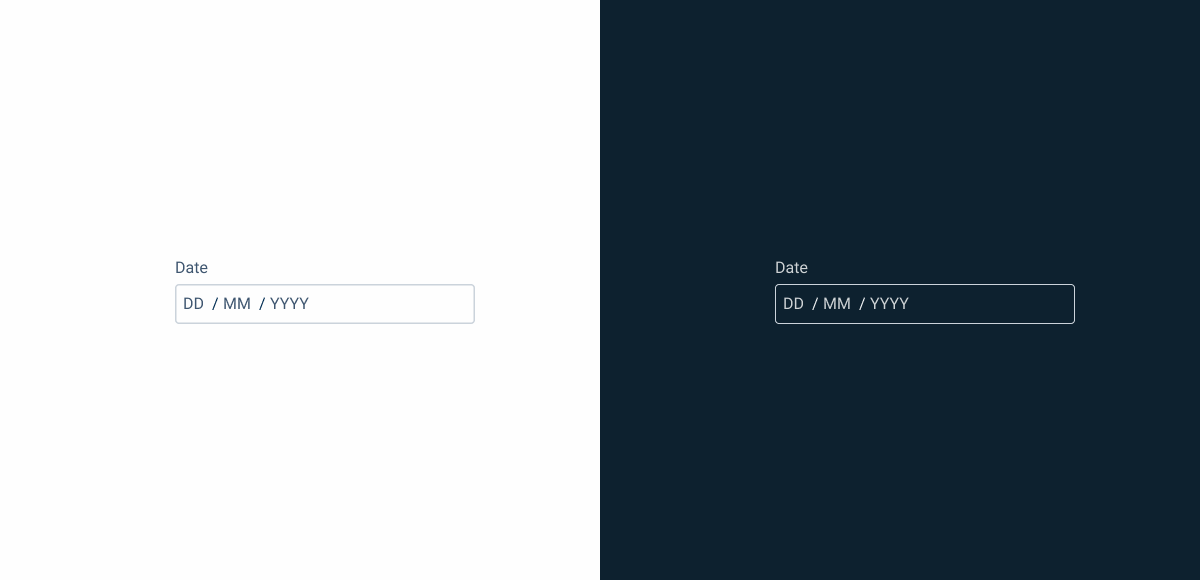
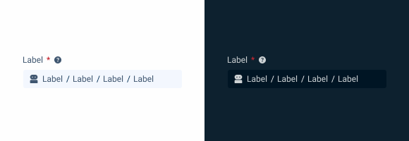
Enabled
.enabled {
label: var(--grey-8);
input-mask-border: var(--grey-5);
input-mask-background: var(--grey-1);
placeholder: var(--grey-7);
divider: var(--grey-9);
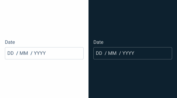
}Hover
.hover {
label: var(--grey-8);
input-mask-border: var(--grey-6);
input-mask-background: var(--grey-1);
placeholder: var(--grey-7);
divider: var(--grey-9);
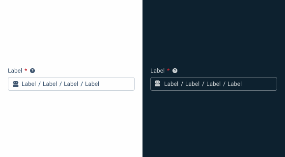
}Focus
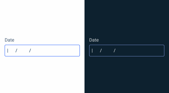
.focus {
label: var(--grey-8);
input-mask-border: var(--theme-100);
input-mask-background: var(--grey-1);
insert: var(--grey-9);
divider: var(--grey-9);
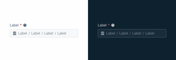
}Read-only
.readOnly {
  label: var(--grey-8);
  input-mask-border: var(--grey-1);
  input-mask-background: var(--grey-3);
  placeholder: var(--grey-7);
  divider: var(--grey-9);
}
Disabled
.disabled {
  label: var(--grey-9);
  input-mask-border: var(--grey-4);
  input-mask-background: var(--grey-2);
  placeholder: var(--grey-6);
  divider: var(--grey-6);
}
Error

.error {
  label: var(--grey-8);
  input-mask-border: var(--error-100);
  input-mask-background: var(--grey-1);
  placeholder: var(--grey-7);
  divider: var(--grey-9);
  icon: var(--error-100);
}
Size
Small
.small {
  label: var(--label-small);
  input-height: 28px;
  input-border: var(--x-small-radius);
  input-gap: 4px;
  input-padding: var(0, --spacing-8);
  icon: 16px;
  placeholder: var(--label-small);
}
Regular
.regular {
  label: var(--label-regular);
  input-height: 36px;
  input-border: var(--x-small-radius);
  input-gap: 8px;
  input-padding: var(0, --spacing-8);
  icon: 20px;
  placeholder: var(--label-regular);
}
Large

.large {
  label: var(--label-large);
  input-height: 40px;
  input-border: var(--x-small-radius);
  input-gap: 8px;
  input-padding: var(0, --spacing-8);
  icon: 24px;
  placeholder: var(--label-large);
}
Useful links

Consult our Figma file to access our assets and inspect them in dev mode.

This component is or will be provided by the Polygon framework. See its documentation to learn more.

This element is in line with the guidelines of the CDS (Cegid Design System). Find out more.
Behavior
Position
Input-type components must always be placed on grey-1 backgrounds (white) for optimal usability.
Avoid using them on grey-3 backgrounds (grey), as this can compromise the visibility of disabled and read-only states.
If placement on grey-3 backgrounds is necessary, ensure that disabled or read-only states are not utilized in these scenarios.
Avoid placing input-type components on grey-3 backgrounds to maintain optimal visibility and accessibility.
Input-type components should be placed over grey-1 backgrounds for optimal visibility and usability.
Validation
A method for validating the inserted values is real-time validation. As with the Numeric component, once the Input Mask exits the Focus state, a validation is carried out to verify that all sections have been correctly filled in. If it is not the case, the Error state will be triggered.

If necessary, use different validations for each section.
You can use different types of divisions in the same input.
Voice-Over
For general guidelines on screen reader compatibility, see the following blog post on best practices: Designing the Invisible: How to Make Your Interfaces Work Without a Screen.
Announce the expected format type beforehand so users know what to introduce.
Provide real-time guidance. Let users know which part of the input mask they are filling out.
Don’t be too inflexible. Have screen readers skip separators as it may be easier for users.
Leave the users lost. If they enter a partial input, explain them what’s wrong and how to fix it.
Reading Order

| Reading Order | Element | Screen Reader Reading |
| 1 | Title | Card Number, required field |
| 2 | Tooltip | Information, [tooltip content] |
| 3 | Icon (optional) + Description | [Icon alt text (if relevant)]; enter card number (if empty). |
| 4 | Slot 1 | [Digits entered by the user in real time] |
| 5 | Slot 2 | [Digits entered by the user in real time] |
| 6 | Slot 3 | [Digits entered by the user in real time] |
| 7 | Slot 4 | [Digits entered by the user in real time] |
Case Studies

Read Mode: Making Content Feel Effortless and Understandable

A Visual Recap of 2025: how we enhanced chatbot communication