
Date Pickers
Date Pickers are user interface elements that allow users to select dates intuitively.

- Overview
- Specs
- Guidelines
- Mobile
Component
Date Pickers are user interface components designed to facilitate the selection of dates in an intuitive manner. It presents users with a visual representation of a calendar, enabling them to navigate through months and years to pinpoint the desired date effortlessly.
Additionally, Date Pickers may include features such as date range selection, localization support for different date formats and languages, and accessibility.
Overall, Date Pickers serve as a valuable tool in applications requiring date input, contributing to a more efficient and user-friendly interaction experience.

A: Day Variation
B: Month Variation
C: Year Variation
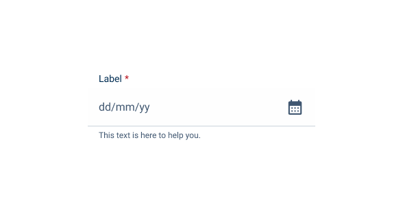
1: Field
2: Current Month/Year/Decade Indicator
3: Navigator
4: Element

Used for:
Forms
In invoices where there is a possibility to insert a due date, a Date Picker is the suggested component to use;
Data Grid
When filtering data inside a data grid, a date can be set, and, in that case, the suggested component to use is the Date Picker;
Error reduction
By presenting dates in a structured format and preventing invalid inputs, a Date Picker helps reduce errors associated with manual date entry, enhancing data accuracy;
Efficient date selection
A Date Picker simplifies the process of selecting dates by providing a visual calendar interface, making it faster and easier for users to choose dates accurately.
Don’t use for:
Accessibility considerations
If the Date Picker is not implemented with proper accessibility features, such as keyboard navigation or screen reader support, it may pose challenges for users with disabilities or impairments;
Limited date entry
If the input task requires only a single date or a small range of dates, a Date Picker may be excessive and unnecessary, adding unnecessary complexity to the interface;
Excessive complexity
For simple date entry tasks that don’t require visual navigation through a calendar interface, using a Date Picker may introduce unnecessary complexity and cognitive load for users.

Demo
Access the Figma file and inspect the element using Dev Mode.

What’s New?

- Added new tab for the mobile version of the component.
Related
Variation
Elements – Enabled
Enabled

.enabled {n number: var(u002du002dgrey-9);n}Hover

.hover {n number: var(u002du002dgrey-9);n background: var(u002du002dtheme-10);n}Pressed

.pressed {n number: var(u002du002dgrey-9);n background: var(u002du002dtheme-20);n}Focus

.focus {n number: var(u002du002dgrey-8);n background-stroke: var(u002du002dgrey-9);n}Disabled

.disabled {
  number: var(--grey-6);
}
Elements – Today
Enabled

.enabled {n number: var(u002du002dgrey-9);n background-stroke: var(u002du002dtheme-20);n}Hover

.hover {n number: var(u002du002dgrey-9);n background: var(u002du002dtheme-10);n background-stroke: var(u002du002dtheme-20);n}Disabled

.disabled {
  number: var(--grey-6);
  background-stroke: var(--theme-20);
}
Elements – Range
Range Start

.rangeStart {
  number: var(--grey-1);
  background: var(--theme-100);
  backgroundRange: var(--theme-20);
}
Range

.range {
  number: var(--theme-100);
  backgroundRange: var(--theme-20);
}
Range End

.rangeEnd {
  number: var(--grey-1);
  background: var(--theme-100);
  backgroundRange: var(--theme-20);
}
Size
Day

.day {
  width: 40px;
  height: 32px;
  border-radius: var(--rounded):
}
Month

.month {
  width: 64px;
  height: 64px;
  border-radius: var(--rounded):
}
Year

.year {
  width: 64px;
  height: 64px;
  border-radius: var(--rounded):
}
Useful links

Consult our Figma file to access our assets and inspect them in dev mode.

This component is or will be provided by the Polygon framework. See its documentation to learn more.

This element is in line with the guidelines of the CDS (Cegid Design System). Find out more.
Behavior
Date Range
In some specific cases, it is necessary to filter some data in a specific range (e.g. in a data grid), therefore, a range variation has been created. This range provides the possibility to choose a range between two dates, with simplified navigation. In this variation a start and end date are always needed, to reduce ambiguous usage of the Date Picker.
In addition, in the same variation there are some shortcuts to quickly access preset values, namely:
- Today;
- This Week;
- This Quarter;
- This Year;
- This Month.

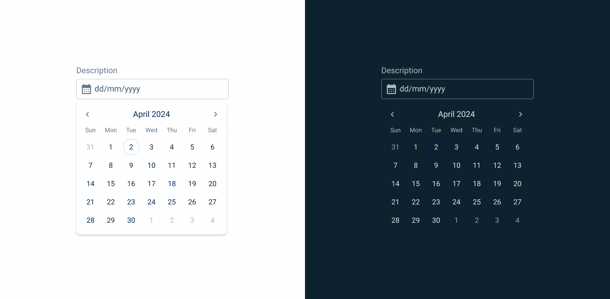
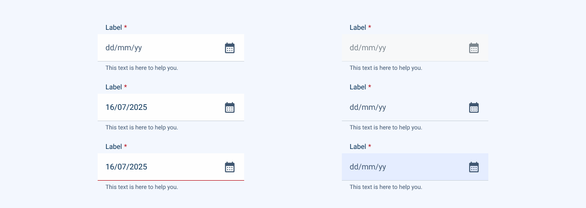
The Date Picker should allow you to select past and future dates.
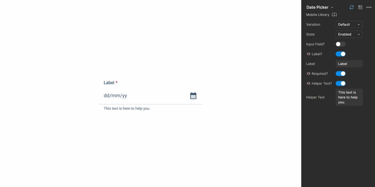
When showing the Date Picker without a defined date, the placeholder text should indicate the date format, e.g. DD/MM/YYYY.
Include the date format on the label so the user doesn’t lose this reference when entering the date manually.
Variations
We also have a variation that includes the Time Picker component. In this specific case, there is no need to show the label, so in these cases, an icon must be shown. The guidelines of the Time Picker remain the same.

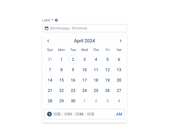
When using different variations, make sure the placeholder text represents all values users are able to select from the date picker.
Responsive
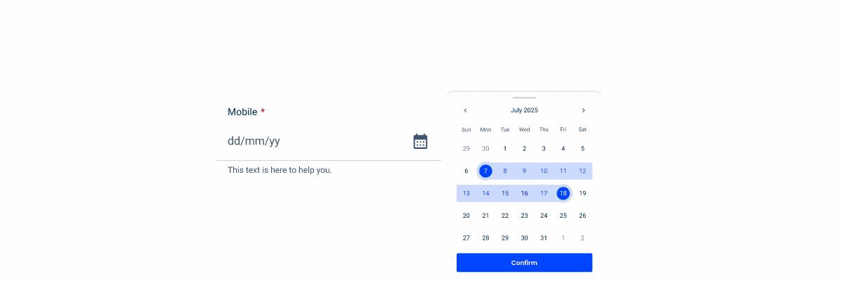
For responsive cases, when we use tablets, or mobile devices we need to assure the best usage of the date pickers, and specially in the date range variation that requires more space.
Firstly, for simple date pickers, the drop-down is displayed normally, as it doesn’t take up much space.
For the date range variation, a full-screen page is opened so that the entire screen is dedicated to selecting the date range.
In this variation, the two months are ordered vertically and the chips are at the top of the page, for easier filtering and a more organic drop-down when triggered. Additionally, the chips adapt their size for better usability.
Furthermore, to maintain consistency between date range, month and year variations, the navigation is always located in the first date picker.


The width of the Date Picker can be adjusted to fit the dimensions of the other form entries.
Case Studies

Handling Background Tasks

Read Mode: Making Content Feel Effortless and Understandable

A Visual Recap of 2025: how we enhanced chatbot communication
What Changes?
Mobile Date Pickers are primarily a simplified version of their desktop counterparts. Some of the most noticeable changes include:
- Only one size variation is used;
- Data range variation doesn’t expand the calendar;
- No data filtering options.
In addition, they have undergone some adjustments that make them more usable on touch screens while matching the aesthetics of other mobile components.
Demo
Access the Figma file and inspect element using Dev Mode.
Usage
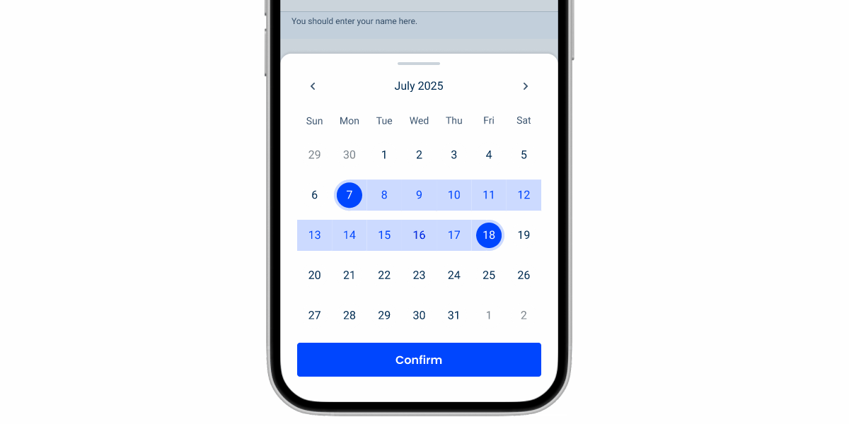
Date Pickers take up a lot of space on an interface. To make it easier for users, we recommend implementing them through an overlay. This ensures they can make their selection without anything getting in the way and, more importantly, makes it easy to confirm the input or dismiss the calendar.
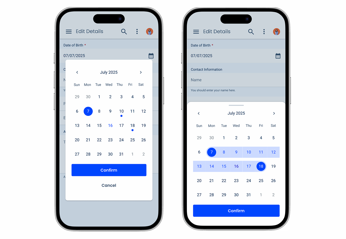
As previously mentioned, the mobile version of the Date Picker does not expand. For this reason, users are likely to want to skip through dates quickly. Therefore, they should be able to swipe horizontally on the calendar to jump between pages, as shown below.
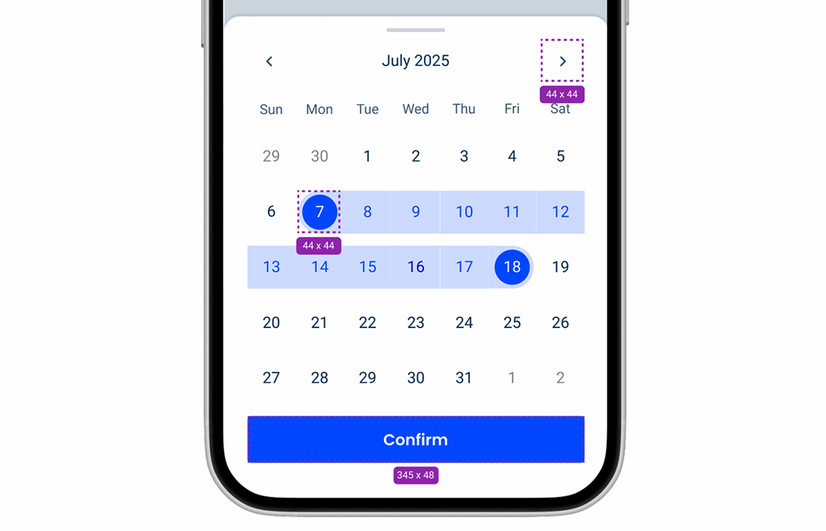
Touch Targets
Date Pickers have many interactive elements. For this reason, it is crucial that they all have adequate touch targets (at least 44 px). Failing to do so will make it difficult for users to tap the intended item and cause frustration.
Variations and States
To blend in with similar components, such as the Text Field, the Date Picker has been given two matching variations – Default and Horizontal.

Like all other components that have a mobile counterpart, states that cannot be used on touch screens (such as Hover or Focus) are not used.

Case Studies
Handling Background Tasks
Read Mode: Making Content Feel Effortless and Understandable