
Close
Dismiss components with a clear Close icon. Accessible, and enhancing usability across interfaces.

- Overview
- Specs
- Guidelines
Component
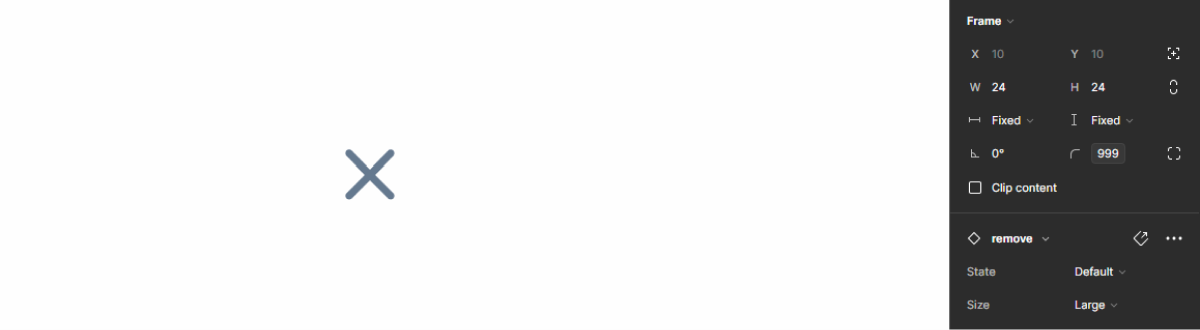
The Close Button is a fundamental UI element used to dismiss or close a specific component, modal, or notification within an interface.
It typically consists of a small icon or symbol, such as an X, positioned in the corner of the component. The Close Button provides users with a clear and intuitive way to exit or dismiss content or interactions, enhancing usability and user experience.

A: Close Component
1: Hover Background
2: Icon

Used for:
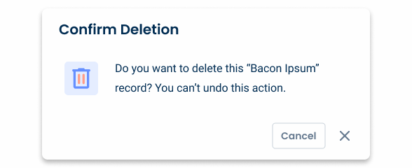
Modals
When presenting a modal, the user must be able to dismiss it. This can be reached either by clicking outside the modal area or by using the Close Button;
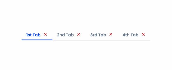
Tabs
When using the Removable variation of tabs, the Close Button is displayed to remove/dismiss the tab item;
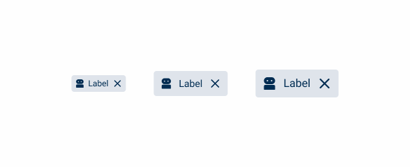
Text-fields
In this context, the Close Button is used for clearing the introduced data in the Focus state;
Flyouts
As is the case with modals, Close Buttons are used to dismiss the flyout as a complementary access, by using the keyboard, for example;
Drafts
In order to remove drafts, the Close Button can be used as it isn’t a critical action inside the user flow.
Don’t use for:
Replacing delete buttons
A Close Button is only for dismissing or closing its parent component, not for taking a destructive action. In this situation, consider using a button;
Non-dismissible components
In views or areas where the focus is important, consider not using the Close Button;
Guided processes
In interfaces guiding users through a step-by-step process or tutorial, Close Buttons may undermine the guided experience by allowing users to skip ahead or exit prematurely;
Error prevention
In interfaces where closing a component could result in data loss or unintended actions, such as in form submissions or document editing applications, omitting Close Buttons can help prevent user errors.

Demo
Access the Figma file and inspect the element using Dev Mode.
Last Update

- Added to Design System;
Related
States

Enabled

.enabled {
  color: var(--grey-8);
}
Hover

.hover {
  background-color: var(--grey-3);
  color: var(--grey-9);
}
Pressed

.pressed {
  background-color: var(--grey-4);
  color: var(--grey-9);
}
Size
Small

.small {
  border-radius: var(--rounded);
  icon: 16px;
}
Regular

.regular {
  border-radius: var(--rounded);
  icon: 20px;
}
Large

.large {
  border-radius: var(--rounded);
  icon: 24px;
}
Useful links

Consult our Figma file to access our assets and inspect them in dev mode.

This component is or will be provided by the Polygon framework. See its documentation to learn more.

This element is in line with the guidelines of the CDS (Cegid Design System). Find out more.
Behavior
Close status
The Close Button changes between hover and pressed in order to have visual feedback and affordance towards the user.

The applied size should be consistent to the component size.
Don’t apply different colors other than the ones specified.
Avoid using Close Buttons to trigger destructive actions.
Case Studies

Creating Context-Aware Notifications for a Better Experience

Read Mode: Making Content Feel Effortless and Understandable
