
Chips
Chips are small visual elements commonly used in user interfaces to represent discrete pieces of information.

- Overview
- Specs
- Guidelines
- Mobile
Component
Chips are small visual elements often used in user interfaces to represent specific information or categories.
They typically appear as rounded rectangles with concise text labels or icons, conveying attributes like content organization or selected options in filters.
Chips streamline interaction by offering a compact, intuitive way to display and manipulate contextual data, enabling users to quickly identify, select, or remove tags as required.

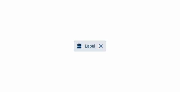
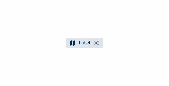
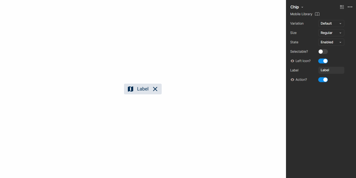
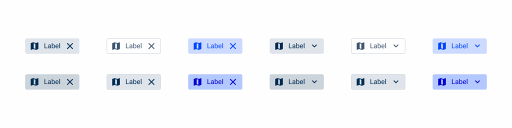
A: Closable Variation
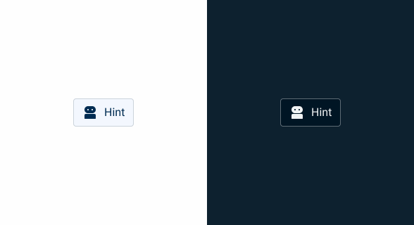
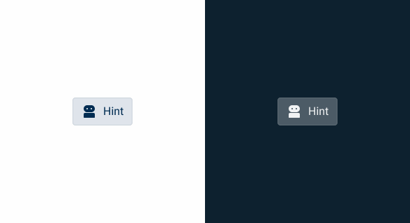
B: Hint Variation
C: Informative Variation
D: Selectable Indicator
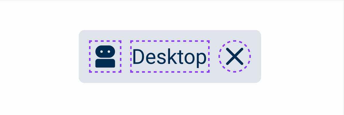
1: Adornment
2: Label
3: Chevron
4: Dropdown

Used for:
Text fields
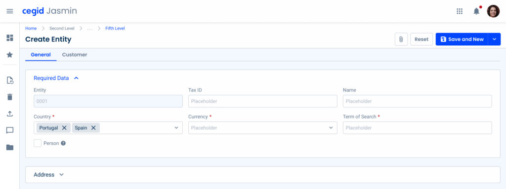
When a text field is applied with the Chips variation, chips will appear as soon as the text field has an inserted value;
Numeric fields
In the Primary variation, Chips are used to indicate the currency used for the field (e.g. Euro);
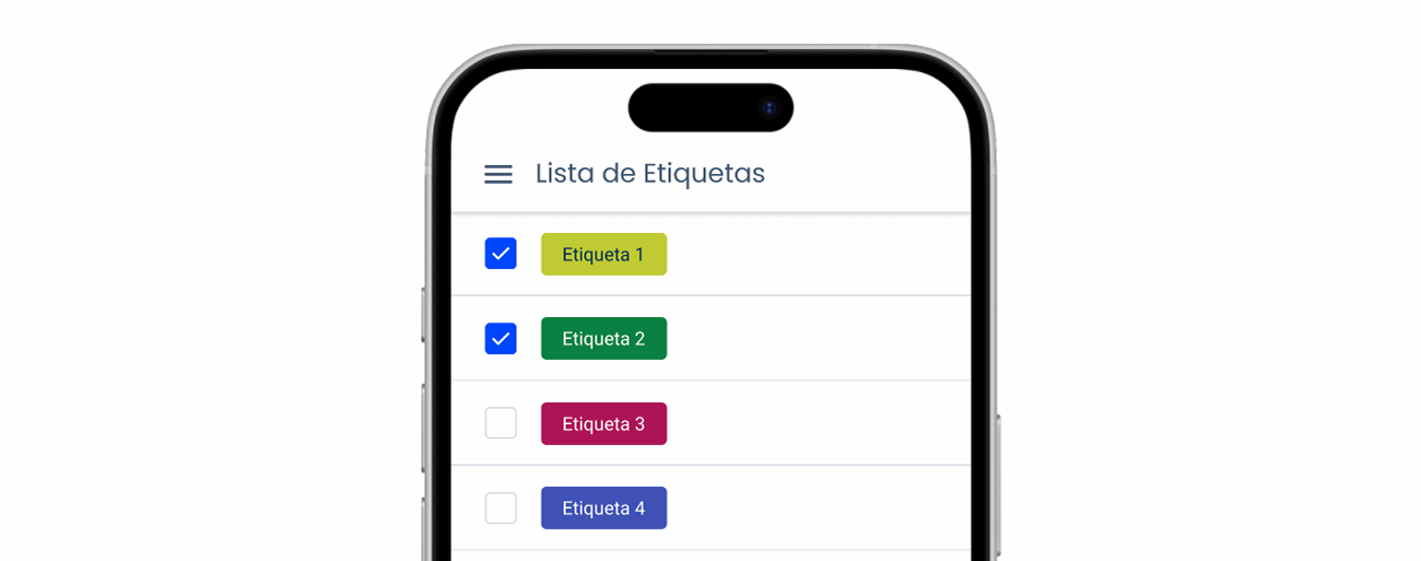
Selectbox
As with the text field, if the selectbox is under the Multi Selection variation, Chips will appear once the values are selected, when they can be removed;
Data Grid
As Chips serve as indicators for filters applied, they are set to be visible when a filter is applied to the Data Grid;
Compactness
Chips offer a compact way to display contextual information without occupying excessive screen space.
Don’t use for:
Visual noise
The excessive use of chips can clutter the interface and create visual noise, especially if too many tags are displayed simultaneously, making it difficult for users to focus on essential information;
Mobile constraints
On small mobile screens, the excessive use of chips can take up too much space and detract from the overall user experience, especially if users need to scroll excessively to view all the tags;
Inconsistent use
Inconsistent use of chips throughout the interface can lead to confusion and incoherence in the user experience, especially if their presence varies across different screens or contexts.

Demo
Access the Figma file and inspect the element using Dev Mode.

Last Update
- Added new tab for the mobile version of the component.
Related
Variations

Closable
Enabled

.enabled {n icon: var(u002du002dgrey-8);n label: var(u002du002dgrey-8);n color: var(u002du002dgrey-4);n}Hover

.hover {n icon: var(u002du002dgrey-9);n label: var(u002du002dgrey-9);n color: var(u002du002dgrey-5);n}Pressed

.pressed {n icon: var(u002du002dgrey-9);n label: var(u002du002dgrey-9);n color: var(u002du002dgrey-4);n stroke: var(u002du002dgrey-6);n}Hint
Enabled

.enabled {n icon: var(u002du002dgrey-8);n label: var(u002du002dgrey-8);n color: var(u002du002dgrey-1);n stroke: var(u002du002dgrey-5);n}Hover
.hover {n icon: var(u002du002dgrey-9);n label: var(u002du002dgrey-9);n color: var(u002du002dgrey-3);n stroke: var(u002du002dgrey-5);n}Pressed
.pressed {n icon: var(u002du002dgrey-9);n label: var(u002du002dgrey-9);n color: var(u002du002dgrey-4);n stroke: var(u002du002dgrey-5);n}Informative
Primary

.primary {n icon: var(u002du002dgrey-9);n label: var(u002du002dgrey-9);n color: var(u002du002dgrey-4);n}Secondary

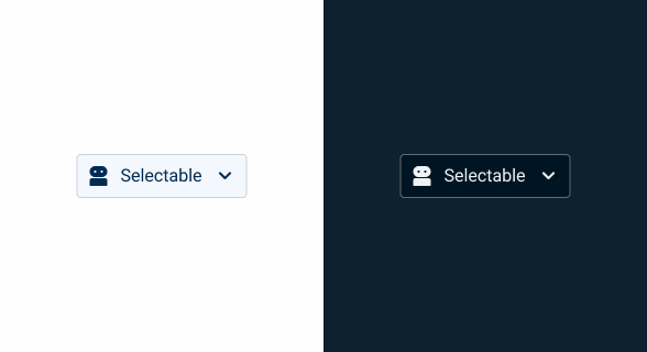
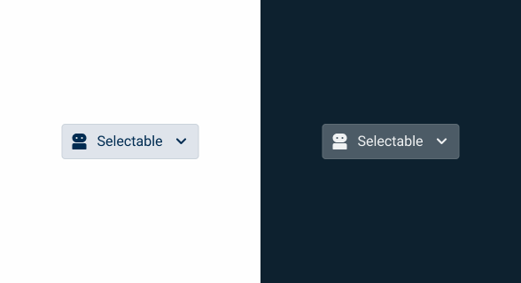
.secondary {n icon: var(u002du002dgrey-8);n label: var(u002du002dgrey-8);n color: var(u002du002dgrey-1);n stroke: var(u002du002dgrey-5);n}Selectable
Is Selected = False
Enabled

.enabled {n icon: var(u002du002dgrey-8);n label: var(u002du002dgrey-8);n color: var(u002du002dgrey-1);n stroke: var(u002du002dgrey-5);n}Hover
.hover {n icon: var(u002du002dgrey-9);n label: var(u002du002dgrey-9);n color: var(u002du002dgrey-3);n stroke: var(u002du002dgrey-5);n}Pressed
.pressed {n icon: var(u002du002dgrey-9);n label: var(u002du002dgrey-9);n color: var(u002du002dgrey-4);n stroke: var(u002du002dgrey-5);n}Focus

.pressed {n icon: var(u002du002dgrey-9);n label: var(u002du002dgrey-9);n color: var(u002du002dgrey-4);n stroke: var(u002du002dgrey-9);n}Is Selected = True
Enabled

.enabled {
  icon: var(--theme-100);
  label: var(--theme-100);
  color: var(--theme-20);
}
Hover

.hover {
  icon: var(--theme-highlight);
  label: var(--theme-highlight);
  color: var(--theme-40);
}
Pressed

.pressed {n icon: var(u002du002dtheme-100);n label: var(u002du002dtheme-100);n color: var(u002du002dtheme-20);n stroke: var(u002du002dtheme-80);n}Focus

.focus {
  icon: var(--theme-100);
  label: var(--theme-100);
  color: var(--theme-40);
  stroke: var(--theme-highlight);
}
Size
Extra Small

.extraSmall {
  height: 24px;
  padding: var(--spacing-4, 0);
  gap: var(--spacing-4);
  icon: 16px;
  label: var(--label-small);
}
Small

.small {
  height: 28px;
  padding: var(--spacing-8, 0);
  gap: var(--spacing-8);
  icon: 16px;
  label: var(--label-small);
}
Regular

.regular {
  height: 36px;
  padding: var(--spacing-8, 0);
  gap: var(--spacing-8);
  icon: 20px;
  label: var(--label-regular);
}
Large

.large {
  height:40px;
  padding: var(--spacing-8, 0);
  gap: var(--spacing-8);
  icon: 24px;
  label: var(--label-large);
}
Useful links

Consult our Figma file to access our assets and inspect them in dev mode.

This component is or will be provided by the Polygon framework. See its documentation to learn more.

This element is in line with the guidelines of the CDS (Cegid Design System). Find out more.
Behavior
Variations
Since there are four different variations, each one is used for a specific reason or case of use, as seen in the Overview page, namely:
- Closable: this variation, as the name refers, can be closed, and is used for filtered content that can easily be reset or cleared;
- Hint: this variation is more commonly used to suggest an action or interaction;
- Informative: this variation represents a keyword, information or tag, and is retrieved inside cards, for example;
- Selectable: this variation can be selected with dropdown options. It’s used to filter or select information, and is retrieved in text fields, for example.

Usage
Sizes
We’ve introduced an extra small (24 px) size to provide a more compact option, ideal for dense interfaces. Additionally, all chip sizes have been refined to follow a logical 4 px increment, enhancing alignment within our spacing system.
The updated sizes are now extra small (24 px), small (28 px), regular (36 px), and large (40 px), ensuring better adaptability across different layouts while maintaining visual harmony.
As part of this update, small input fields now use the extra small chip variation, ensuring a more balanced and proportional appearance in the form elements.
Application
The application of chip sizes follows a consistent approach, ensuring alignment with surrounding elements for visual harmony. We apply the chip size that best matches the context in which it is used.
For example, when using status indicators within the Second Line component, we use the extra small chip alongside them to maintain consistency.

In some cases, chips are used to display both a label and a value, where the label remains in regular weight, and the value is emphasized in bold. This approach is particularly useful in components like Expanders, where it is essential to quickly highlight key information.
For example, a chip inside an Expander might display ‘First Name: John‘, ensuring users can quickly interpret relevant details without expanding the content.

Labels should be short and concise, no more than two words. If this is not possible, then the text should be cut off and a Tooltip should contain the full text (in the Hover effect).
Use different chip variations in the same component/pattern.
Voice-Over
For general guidelines on screen reader compatibility, see the following blog post on best practices: Designing the Invisible: How to Make Your Interfaces Work Without a Screen.
Hide decorative icons from screen readers, as this prevents unnecessary clutter in the reading order.
Clearly indicate the actions of the interactive chips. If chips can be selected, removed, etc., ensure that the screen reader announces their purpose.
Group unrelated chips since this can confuse users. Chips should be grouped by their purpose.
Reading Order

| Reading Order | Element | Screen Reader Reading |
| 1 | Chip (initial focus) | Actions, button, collapsed. |
| 2 | Chip (when activated) | Actions, button, expanded. |
| 3 | Menu item ‘List’ | List, menu item. |
| 4 | Menu item ‘Create’ | Create, menu item. |
| 5 | Menu item ‘Duplicate’ | Duplicate, menu item. |
Case Studies

Handling Background Tasks

Read Mode: Making Content Feel Effortless and Understandable

A Visual Recap of 2025: how we enhanced chatbot communication
References
What Changes?
Although the Chips remain practically the same when used on mobile, they undergo three important changes:
- All variations are merged into one singular component;
- Dimensions are adjusted to improve touch target size;
- The creation of the Tag component, which allows accent colors to be applied to Chips.
Demo
Access the Figma file and inspect the element using Dev Mode.
Size & Touch Target
As with most of the components that have migrated to the Mobile Library, the font size increases. Additionally, interactive elements are designed to have a touch target of, at least, 44×44 px.
To better incorporate these requirements, the Chip has received some adjustments to its dimensions, as shown in the image below.
The negative margins help to ensure the component doesn’t look strange when the icons or actions are removed.
Tag
Some of Cegid’s mobile products can benefit from adding customizable tags to items. To improve sorting options, we designed the Tag component, which works like a Chip, but has several colors.
Depending on the selected color, the label will also change to ensure that it maintains high contrast with the background.
States & Variations
States that require a cursor, such as hover, aren’t used on mobile.
Variations that aim to make the component more flexible have been implemented.
Case Studies
Handling Background Tasks
Read Mode: Making Content Feel Effortless and Understandable