
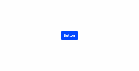
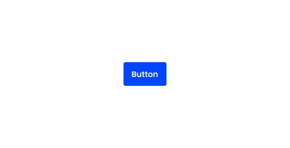
Buttons
Buttons are used to perform an action. Their labels tell the user what will happen when they interact with them.

- Overview
- Specs
- Guidelines
- Mobile
Component
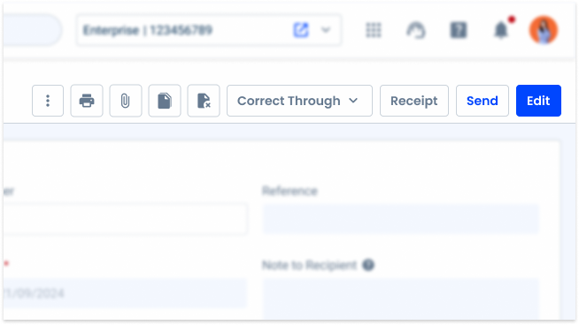
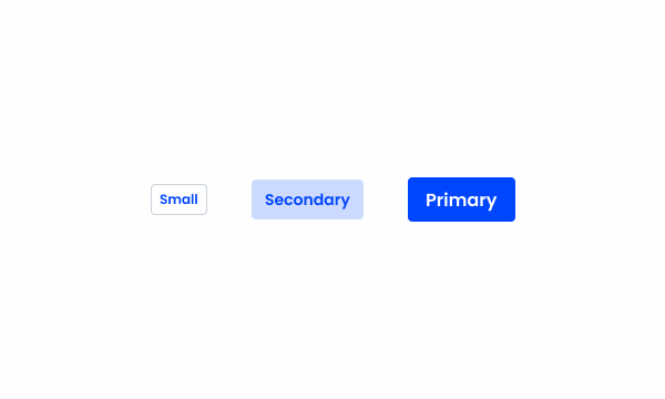
It’s the area where the user can trigger an action and it can contain icons and labels.
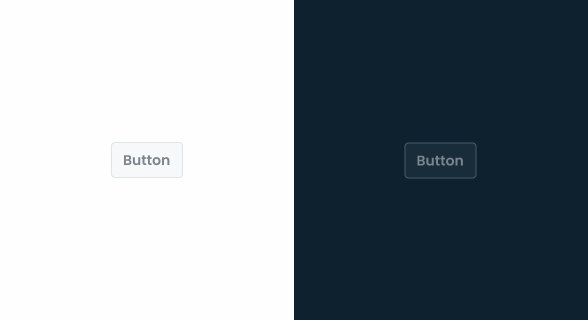
Can be represented with the colors theme, grey and error. Alongside it can be combined with the variations primary, secondary, tertiary and text button.

- A: Primary variation
- B: Secondary variation
- C: Tertiary variation
- D: Text Button variation
- 1: Left icon
- 2: Label
- 3: Right icon
Used for:
Form submission
Used to submit data entered into forms, such as Submit or Send.
Progressing or regressing
Enables users to navigate within a Modal, including Next, Previous, Previous Step and Next Step.
Expansion buttons
Reveals additional content or options when clicked, like Show More or Expand.
File upload buttons
Initiates the process of uploading files or media, labeled as Upload File or Choose File.
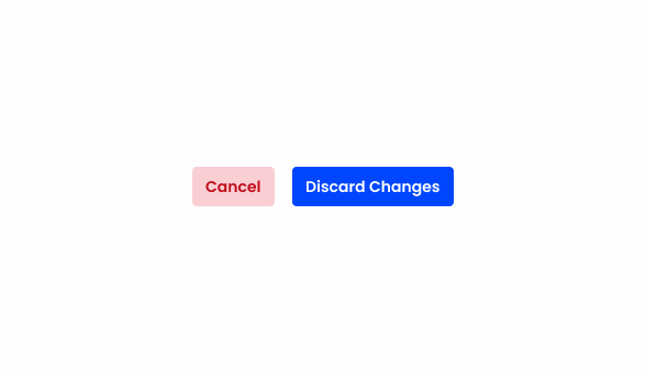
Alternative actions
Offers an alternative action or serves as a backup option to the primary action, often labeled as Cancel, Close or Back.
Don’t use for:
Navigation within the page
Do not use buttons as navigational elements. Instead, use Links.
Ambiguous actions
If the action triggered by the button is ambiguous or may have unintended consequences, consider providing additional context or confirmation to prevent user errors.
Redundant content
Avoid introducing buttons that duplicate functionality already available through other interface elements.
Temporary content
Avoid using buttons for content that is temporary or transitional in nature. For example, elements that appear briefly for notifications or alerts may not require button interaction unless necessary.

Glossary
If you’d like, you can consult the buttons glossary, which contains a set of buttons, their description and translations into Portuguese and Spanish.
Demo
Access the Figma file and inspect element using Dev Mode.

Last Update
- Added new tab for the mobile version of the component.
Related
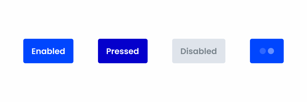
States

Primary
Enabled

.enabled {
background-color: var(--Theme-100);
color: var(--grey-1);
}
Hover

.hover {
background-color: var(--Theme-80);
color: var(--grey-1);
}
Pressed

.pressed {
background-color: var(--Theme-highlight);
color: var(--grey-1);
}
Loading

.loading {
background-color: var(--Theme-100);
color-1: var(--Theme-80);
color-2: var(--Theme-60);
}
Disabled

.disabled {
background-color: var(--Grey-4);
color: var(--grey-6);
}
Focus

.focus {
background-color: var(--Theme-80);
border-color: var(--Theme-highlight);
color: var(--grey-1);
}
Secondary
Enabled

.enabled {
background-color: var(--Theme-20);
color: var(--Theme-100);
}
Hover

.hover {
background-color: var(--Theme-40);
color: var(--Theme-highlight);
}
Pressed

.pressed {
background-color: var(--Theme-20);
border-color: var(--Theme-80);
color: var(--Theme-100);
}
Loading

.loading {
background-color: var(--Theme-20);
color-1: var(--Theme-80);
color-2: var(--Theme-60);
}
Disabled

.disabled {
background-color: var(--Grey-4);
color: var(--Grey-6);
}
Focus

.focus {
background-color: var(--Theme-20);
border-color: var(--Theme-highlight);
color: var(--Theme-100);
}
Tertiary
Enabled

.enabled {
background-color: var(--Grey-1);
border-color: var(--Grey-5);
color: var(--Theme-100);
}
Hover

.hover {
background-color: var(--Theme-10);
border-color: var(--Grey-5);
color: var(--Theme-100);
}
Pressed

.pressed {
background-color: var(--Theme-20);
border-color: var(--Grey-5);
color: var(--Theme-100);
}
Loading

.loading {
background-color: var(--Grey-1);
border-color: var(--Grey-5);
color-1: var(--Theme-80);
color-2: var(--Theme-60);
}
Disabled
.disabled {
background-color: var(--Grey-2);
border-color: var(--Grey-4);
color: var(--Grey-6);
}
Focus

.focus {
background-color: var(--Grey-1);
border-color: var(--Theme-highlight);
color: var(--Theme-100);
}
Text Button
Enabled

.enabled {
color: var(--Theme-100);
}
Hover

.hover {
background-color: var(--Theme-10);
color: var(--Theme-100);
}
Pressed

.pressed {
background-color: var(--Theme-20);
color: var(--Theme-100);
}
Loading

.loading {
color-1: var(--Theme-80);
color-2: var(--Theme-60);
}
Disabled

.disabled {
color: var(--Grey-6);
}
Focus

.focus {
border-color: var(--Theme-highlight);
color: var(--Theme-100);
}
Variations
Colors
Theme

.primary-enabled { background-color: var(--Theme-100); color: var(--grey-1); }
.secondary-enabled { background-color: var(--Theme-20); color: var(--Theme-100); }
.tertiary-enabled { background-color: var(--Grey-1); border-color: var(--Grey-5); color: var(--Theme-100); }
.text_button-enabled { color: var(--Theme-100); }
Error

.primary-enabled { background-color: var(--Error-100); color: var(--grey-1); }
.secondary-enabled { background-color: var(--Error-20); color: var(--Error-100); }
.tertiary-enabled { background-color: var(--Grey-1); border-color: var(--Grey-5); color: var(--Error-100); }
.text_button-enabled { color: var(--Error-100); }
Grey

.primary-enabled { background-color: var(--Grey-8); color: var(--grey-1); }
.secondary-enabled { background-color: var(--Grey-2); color: var(--Grey-8); }
.tertiary-enabled { background-color: var(--Grey-1); border-color: var(--Grey-5); color: var(--Grey-7); }
.text_button-enabled { color: var(--Grey-7); }
Size
Small

.small {
  padding: var(--spacing-8) var(--spacing-4) var(--spacing-8) var(--spacing-4);
  gap: var(--spacing-4);
  border-radius: var(--x-small-radius);
  icon: icon: 20px;
  label: var(--Button-small);
}
Regular

.regular {
  padding: var(--spacing-12) var(--spacing-8) var(--spacing-12) var(--spacing-8);
  gap: var(--spacing-4);
  border-radius: var(--x-small-radius);
  icon: icon: 20px;
  label: var(--Button-regular);
}
Large

.large {
  padding: var(--spacing-16) var(--spacing-8) var(--spacing-16) var(--spacing-8);
  gap: var(--spacing-8);
  border-radius: var(--x-small-radius);
  icon: icon: 24px;
  label: var(--Button-large);
}
Useful links

Consult our Figma file to access our assets and inspect them in dev mode.

This component is or will be provided by the Polygon framework. See its documentation to learn more.

This element is in line with the guidelines of the CDS (Cegid Design System). Find out more.
Behavior
Min & Max Width
Ideally, for good UX practice, you shouldn’t use buttons that are too long. To prevent them from being deformed, a minimum and maximum width is applied to the button.
If the maximum width is exceeded, the label will be trimmed. Otherwise, the content is always centered. Depending on the size of the button, different minimum and maximum width must be applied:
- Small: 46px min width, 160px max width;
- Regular: 60px min width, 180px max width;
- Large: 76px min width, 200 max width.

Use different sizes in the same set.
Trimming
When a label is trimmed due to exceeding the maximum width, a tooltip must be displayed, for the user not to lose context of what action is being triggered.
Trimming is applied in order to avoid excessive content inside labels, as these must be short and concise within the context.
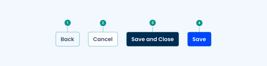
Hierarchy
Buttons follow a clear hierarchy to guide user actions effectively.
Primary Button
The primary button is the most prominent and should be used for the main action on a screen. For this reason, it always has the highest visibility.
Some common examples of the use of this button are destructive actions and confirmation prompts.

Secondary Button
Secondary Buttons provide alternative, less prominent actions. They’re often used to support primary actions without overshadowing them.
They can help represent actions or features users are likely to interact with, but aren’t required for their current task, such as editing a form or navigating to another page.

Tertiary Button
Tertiary Buttons are more subtle and typically used for less critical actions or complementary features. They are frequently dismissive or ones the user is less likely to use, such as clearing forms or closing a dialog.

More complex interfaces may require the implementation of several tertiary buttons. In order to maintain a good hierarchy and not overwhelm the interface, it’s often better to use text buttons. These have a similar purpose, but don’t stand out as much.

Use different button hierarchies and in the following order: tertiary, secondary, primary.

Combine theme colors with grey.

When using secondary buttons of the same color together.
Using red for less important actions makes it more difficult to focus on higher priority actions.
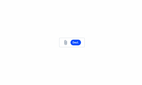
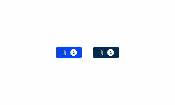
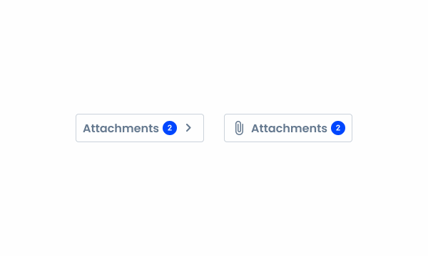
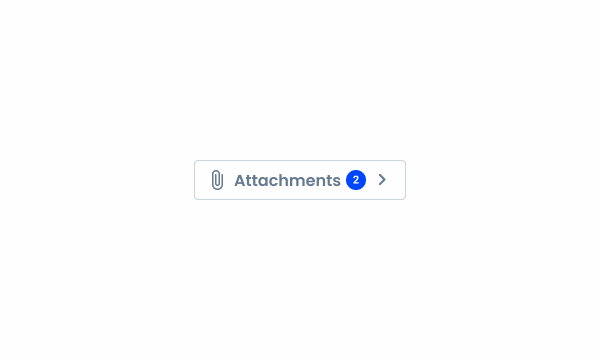
Badge
Some buttons may include a badge to indicate the number of records, such as the number of attached documents in a form. The counter provides a quick visual reference for users:
- The counter can be used on both button and button-icon components;
- The counter displays up to 99 records. For values greater than 99, use 99+.
Examples


Use the counter with text.
When using primary button variations with the counter.
When using the counter with an icon and a label.
When using the counter on a button with two icons and label.
Voice-Over
For general guidelines on screen reader compatibility, see the following blog post on best practices: Designing the Invisible: How to Make Your Interfaces Work Without a Screen.
Keep button actions predictable. When a button is selected, it should always perform the action implied by its name, such as submitting an invoice or confirming a selection.
Place buttons where users expect to find them, so that it is easier for them to navigate your interface.
Ensure the screen reader focus follows button hierarchy.
Whenever there are several grouped actions, consider having the screen reader indicate the type of button (primary, secondary, tertiary) so that screen reader users can have this information, which otherwise only exists as a visual cue.
Avoid placing destructive actions (e.g. Delete) close to safe actions (e.g. Save), as it can confuse users and lead to serious errors.
Reading
| Reading | Element | Screen Reader Reading |
| 1 | Text Button | Back, button. |
| 2 | Tertiary Button | Cancel, tertiary button [if applicable]. |
| 3 | Primary Grey Button | Save and Close, secondary button [if applicable]. |
| 4 | Primary Button | Save, primary button [if applicable]. |
Case Studies

Handling Background Tasks

Read Mode: Making Content Feel Effortless and Understandable

A Visual Recap of 2025: how we enhanced chatbot communication
What Changes?
When used on mobile interfaces, Buttons will behave in a very similar way. However, there are some differences in appearance and behavior to bear in mind.
Demo
Access the Figma file and inspect element using Dev Mode.

Size
All variations have increased height. This aims to improve usability by increasing the touch area, as most users will not be as precise when using their thumbs.
Additionally, the font size has been increased to make sure content is readable in small screens.

For similar reasons, it’s very common to have buttons fill the container they’re in, which means width constraints aren’t applicable. In addition to improving the touch target size, it ensures buttons adjust seamlessly to the various screen resolutions available for mobile devices.

Even though Buttons can be more flexible on mobile, avoid grouping too many actions together as it will lower the touch area and clutter the interface.
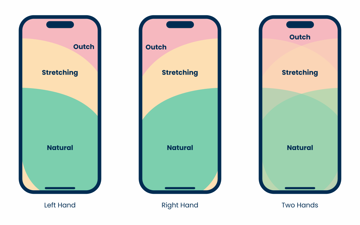
Position
As buttons are one of the most universal components in any design system, their positions may vary significantly.
On desktop interfaces, they’re often placed in areas with great visibility, such as the center or the top. However, smartphone users may struggle to reach those areas on their devices without straining their thumbs.
When implementing important actions that users will need to access frequently, be sure to keep in mind ease of access, and not just visibility or aesthetics.
States
For the most part, states are kept the same. However, the lack of a cursor means the hover and focus states aren’t used.
Case Studies
Handling Background Tasks
Read Mode: Making Content Feel Effortless and Understandable