
Button Icons
Button Icons are used for minor actions that can be resumed within one icon.
- Overview
- Specs
- Guidelines
- Mobile
Component
Button icons are used to be displayed within compact layouts, where the desired action can be resumed in one icon and unambiguously.
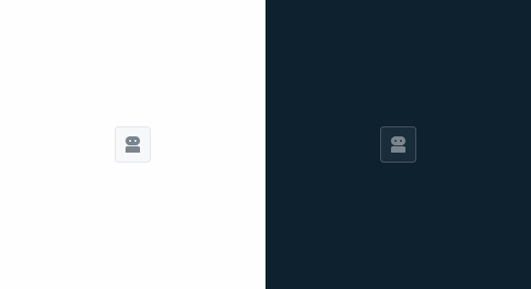
Button icons can be represented with the colors theme, grey and error. Alongside it can be combined with the variations primary, secondary, tertiary and text button. This component follows the same color states as the buttons.

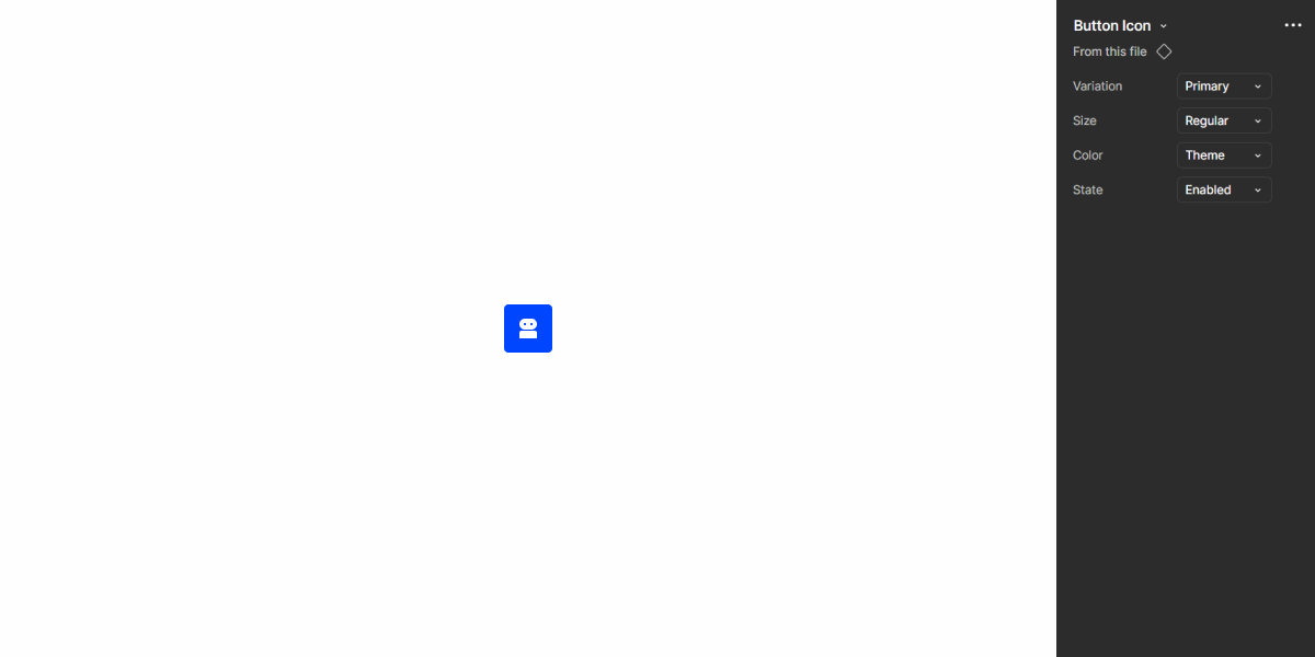
A: Primary variation
B: Secondary variation
C: Tertiary variation
D: Text Button variation
1: Icon
Used for:
Action bar options
Used to provide quick access to frequent actions, such as print and attach;
Sorting and filtering
Enable users to sort and group by columns inside the data-grid pattern;
Messaging actions
Used to represent a send button without taking to much place;
File management
Complete the process of uploading files or media, either for accepting or canceling the media attached;
Don’t use for:
Insufficient visual cues
It’s not recommended to use button icons when the meaning of the icons is not immediately clear or intuitive;
Accessibility concerns
Do not use button icons to display primary information such as “Save”, in order to maintain the base functionality for persons using a screen reader. Consider using buttons instead;
Overreliance on icons
Avoid overreliance on button icons for critical actions, especially when users may be unfamiliar with the meaning of the icons;
Inconsistent iconography
If the iconography used in button icons is inconsistent or lacks standardization across the interface, users may struggle to interpret their meaning consistently;
Demo
Access the Figma file and inspect element using Dev Mode.

Last Update
- Added new tab for the mobile version of the component.
States

Primary
Enabled

.enabled {
background-color: var(--Theme-100);
color: var(--grey-1);
}
Hover

.hover {
background-color: var(--Theme-80);
color: var(--grey-1);
}
Pressed

.pressed {
background-color: var(--Theme-highlight);
color: var(--grey-1);
}
Loading

.loading {
background-color: var(--Theme-100);
color-1: var(--Theme-80);
color-2: var(--Theme-60);
}
Disabled

.disabled {
background-color: var(--Grey-4);
color: var(--grey-6);
}
Focus

.focus {
background-color: var(--Theme-80);
border-color: var(--Theme-highlight);
color: var(--grey-1);
}
Secondary
Enabled

.enabled {
background-color: var(--Theme-20);
color: var(--Theme-100);
}
Hover

.hover {
background-color: var(--Theme-40);
color: var(--Theme-highlight);
}
Pressed

.pressed {
background-color: var(--Theme-20);
border-color: var(--Theme-80);
color: var(--Theme-100);
}
Loading

.loading {
background-color: var(--Theme-20);
color-1: var(--Theme-80);
color-2: var(--Theme-60);
}
Disabled

.disabled {
background-color: var(--Grey-4);
color: var(--Grey-6);
}
Focus

.focus {
background-color: var(--Theme-20);
border-color: var(--Theme-highlight);
color: var(--Theme-100);
}
Tertiary
Enabled

.enabled {
background-color: var(--Grey-1);
border-color: var(--Grey-5);
color: var(--Theme-100);
}
Hover

.hover {
background-color: var(--Theme-10);
border-color: var(--Grey-5);
color: var(--Theme-100);
}
Pressed

.pressed {
background-color: var(--Theme-20);
border-color: var(--Grey-5);
color: var(--Theme-100);
}
Loading

.loading {
background-color: var(--Grey-1);
border-color: var(--Grey-5);
color-1: var(--Theme-80);
color-2: var(--Theme-60);
}
Disabled
.disabled {
background-color: var(--Grey-2);
border-color: var(--Grey-4);
color: var(--Grey-6);
}
Focus

.focus {
background-color: var(--Grey-1);
border-color: var(--Theme-highlight);
color: var(--Theme-100);
}
Text Button
Enabled

.enabled {
color: var(--Theme-100);
}
Hover

.hover {
background-color: var(--Theme-10);
color: var(--Theme-100);
}
Pressed

.pressed {
background-color: var(--Theme-20);
color: var(--Theme-100);
}
Loading

.loading {
color-1: var(--Theme-80);
color-2: var(--Theme-60);
}
Disabled

.disabled {
color: var(--Grey-6);
}
Focus

.focus {
border-color: var(--Theme-highlight);
color: var(--Theme-100);
}
Variations
Colors
Theme

.primary-enabled { background-color: var(--Theme-100); color: var(--dgrey-1); }
.secondary-enabled { background-color: var(--Theme-20); color: var(--Theme-100); }
.tertiary-enabled { background-color: var(--Grey-1); border-color: var(--Grey-5); color: var(--Theme-100); }
.text_button-enabled { color: var(--Theme-100); }
Error

.primary-enabled { background-color: var(--Error-100); color: var(--grey-1); }
.secondary-enabled { background-color: var(--Error-20); color: var(--Error-100); }
.tertiary-enabled { background-color: var(--Grey-1); border-color: var(--Grey-5); color: var(--Error-100); }
.text_button-enabled { color: var(--Error-100); }
Grey

.primary-enabled { background-color: var(--Grey-9); color: var(--grey-1); }
.secondary-enabled { background-color: var(--Grey-2); color: var(--Grey-9); }
.tertiary-enabled { background-color: var(--Grey-1); border-color: var(--Grey-5); color: var(--Grey-8); }
.text_button-enabled { color: var(--Grey-8); }
Size
Small

.small {
  padding: var(--spacing-6) var(--spacing-6);
  border-radius: var(--x-small-radius);
  icon: icon: 16px;
}
Regular

.regular {
  padding: var(--spacing-8) var(--spacing-8);
  border-radius: var(--x-small-radius);
  icon: icon: 20px;
}
Large

.large {
  padding: var(--spacing-8) var(--spacing-8);
  border-radius: var(--x-small-radius);
  icon: icon: 24px;
  }
Useful links

Consult our Figma file to access our assets and inspect them in dev mode.

This component is or will be provided by the Polygon framework. See its documentation to learn more.

This element is in line with the guidelines of the CDS (Cegid Design System). Find out more.
Behavior
Fixed Size
Button icons, by nature, must always have a fixed size, because the button only allows us to show one icon and this must be proportional in all scenarios. The height follows the button component so that it can be paired with action bars, for example. This component follows the same color states as the buttons.


Don’t use different sizes in the same set.
Hierarchy
Button icons hierarchy follows the same rules documented in the article on buttons.

Use different button hierarchies and in the following order: tertiary, secondary, primary.

Combine theme colors with grey.

Use secondary buttons of the same color together.
Voice-Over
For general guidelines on screen reader compatibility, see the following blog post on best practices: Designing the Invisible: How to Make Your Interfaces Work Without a Screen.
Use button icons for clear and obvious actions, such as Save, Close or Delete.
Place button icons where users expect to find them, so it is easier for them to navigate your interface.
Whenever there are several grouped actions, consider having the screen reader indicate the type of button (primary, secondary, tertiary) so that screen reader users can have this information, which otherwise only exists as a visual cue.
Use button icons without an appropriate label, as this makes them unusable for screen reader users and makes them feel unsafe. For example, don’t label them as “pencil”, but rather “edit invoice”.
Reading
| Reading | Element | Screen Reader Reading |
| 1 | Text Button | Move to trash, button. |
| 2 | Tertiary Button | Print [what needs to be printed, e.g. invoice], tertiary button [if applicable]. |
| 3 | Primary Grey Button | Edit [what needs to be edited, e.g. invoice] secondary button [if applicable]. |
| 4 | Primary Button | Save [what needs to be saved, e.g. invoice], primary button [if applicable] . |
Case Studies

Handling Background Tasks

Read Mode: Making Content Feel Effortless and Understandable

A Visual Recap of 2025: how we enhanced chatbot communication
What Changes?
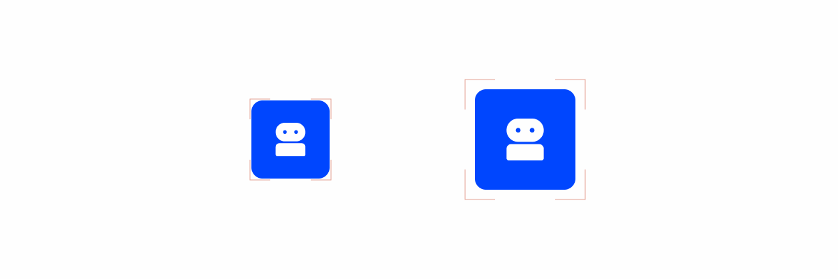
Mobile Button Icons look and behave very similarly to their desktop counterpart, with only a few slight changes to their appearance.
Demo
Access the Figma file and inspect element using Dev Mode.
Size
All variations had their size increased in order to improve visibility on small screens. Additionally, smaller variations have been placed in a container that helps ensure that their touch target is at least 44×44 px, regardless of where they are used.
Position
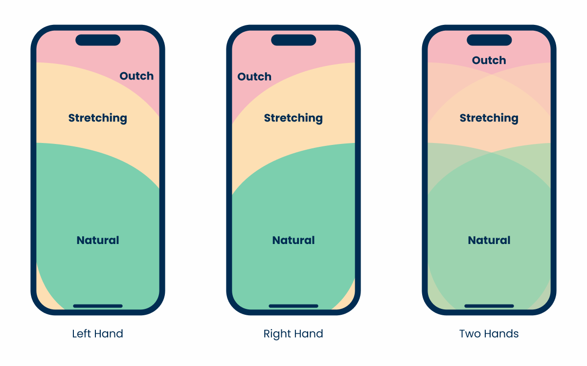
Button Icons are one of the most universal components in any design system, meaning their positions may vary significantly.
On desktop interfaces, they’re often placed in areas with great visibility, such as the center or the top. However, smartphone users may struggle to reach those areas on their devices without straining their thumbs.
When implementing important actions that users will need to access frequently, be sure to keep in mind ease of access, and not just visibility or aesthetics.
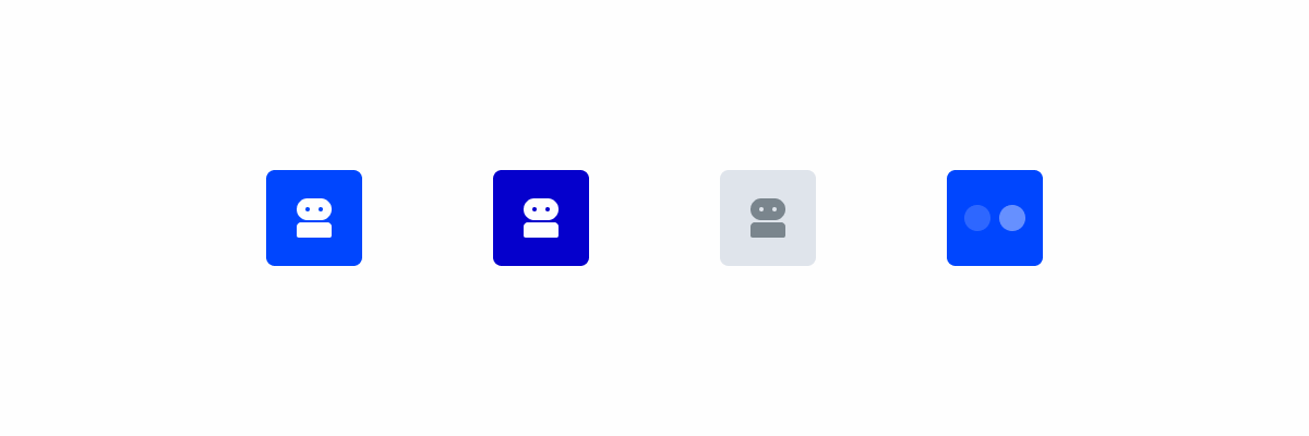
States
For the most part, variations are kept the same. However, the lack of a cursor means the hover and focus states aren’t used.
Use Button Icons if the action they’re representing isn’t clear, as you cannot rely on tooltips in mobile interfaces.
Case Studies
Handling Background Tasks
Read Mode: Making Content Feel Effortless and Understandable