
Button Group
Group of selection options in button format which can be multiple or single selection.

- Overview
- Specs
- Guidelines
Component
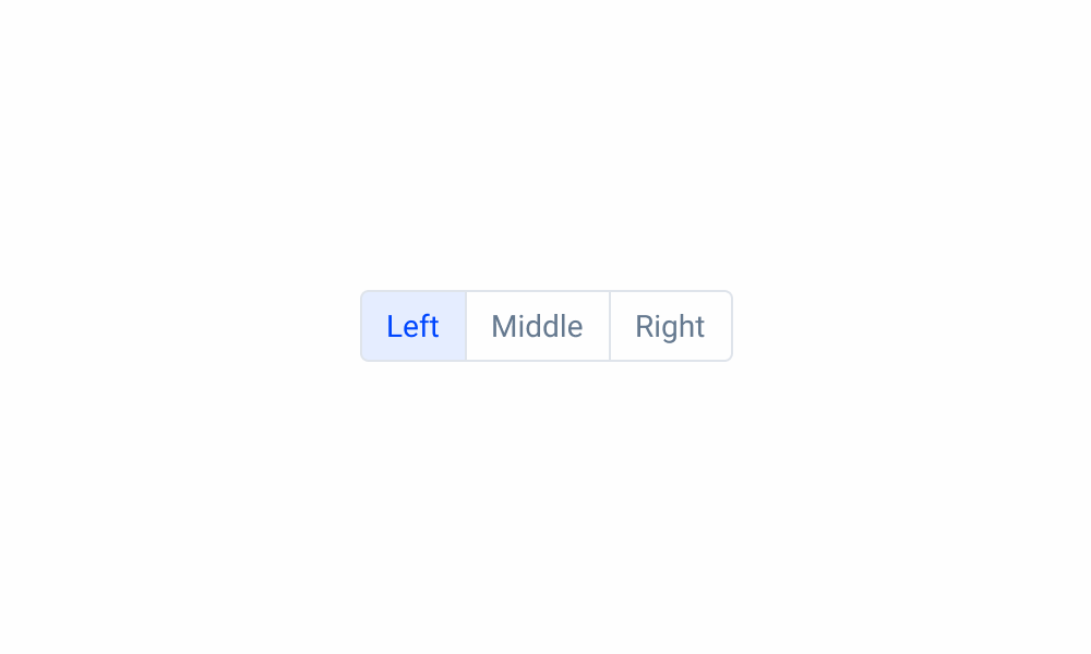
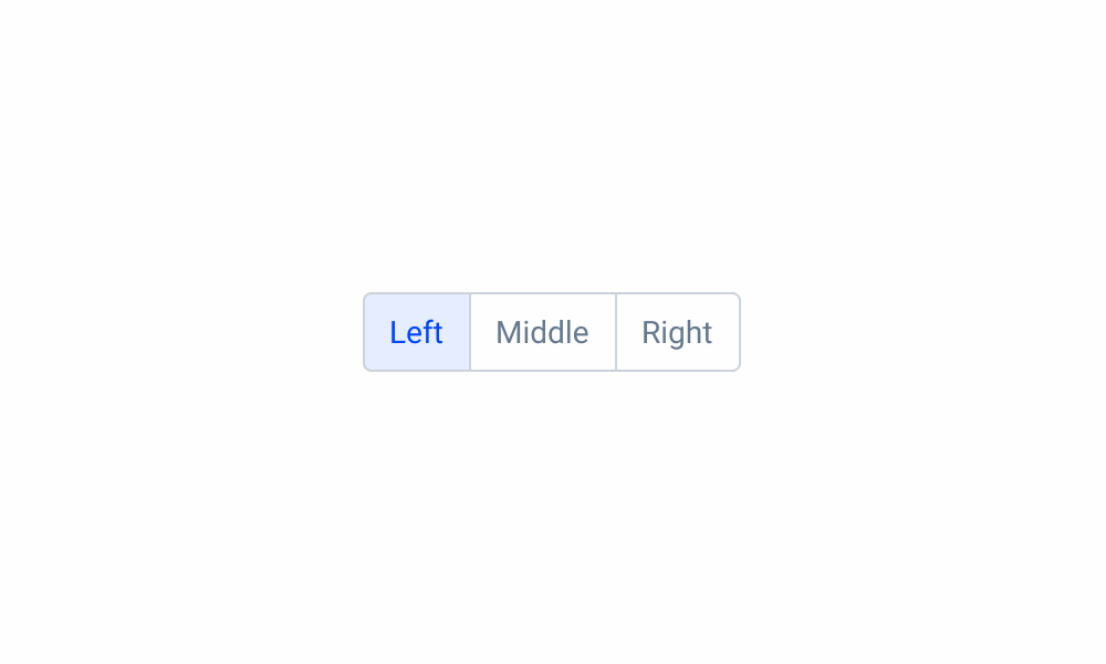
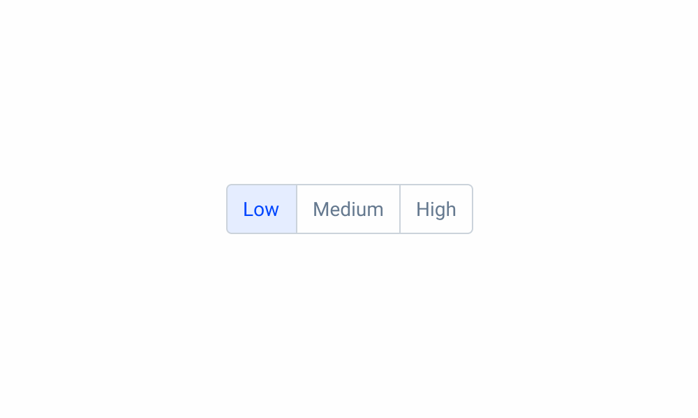
It’s a set of at least two selectable buttons and it can contain icons or labels.
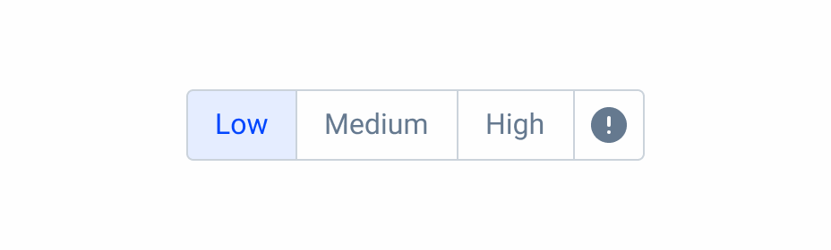
It can be single or multiple selection, from two to five options.
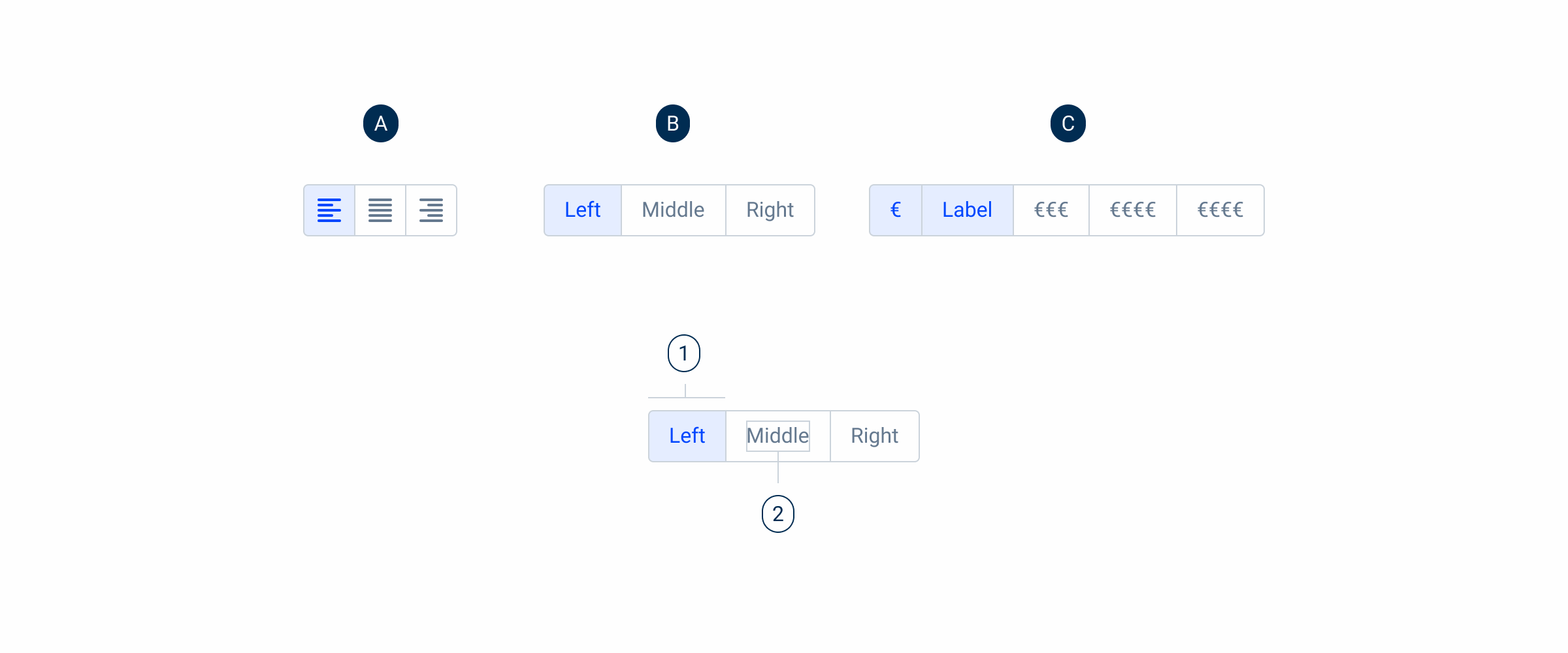
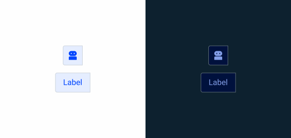
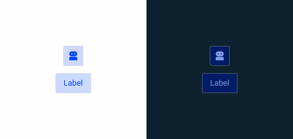
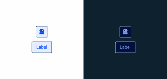
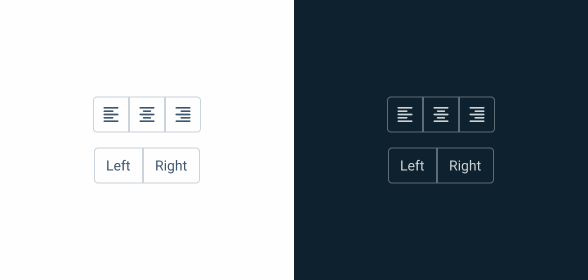
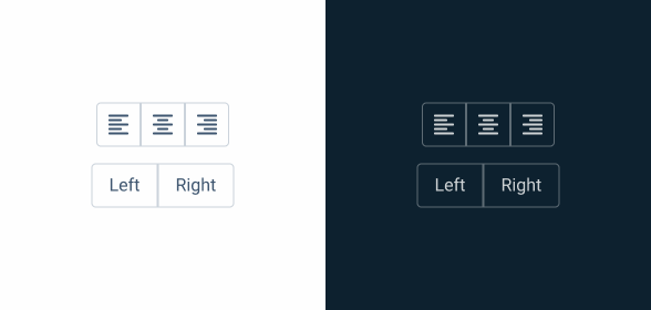
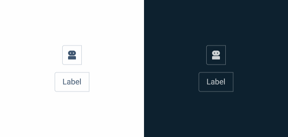
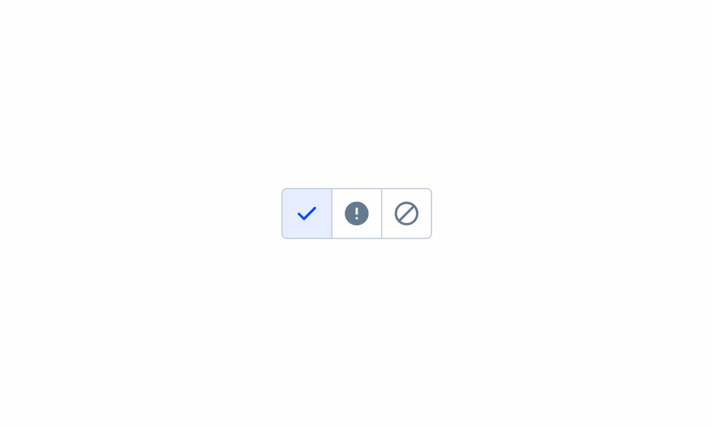
A – Icon Variation
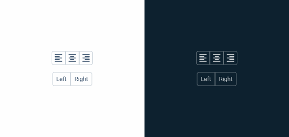
B – Single Selection
C – Multi Selection
1 – Button/Option
2 – Label
Used for:
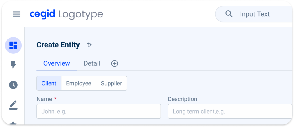
Filtering options
Allow users to filter by categories such as price range, size, color or priority;
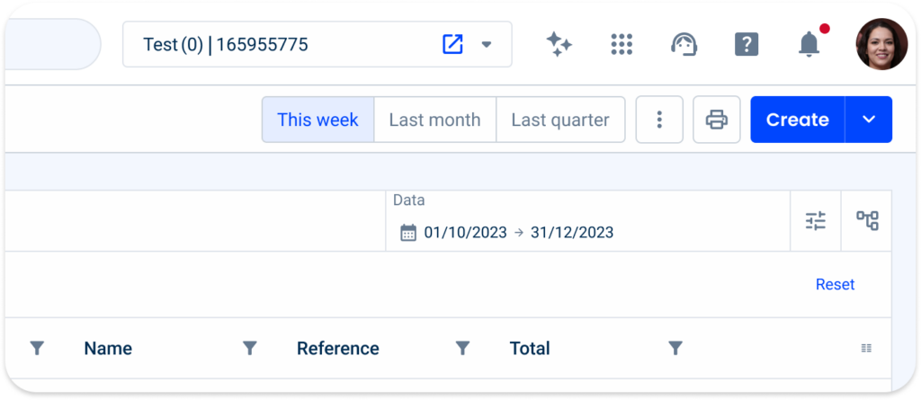
Sort functionality
On a dashboard or data table, a button group can provide sorting options such as sorting by date, name or relevance;
Navigation Menu
Provides users with quick access to different sections or features.
Selection
Provides multiple choice options in a visually appealing way;
Toggle buttons
To switch between different modes or views, such as a light/dark theme toggle or a grid/list view toggle, a button group can be used to easily switch between options;
Don’t use it for:
Single Option Selection
If there’s only one option available or if only one selection is allowed at a time, use a checkbox instead.
Large number of options
If there are too many options to fit comfortably in a button group, use a select box instead.
Complex hierarchical structures
Button groups are not suitable for presenting complex hierarchical structures or nested options. In such cases, another interface element such as a tree view or a drop-down menu may be more appropriate.
Dynamic content
If the options or choices within the group are subject to frequent changes or updates, a more flexible interface component may be required to accommodate dynamic content.
Non-discrete options
Button groups are designed to present discrete, mutually exclusive options. If the options are continuous or overlapping, such as in a combo box or slider, a different type of control should be used.
Demo
Access the Figma file and inspect element using Dev Mode.
Last Update
- Added border-radius variables;
- Added label as component;
- Updated state color variables;
- Reduced button group elements up to five;
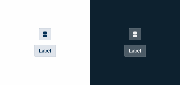
States
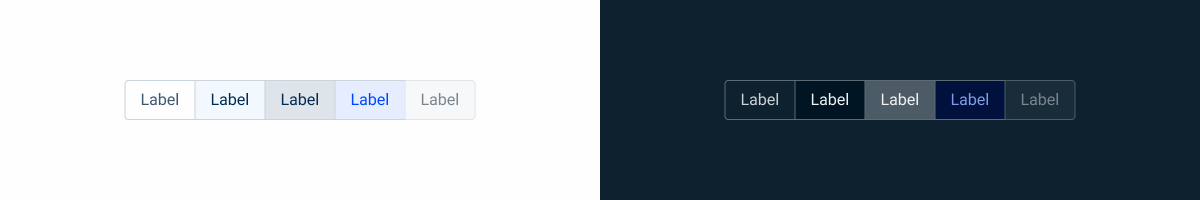
Not Active
Enabled

.enabled {
    background-color: var(--grey-1);
    border-color: var(--grey-5);
    color: var(--grey-8);
}
Hover
.hover {
    background-color: var(--grey-3);
    border-color: var(--grey-5);
    color: var(--grey-9);
}
Pressed
.pressed {
    background-color: var(--grey-4);
    border-color: var(--grey-5);
    color: var(--grey-9);
}
Disabled
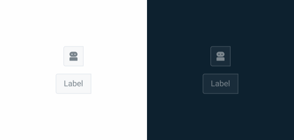
.disabled {
    background-color: var(--grey-2);
    border-color: var(--grey-4);
    color: var(--grey-6);
}
Focus
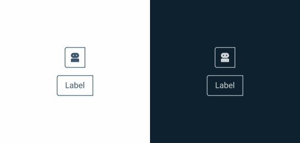
.focus {
    background-color: var(--grey-1);
    border-color: var(--grey-9);
    color: var(--grey-8);
}
Active
Enabled
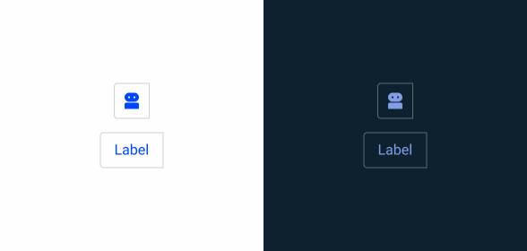
.enabled {
    background-color: var(--grey-1);
    border-color: var(--grey-5);
    color: var(--theme-100);
}
Hover
.hover {
    background-color: var(--theme-10);
    border-color: var(--grey-5);
    color: var(--theme-100);
}
Pressed
.pressed {
    background-color: var(--theme-20);
    border-color: var(--grey-5);
    color: var(--theme-100);
}
Focus
.focus {
    background-color: var(--theme-10);
    border-color: var(--grey-9);
    color: var(--theme-100);
}
Variations
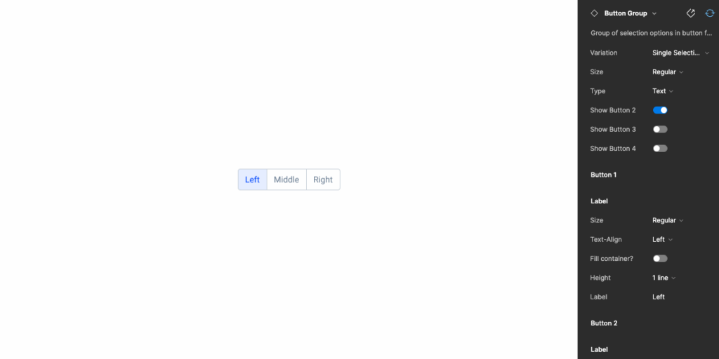
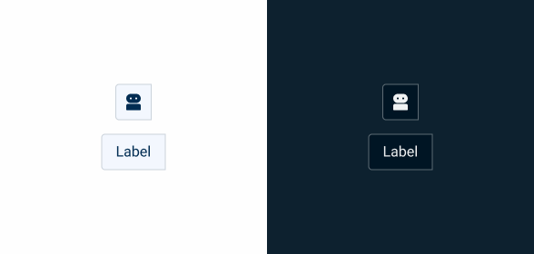
Type
Label

.small {
    label: small, left, 1 line, ;
}

.regular {
    label: regular, left, 1 line, ;
}

.large {
    label: large, left, 1 line, ;
}
Consult label component for more specs.
Icon

.small {
    icon: 20px ;
}

.regular {
    icon: 20px ;
}

.large {
    icon: 24px ;
}
Consult icon component for more specs.
Size
Small
.label {
    padding: var(--spacing-8) var(--spacing-4) var(--spacing-8) var(--spacing-4);
}

.icon {
    padding: var(--spacing-4);
}
Regular
.label {
    padding: var(--spacing-8) var(--spacing-12) var(--spacing-8) var(--spacing-12);
}

.icon {
    padding: var(--spacing-8);
}
Large
.label {
    padding: var(--spacing-8) var(--spacing-16) var(--spacing-8) var(--spacing-16);
}

.icon {
    padding: var(--spacing-8) var(--spacing-8) var(--spacing-8) var(--spacing-8);
}
Position
Left
.left {
    border-radius: var(--x-small-radius) 0px 0px var(--x-small-radius);
}
Center

.center {
    border-radius: none;
}
Right

.right {
    border-radius: 0px var(--x-small-radius)  var(--x-small-radius) 0px;
}
Useful links

Consult our Figma file to access our assets and inspect them in dev mode.

This component is or will be provided by the Polygon framework. See its documentation to learn more.

This element is in line with the guidelines of the CDS (Cegid Design System). Find out more.
Behavior
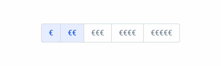
Single Selection
It can only have one option selected.
If the button group is single selection, it only allows one selection to be active. If you click to select another item, the previously selected item changes to enabled.
Multi Selection
It can have more than one option selected.
If the button group is multiple selection, it allows more than one selection to be active. When you click to select another item, the previously selected item remains active.
The button group should not be used when there are too many selections, in which case it should be changed to a selectbox.
Responsive
Trimming
The button group button is the label component.
Is has a max-width of 200px and can only contain one line.
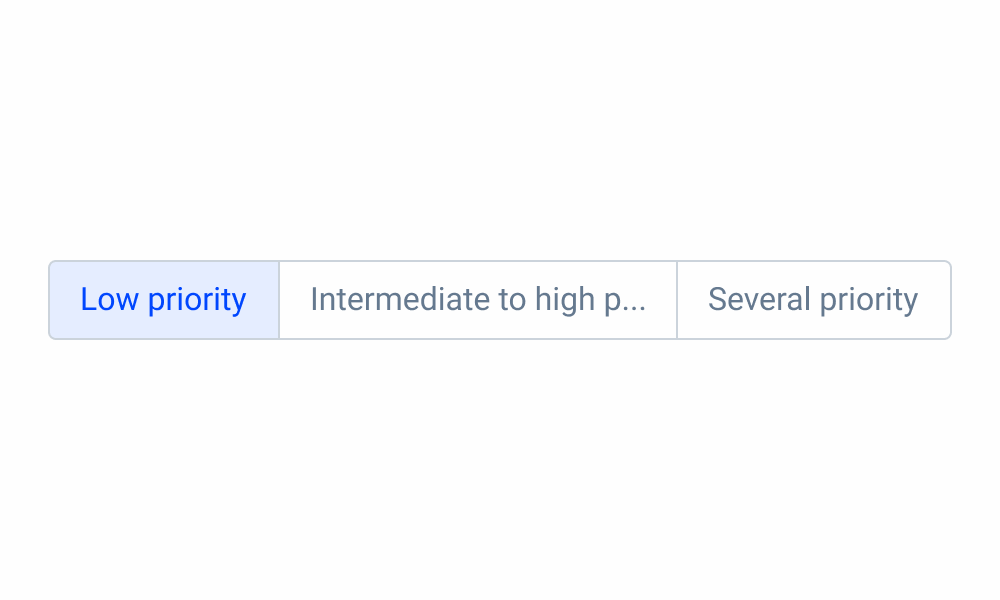
Avoid using complex and multiple words per button.
Use simple and single words to describe the button.
Size
If the button group is wider than the available space, you’ll need to replace it with another component (such as a selectbox).

Use button group for two options.
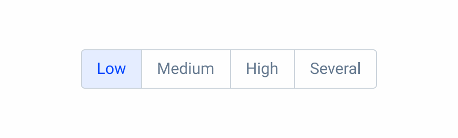
Use button group option for four options.
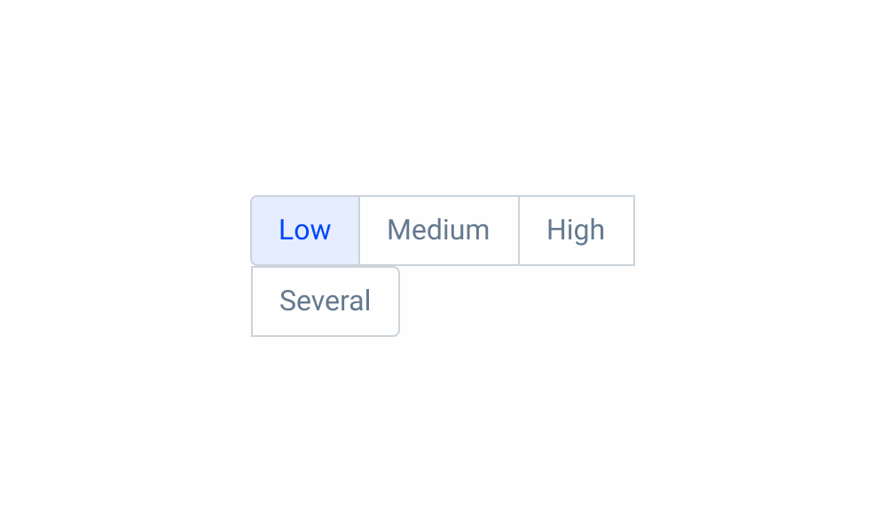
Button group can’t break the line.
Try using icons if the available space is small. Be careful with action recognition.
Don’t mix icons with labels in the same button group.
Voice-Over
For general guidelines on screen reader compatibility, see the following blog post on best practices: Designing the Invisible: How to Make Your Interfaces Work Without a Screen.
Make the purpose of the group clear before users reach the first button. They should understand why a set of buttons exists before encountering the individual actions within it.
Ensure that buttons are read in a logical and consistent order throughout the product. If the order that appears is View | Edit | Delete, this order should be maintained throughout the product as it reduces cognitive load.
Read unrelated actions in the same group, as this may confuse users.
Reading Order
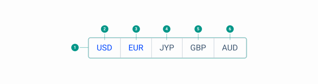
| Reading Order | Element | Screen Reader Reading |
| 1 | Button Group | Choose currency, button group. Use Tab to move between options and press Enter to select. |
| 2 | US Dollar | US Dollar, button, active. |
| 3 | Euro | Euro, button, active. |
| 4 | Japanese Yen | Japanese Yen, button, inactive. |
| 5 | Great British Pound | Great British Pound, button, inactive. |
| 6 | Australian Dollar | Australian Dollar, button, inactive. |
Case Studies

Handling Background Tasks

Read Mode: Making Content Feel Effortless and Understandable
