
Breadcrumbs
Breadcrumbs are a form of secondary navigation that display a series of links, showing users their current location within a website or application and allowing them to easily navigate back to previous or higher-level pages in the hierarchy.

- Overview
- Specs
- Guidelines
Component
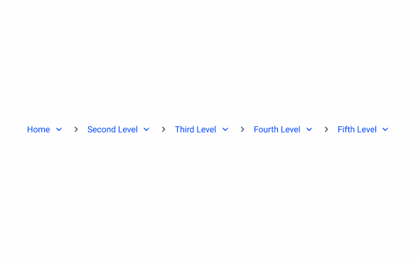
Breadcrumbs are a type of secondary navigation that provide a visual trail of links to help users understand their current location within a website or application. They show the path taken to arrive at the current page and allow users to easily navigate back to previous or higher-level pages in the navigation hierarchy. This feature enhances usability by clarifying the structure of the site and reducing the number of steps needed to return to previously visited pages.

- 1: Parent page: Directs users to the parent-level page;
- 2: Separator: Clearly distinguishes between each page;
- 3: Drop-down: Contains different child pages;
- 4: First link in the hierarchy: First child page in the hierarchy.
Used for:
Deep navigation hierarchies:
Breadcrumbs help users understand the structure and easily navigate back to higher-level categories.
Multi-Step processes:
Breadcrumbs allow users to see the steps they have completed and the ones remaining, providing a clear process overview.
Don’t use for:
Shallow navigation hierarchies that are one or two levels deep:
In this case, Breadcrumbs offer no additional value since the structure is straightforward and easy to navigate.
Simple websites or areas:
In this case, Breadcrumbs add unnecessary complexity without providing significant navigational benefits.

Demo
Access the Figma file and inspect the element using Dev Mode.

Related
Page Title
Variations
Spacings

States
Enabled

.enabled {
color: var(--Theme-100);
}
Hover

.hover{
color: var(--Theme-100);
text-decoration-line: underline;
}
Pressed

.pressed{
color: var(--Theme-Theme-Highlight);
text-decoration-line: underline;
}
Visited

.visited{
color: var(--Theme-Theme-80);
}
Read-Only

.read_only{ncolor: var(u002du002dGreys-Grey-8);n}Focus

.focus{
color: var(--Theme-100);
stroke: var(--Theme-100);
}
Overflow Menu
Standard
.standard {
text-color: var(--Grey-8);
pages-gap: 0;
}
Categorized
.standard {
text-color: var(--Grey-8);
category-gap: var(--spacing-12);
}
Useful links

Consult our Figma file to access our assets and inspect them in dev mode.

This component is or will be provided by the Polygon framework. See its documentation to learn more.

This element is in line with the guidelines of the CDS (Cegid Design System). Find out more.
Usage
Use Breadcrumbs to indicate users’ positions in a navigation hierarchy and enable them to revisit previous pages as needed. Breadcrumbs are most effective for deep, multi-level navigation structures rather than shallow ones.
As Breadcrumbs are present to indicates either a user can or not navigate to previous hierarchy. Each item needs to indicate either their clickable or not, without needing to hover on each element, using the enable or read-only states.
Mobile
Breadcrumbs are not typically used in mobile interfaces due to the limited screen space and different navigation patterns on smaller devices. Mobile users primarily rely on simpler, more intuitive navigation methods such as bottom navigation bars, hamburger menus, or swipe gestures to move through an app or website.
Breadcrumbs, which help users understand their location within a hierarchy, are more suitable for desktop environments where larger screens allow for additional navigation aids without cluttering the user interface.
Location
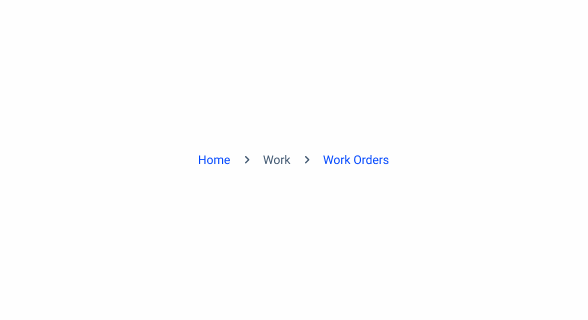
Breadcrumbs are placed in the top left portion of the page. They sit underneath the header and navigation, but above the page title.
Path Behavior
When users click on a parent link, they are directed to that higher-level page. The breadcrumb trail updates to show the new higher-level pages, excluding the current page as a label, and removes any subcategories beyond this point.

Only include the parent paths.

Include the current step on the Breadcrumb.
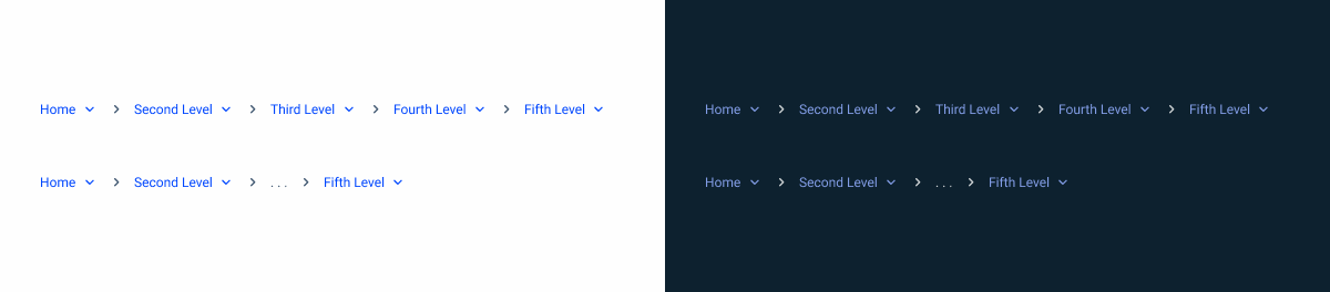
Trimming
When space is limited, opt for the trimmed version to condense Breadcrumbs. Show the first and last two page links, and represent the ones in between as a ” / … / “.

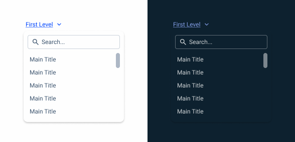
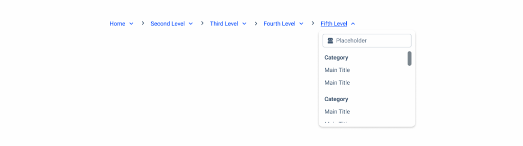
Overflow content
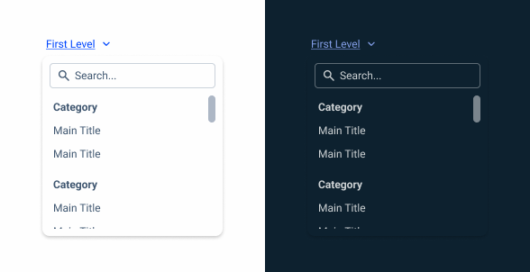
The parent path can have the option of an overflow menu for easier navigation between child pages.

Some products with more complex navigation may require categorization. The overflow menu supports adding titles to child pages. When using this variation, categories must be separated with a 12 px gap.
Read-only State
The read-only state is used to represent a visible but not interactive entry, functioning as a context label, not a link.
Use only when the breadcrumb item does not have a corresponding page.
Case Studies

Handling Background Tasks

Read Mode: Making Content Feel Effortless and Understandable
