
Badge
A Badge is a small visual element used to highlight information, such as notifications or status indicators, increasing the user’s perception of the interface.
- Overview
- Specs
- Guidelines
- Mobile
Component
A Badge is a visual element used in user interfaces to highlight and provide supplementary information about an item, such as a notification count. Usually small and discreet, Badges are often displayed as circular or rounded rectangular shapes with brief text or icons.
They serve to draw attention to important updates, alerts, or categories, enhancing user awareness and engagement with the interface.
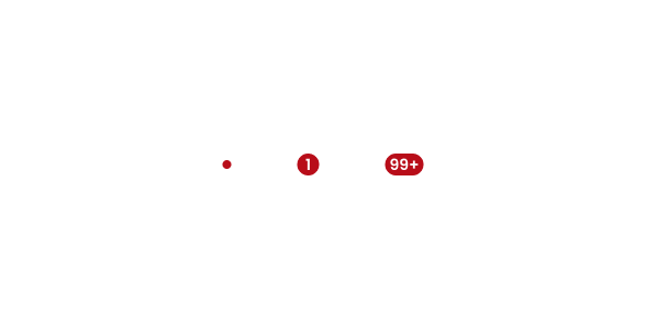
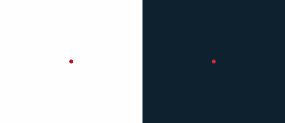
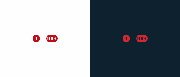
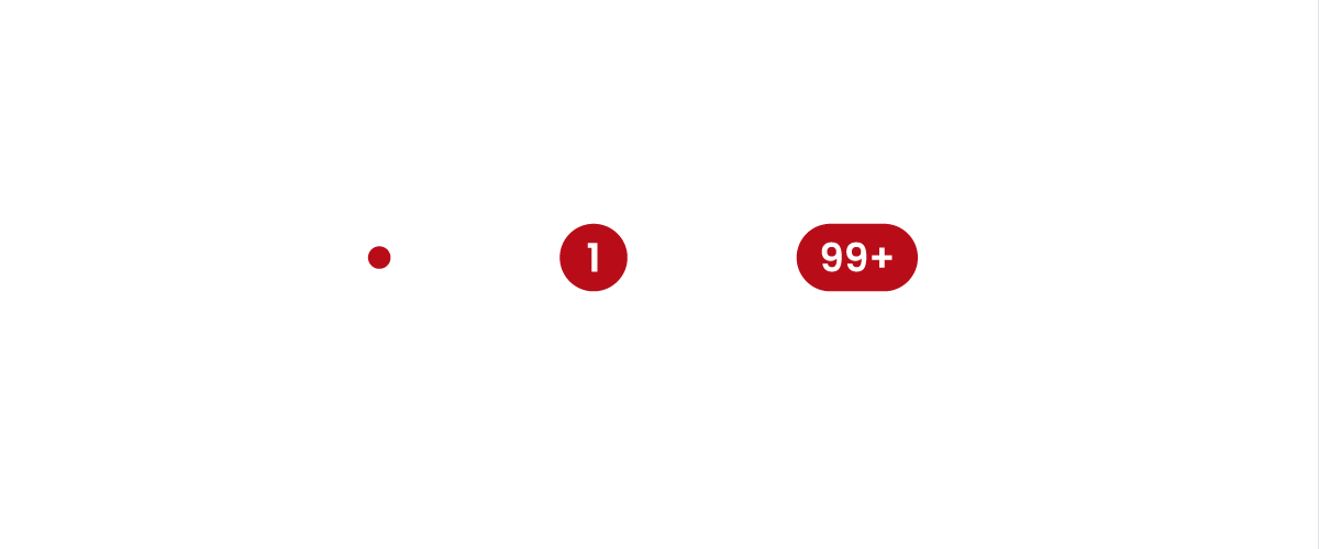
- A: Only Dot Variation
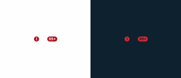
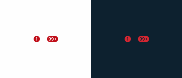
- B: 1 to 99 Variation
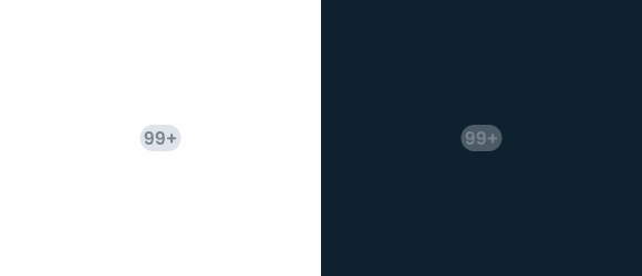
- C: 99+ Variation
- 1: Badge Background
- 2: Badge Number
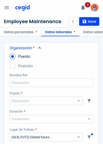
Used for:
Notifications
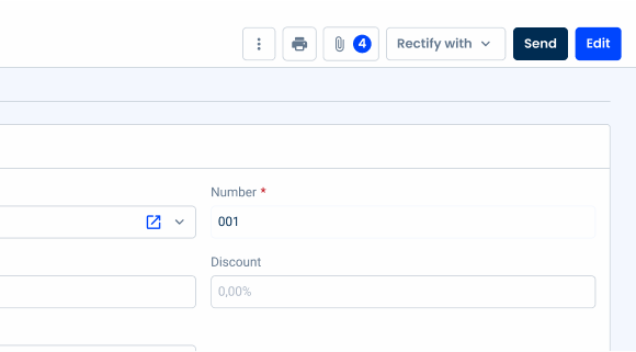
Badges are useful for indicating unread messages, notifications, or updates, providing users with timely information without disrupting their workflow;
Buttons
Badges can also serve as counters, and, in this context, can be used on buttons;
Tabs
As with notifications, Badges are used to indicate notifications or updates in the related tab;
Dynamic content
Badges are ideal for displaying dynamic content, such as real-time updates, user-generated activity, or personalized recommendations, keeping users informed and engaged with brand new content;
Don’t use for:
Irrelevant information
If the Badge does not provide meaningful or relevant information to the user, its presence may unnecessarily confuse or distract users;
Overuse
Using Badges excessively can diminish their effectiveness and lead to user fatigue. Reserve Badges for really important or actionable items to maintain their impact;
Inconsistency
Inconsistent use of Badges or ambiguity in their meaning can confuse users and undermine their utility. Ensure that Badges are used consistently and clearly communicate their purpose;
Redundant information
If the information conveyed by the Badge is already communicated clearly through other means, such as text labels or visual cues, adding a Badge may be redundant and unnecessary;

Demo
Access the Figma file and inspect the element using Dev Mode.
Last Update
- Added new tab for the mobile version of the component.
Related
Variations

Only the Dot
Enabled
.enabled {
  height: 8px;
  width: 8px;
  corner-radius: var(--rounded);
  background-color: var(--error-100);
  color: var(--grey-1);
}
1 to 99
Enabled

.enabled {
  corner-radius: var(--rounded);
  background-color: var(--error-100);
  color: var(--grey-1);
}Disabled
.disabled {
corner-radius: var(--rounded);
background-color: var(--grey-4);
color: var(--grey-6);
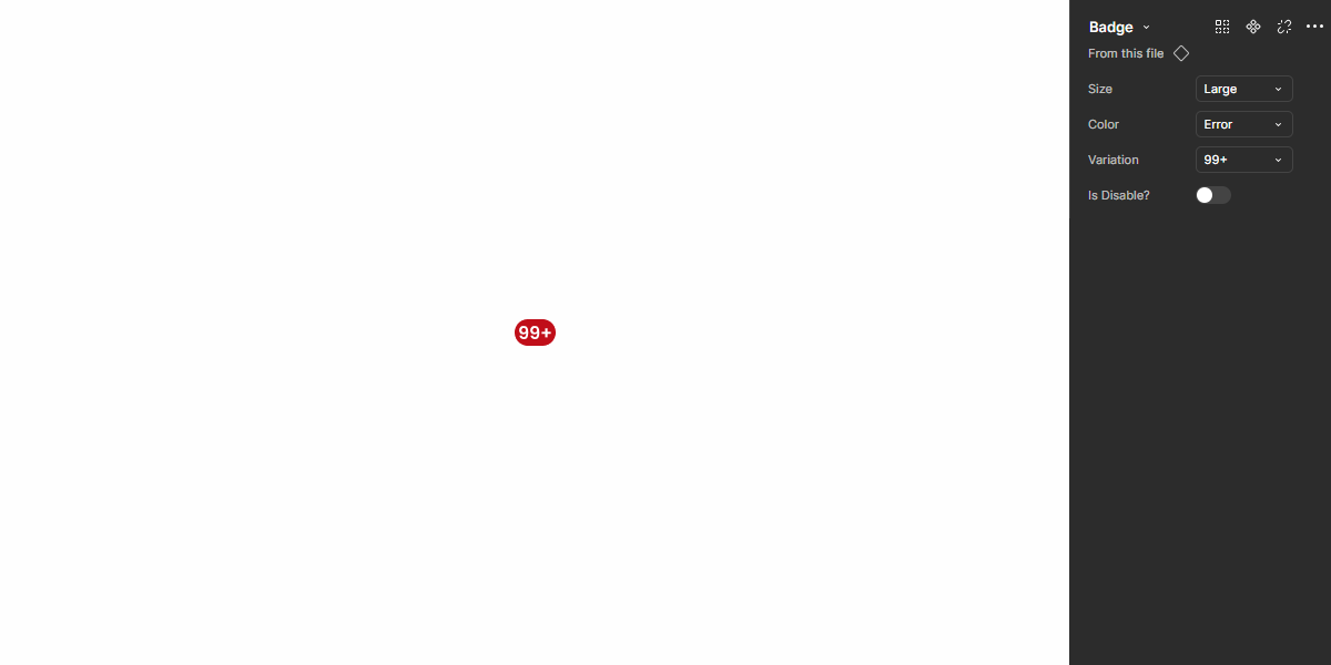
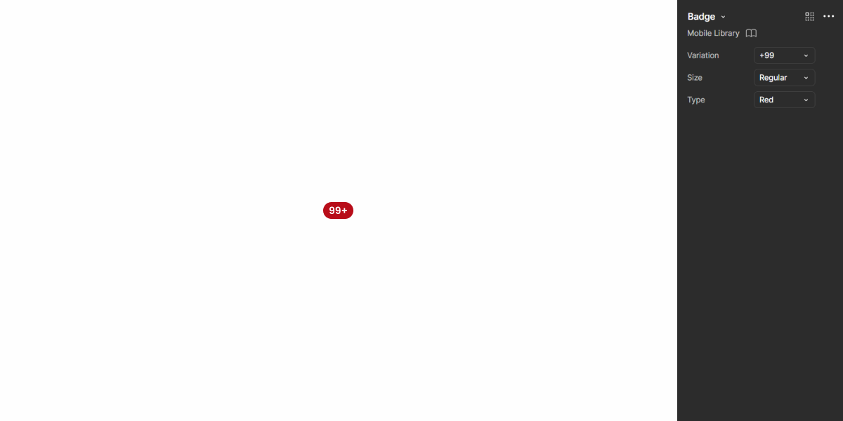
}99+
Enabled

.enabled {
  corner-radius: var(--rounded);
  background-color: var(--error-100);
  color: var(--grey-1);
  text: "99+";
}Disabled
.disabled {
  corner-radius: var(--rounded);
  background-color: var(--grey-4);
  color: var(--grey-6);
  text: "99+";
}Sizes
Small
.small {
  corner-radius: var(--rounded);
  height: 16px;
  min_width: 16px;
  text: var(--button-small);
}Regular
.regular {
  corner-radius: var(--rounded);
  height: 20px;
  min_width: 20px;
  text: var(--button-regular);
}Large
.large {
  corner-radius: var(--rounded);
  height: 24px;
  min_width: 24px;
  text: var(--button-large);
}Colors
Error
.error {
  background-color: var(--error-100);
  color: var(--grey-1);
}Theme
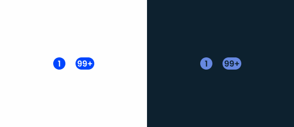
.theme {
  background-color: var(--theme-100);
  color: var(--grey-1);
}Grey-1
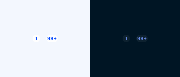
.grey {
  background-color: var(--grey-1);
  color: var(--theme-100); /*Error-100 and Grey-8 colors can also be used */
}Useful links

Consult our Figma file to access our assets and inspect them in dev mode.

This component is or will be provided by the Polygon framework. See its documentation to learn more.

This element is in line with the guidelines of the CDS (Cegid Design System). Find out more.
Variations
Counter
Counters display numerical values and are typically used in interactive elements like buttons. Their main function is to provide real-time feedback on a countable item, such as files, messages, or notifications.
This variation can be found in buttons, menus, or other interactive elements, and updates dynamically as the associated value changes. It is ideal to indicate the number of attached files, unread notifications, or pending approvals.

Badge
Badges act as visual indicators of applied states, particularly for filters, selections, or system statuses. Unlike counters, Badges do not represent a numerical change but rather an applied setting or condition.
This variation is used to highlight active states in filters. It helps users understand when a condition has been applied (e.g., when a filter is active) and is usually non-interactive, but visually linked to an actionable element.
The Badge must follow the same state as the component it is applied to.
Apply a number greater than 99 in the 1 to 99 variation.
Related
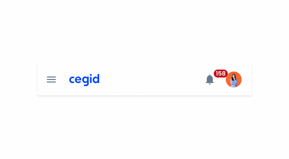
Usage of notification types within a product
What Changes?
The mobile version of the badge has undergone slight changes in size and spacing, making it more suitable for small screens.
Its variations are the same and the use cases are similar to those described in the other sections of this article.

Demo
Access the Figma file and inspect the element using Dev Mode.
Case Studies

Handling Background Tasks

Read Mode: Making Content Feel Effortless and Understandable
