
- Overview
- Specs
- Guidelines
- Mobile
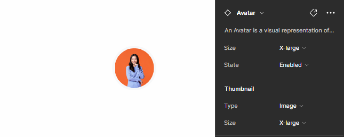
Component
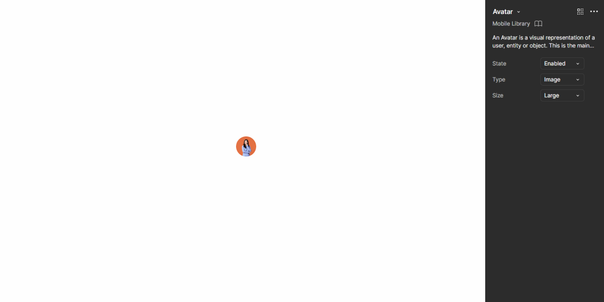
An Avatar is a graphical representation or icon that symbolizes a user, character, or entity in a digital interface. Avatars play a crucial role in enhancing the user experience, adding a humanizing element to otherwise abstract interactions.
They allow users to personalize their profiles, express their identity, and establish a sense of ownership and presence within online communities, social networks, and collaborative platforms.
A: Avatar Variation
B: More Variation
C: Group Variation
1: Avatar Stroke
2: Avatar Representation
3: Dropdown
Used for:
Top Bar
In order for the user to have access to personal data or settings, an Avatar is used as a trigger;
Data Grid
In Data Grids with values associated to different persons, it is possible to use the avatar variation cell;
List Item
When there is a Dropdown where the goal is to select a person, the list item component is a dedicated variation with an avatar;
Usermenu
When the Avatar is triggered in a topbar, the usermenu appears with the user’s personal data, his avatar and settings;
Don’t use for:
Impersonal transactions
For transactional or utilitarian interfaces where personalization is not a priority and users primarily engage in functional tasks, Avatars may be unnecessary and add unnecessary visual noise;
Anonymous interactions
In contexts where user anonymity is preferred or required, such as anonymous forums or confidential surveys, using Avatars could compromise user privacy and anonymity;
Limited user engagement
In interfaces with minimal user interaction or where users primarily consume content passively, without interacting with other users, using Avatars may not add significant value and could be considered superfluous;
Limited screen space
In interfaces with extremely limited screen space, such as mobile apps with small screens or narrow layouts, using Avatars may consume valuable space that could be better used for essential content or functionality.

Demo
Access the Figma file and inspect the element using Dev Mode.
Last Update
- Added new tab for the mobile version of the component.
Related
Variations
Avatar – User Icon
Enabled

.enabled {n stroke-color: var(u002du002dgrey-2);n background-color: var(u002du002dgrey-4);n icon-color: var(u002du002dgrey-9);n}Hover

.hover {n stroke-color: var(u002du002dgrey-2);n background-color: var(u002du002dgrey-4);n icon-color: var(u002du002dgrey-9);n shadow-avatar: var(u002du002dcomponents-primary);n tooltip-background: var(u002du002dgrey-9);n tooltip-text: var(u002du002dgrey-1);n}Focus

.focus {n stroke-color: var(u002du002dgrey-9);n background-color: var(u002du002dgrey-4);n icon-color: var(u002du002dgrey-9);n}Pressed

.pressed {n stroke-color: var(u002du002dgrey-2);n background-color: var(u002du002dgrey-4);n icon-color: var(u002du002dgrey-9);n shadow-avatar: var(u002du002dcomponents-primary);n}More
Enabled

.enabled {n stroke-color: var(u002du002dgrey-2);n background-color: var(u002du002dgrey-4);n icon-color: var(u002du002dgrey-9);n}Hover

.hover {n stroke-color: var(u002du002dgrey-2);n background-color: var(u002du002dgrey-4);n icon-color: var(u002du002dgrey-9);n shadow-avatar: var(u002du002dcomponents-primary);n dropdown-background: var(u002du002dgrey-1);n dropdown-stroke: var(u002du002dgrey-5);n dropdown-text: var(u002du002dgrey-8);n}Focus

.focus {n stroke-color: var(u002du002dgrey-9);n background-color: var(u002du002dgrey-4);n icon-color: var(u002du002dgrey-9);n}Pressed

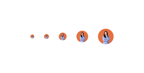
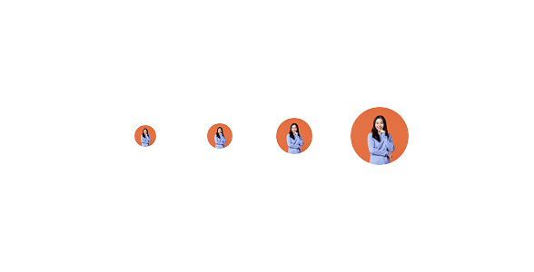
.pressed {n stroke-color: var(u002du002dgrey-2);n background-color: var(u002du002dgrey-4);n icon-color: var(u002du002dgrey-9);n shadow-avatar: var(u002du002dcomponents-primary);n}Size
Small

.small {n width: 16px;n height: 16px;n icon: 12px;n}Regular

.regular {
  width: 24px;
  height: 24px;
  icon: 16px;
}
Medium

.medium {
  width: 32px;
  height: 32px;
  icon: 20px;
}
Large

.large {
  width: 48px;
  height: 48px;
  icon: 24px;
}
X-Large

.x-large {
  width: 64px;
  height: 64px;
  icon: 40px;
}
Useful links

Consult our Figma file to access our assets and inspect them in dev mode.

This component is or will be provided by the Polygon framework. See its documentation to learn more.

This element is in line with the guidelines of the CDS (Cegid Design System). Find out more.
Behavior
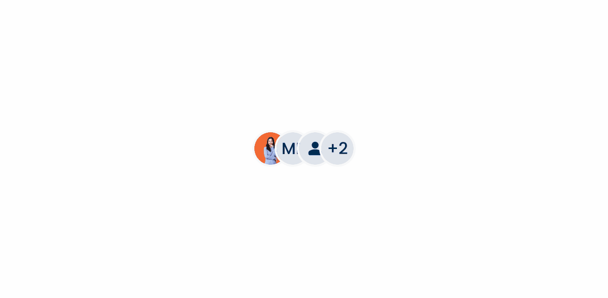
Group
You can specify a maximum number of Avatars per grouping as required. The name of each hidden avatar is shown on the hover of the numeric avatar via a tooltip. Clicking on the numeric avatar opens the list of hidden avatars via a modal.
Empty State
By default, in the different products, when a user does not define a custom avatar, the behavior of the “empty state” in an avatar is to define the initials of the first and last names defined by the user.
As this configuration occurs when the user is setting up their account, the flow is linear and easy, being more personal than applying a general person icon.

Avatars should be based on a circular shape.

Do not use more than two letters for the label.

Do not use lower case to represent the label.
Case Studies

Handling Background Tasks

Read Mode: Making Content Feel Effortless and Understandable

A Visual Recap of 2025: how we enhanced chatbot communication
What Changes?
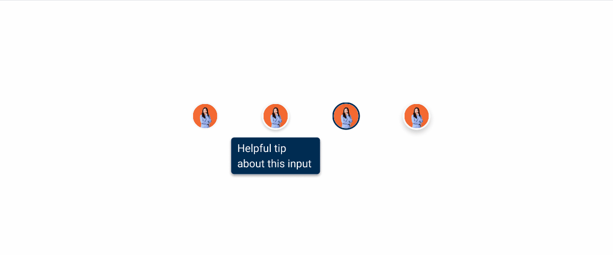
Since it was designed for smaller screens, the mobile version of the Avatar has fewer size variations, each of which is adjusted to perfectly match other mobile components.

Like most of the other mobile components, it also has fewer states, since the Hover and Focus states aren’t usable on touch screens. Additionally, the Pressed state has received some changes that aim to improve usability and consistency throughout the Mobile Library.
Demo
Access the Figma file and inspect the element using Dev Mode.
Case Studies
Handling Background Tasks
Read Mode: Making Content Feel Effortless and Understandable