

Overview
Compose Design 1.5 is here! This update has a strong emphasis on usability improvements to our components, as well as making their guidelines clearer. Here’s some of its highlights:
- Addition of highly requested variations to several components;
- Overhauled and improved guidelines for Skeletons;
- Accessibility and usability improvements across the entire Design System.
As always, we’re eager to know your thoughts. Let us know if your have any feedback!
Bettered Foundations
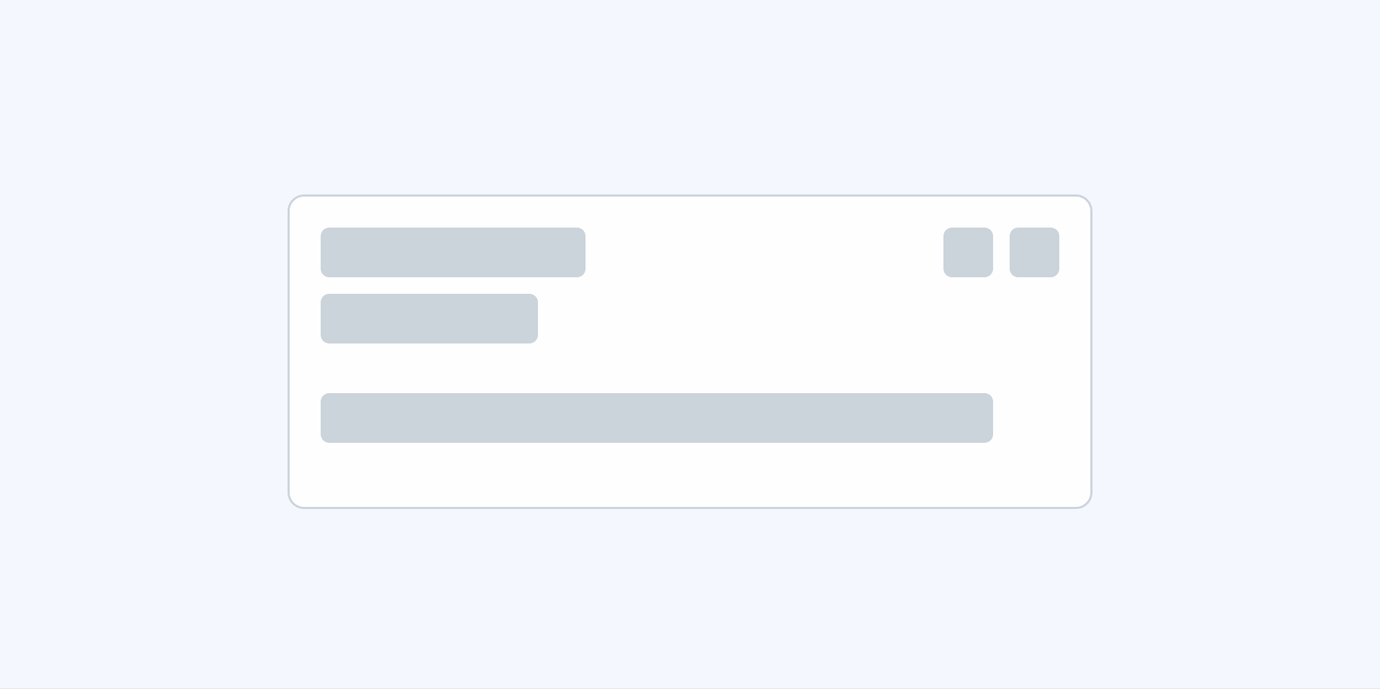
Improvements to Skeletons
Through your feedback, we realized that the previous Skeleton templates we had available were a bit restrictive, so we designed new ones.
The guidelines in the article have also been rewritten and should now be helpful for developers wishing to create their own Skeletons.
We have also taken this opportunity to give Skeleton’s a new look.
Continuous Improvements in Accessibility
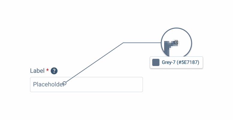
Placeholder Text Update
We consider placeholder text an important part of UX and wanted to make sure no user would miss it.
For this reason, all components were revised, not only to make placeholder text consistent across the design system, but also to be compliant with WCAG guidelines.
Component Updates

Flyout Changes
Flyout size variations have been revised and updated. They are now more flexible and can contain larger forms.
Furthermore, the article on Flyouts has been updated with a new section on button hierarchy, which follows the same principles as the Action Bar.

New Variations
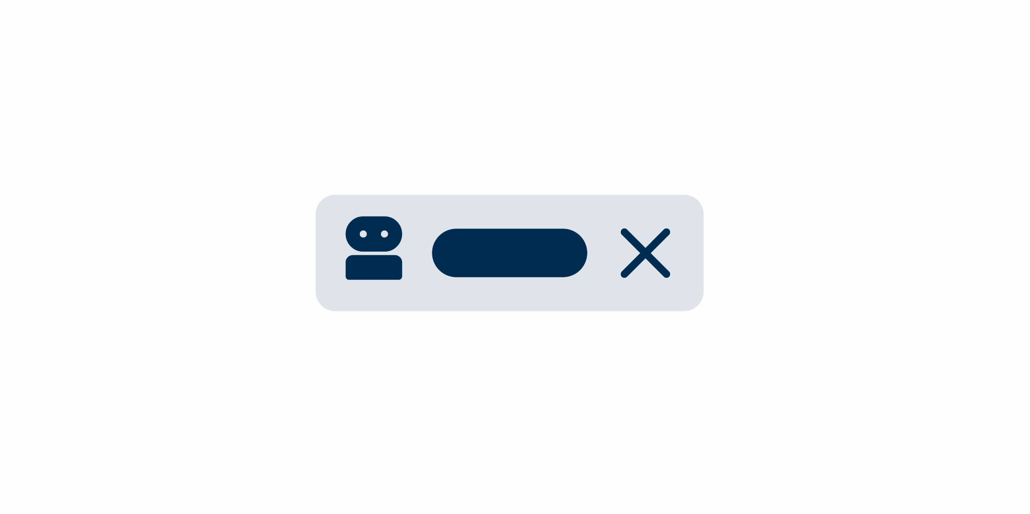
The Inline Message component has been given the “Closable” variation, allowing developers to chose whether or not they should be dismissible.
Dialogs now support the addition of Checkboxes, making them less one-dimensional components.
Improved UX
Component Width Review
Several components have had their maximum width adjusted. Our goal was to make sure they would never look awkward or crop labels prematurely, regardless of screen size.
Table of Changes
| Category | Sub-Category | Article | Notes |
|---|---|---|---|
| Development | All | All | Changed placeholder text color in all components and patterns to grey-7 for better accessibility. |
| Development | All | All | Several components had their Hover state updated so all design system elements follow one unified style. |
| Development | Components | Inline Message | Added new variation, making the “Close” button optional. |
| Development | Components | Select Box | Updated article’s Dos and Don’ts, which now include guidance on handling Chip width for Multi Select Select Boxes. |
| Development | Components | Text Field | Updated all component variations to include Adornments |
| Development | Foundations | Skeletons | Updated Skeleton’s visuals. Added new page templates. Improved article guidelines. |
| Content | General Rules | General Rules | Updated several components’ max width to better align with product needs. |
| Content | Patterns | Dialog | Added new variation, allowing Dialogs to contain Checkboxes. |
| Content | Patterns | Side Bar Page Title | Fixed alignment issues the Page Title and Side Bar experienced under certain conditions. |
| Development | Patterns | Action Bar | Added guideline on how to handle button placement in small screens. |
| Development | Patterns | Flyout | Size variations were reviewed and updated. Button hierarchy was updated to follow the same principles as the Action Bar. A section was added to the article with guidelines for this behavior. |
Got any Suggestions? We’d love to hear them!
Need support or have a bug or feature request for Compose Design? Our team is here to help and actively reviews all new issues you send our way.