

Overview
Compose Design v1.2 introduces key updates to enhance clarity, consistency, and usability across the system, ensuring a more structured and intuitive experience for users. This release focuses on refining patterns, improving component guidelines, and standardizing interactions to create a more seamless workflow.
Here’s what you can look forward to in this release:
✨ Glossary Terms have been further enhanced, as more than 100 HR-related terms have been added to the glossary, ensuring clear communication and alignment throughout the system.
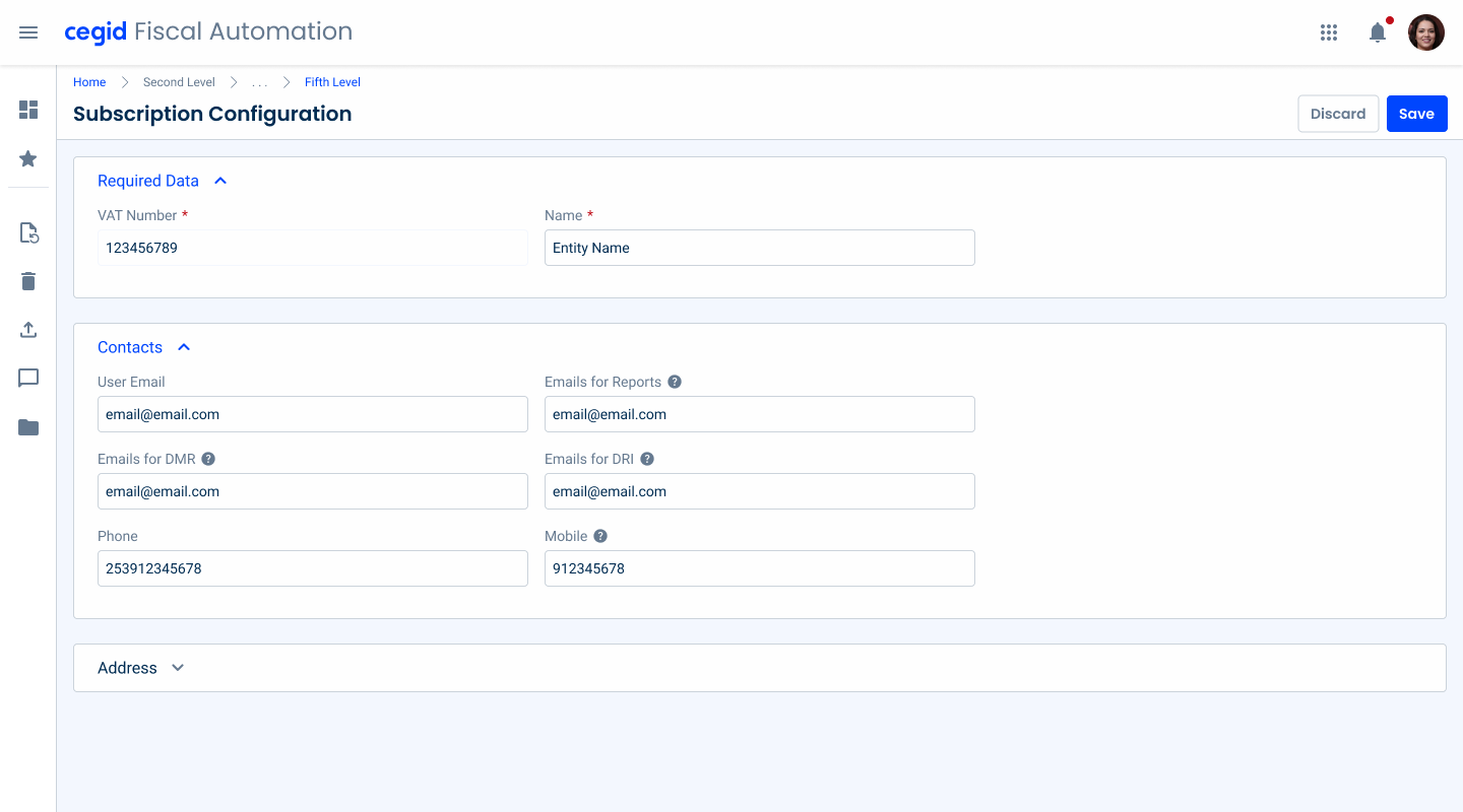
✨ The Page Title now includes a second line for additional context, along with updates to the Action Bar and Overflow Menu for improved usability;
✨ Empty States have been extended to several components to enhance coherence and provide clearer usage recommendations;
✨ Datagrid Actions have received new specifications for fixed and hover interactions, along with defined default cell widths for better readability.
Our goal is to deliver a faster and more stable package to enhance the experience of developers using our library. We can’t wait to see what you create with Compose Design!
Glossary Expanded

Terms
A structured approach to more than 100 HR-related terms has been introduced. These term definitions ensure clearer communication, reduce ambiguity, and provide a standardized reference across the system.
Improved Pattern Experiences
Page Title
It has been enhanced with a second line for additional information and, also, the Action Bar and Overflow Menu have been updated to improve usability and adaptability.

Empty States
It has been enhanced with new comprehensive guidelines on several components, ensuring a more consistent experience.

Datagrid
It now includes guidelines for fixed and hover actions, along with default cell widths for better readability and consistency.
Forms
Forms now support multiple display options, allowing for flexible layouts with different column configurations to enhance readability and usability.
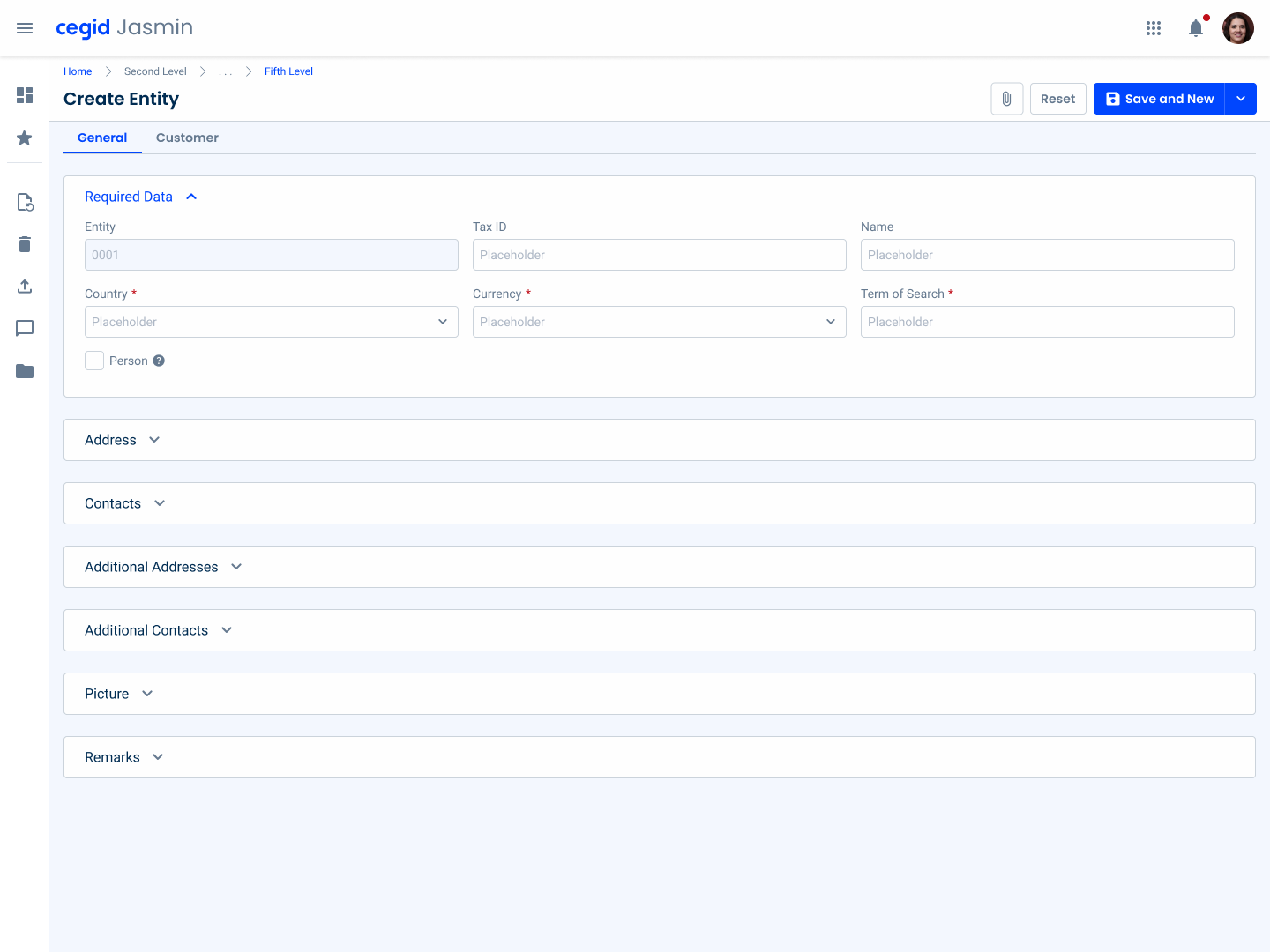
Table of Changes
| Category | Sub-Category | Article | Notes |
|---|---|---|---|
| Blog | N.A | Datagrids Demystified: A Deep Dive into Functionalities | Article creation |
| Blog | N.A | Key principles for designing shortcuts | Added information from study made and updated images |
| Content | Glossary | Terms | 116 HR-related terms added to the terms glossary |
| Development | Components | Breadcrumbs | Updated article layout and guidelines |
| Development | Foundations | Color | Added colorful chart colors |
| Development | Patterns | Counter | Article creation |
| Development | Patterns | Data Grid | – Updated guidelines for fixed vs hover actions and added a table for default width of cells. – Added guidelines for empty state |
| Development | Patterns | Side Bar | Added list of resources in different languages and guidelines for Homepage naming |
| Development | Foundations | Icons | Updated icon list |
| Development | Foundations | Accent Icons | Updated accent icon list |
| Development | Components | Select Box | Added guidelines for adornments and empty state |
| Development | Components | Text Field | Updated link variation |
| Development | Components | Date Pickers | Added guidelines for mobile usage |
| Development | Components | Checkbox | Updated sizes |
| Development | Components | Radio Button | Updated sizes |
| Development | Templates | Forms | Article creation |
| Development | Patterns | Empty State | Added guidelines and new size |
| Development | Patterns | Thumbnail | Added guidelines for empty state |
| Development | Patterns | File Uploader | Added guidelines for empty state |
| Development | Patterns | Image Uploader | Added guidelines for empty state |
| Development | Patterns | Search | Added guidelines for empty state |
| Development | Components | Overflow Menu | Added guidelines for dividers and sub-menus |
| Development | Patterns | Page Title | Added second line and guidelines |
| Development | Patterns | Action Bar | Added loading and error states and guidelines |
Got any Suggestions? We’d love to hear them!
Need support or have a bug or feature request for Compose Design? Our team is here to help and actively reviews all new issues you send our way.