Introduction
Each component has it purpose and it’s not any different for our notifications components. Currently in our Design System we can find 5 different components for notifications proposes, these are:
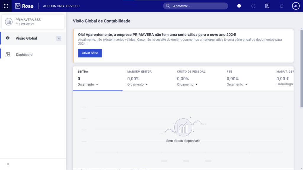
- Banner: These occupy in all cases the full width of the view and are located at the top of the screen, usually used for displaying important messages or notifications;
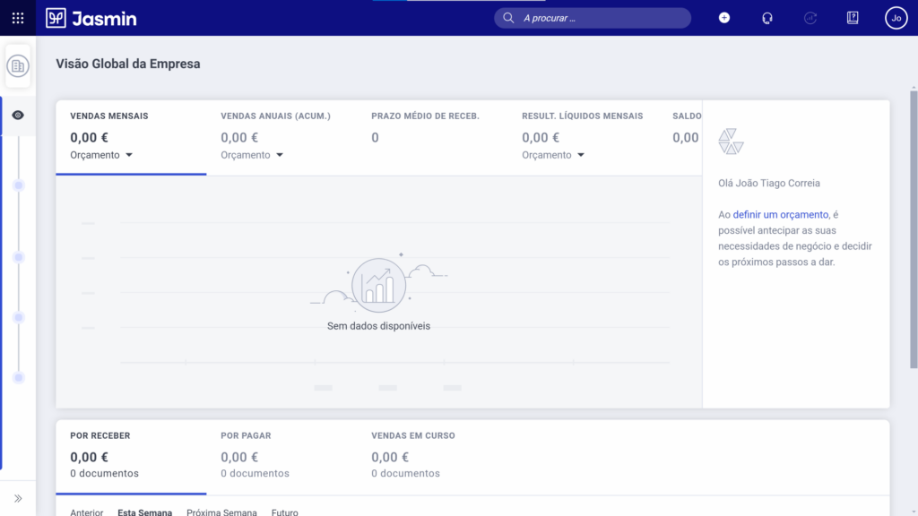
- Contextual Messages: These are always located by the side of a widget, in order to transmit information within a key moment. These are then always associated to messages with the “insight” state;
- Inline Messages: Divided in 2 categories, one for “primary” uses, which contain information that are related for all the content of the form, having an increased visual highlight. In the other hand, the “secondary” variation are field related, which means that they can be introduced inside an accordion per example;
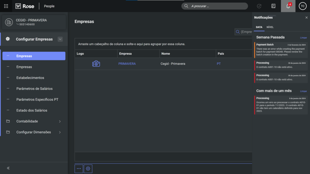
- Notification Panel: This panel is a notifications center that presents messages generated by the system for the users;
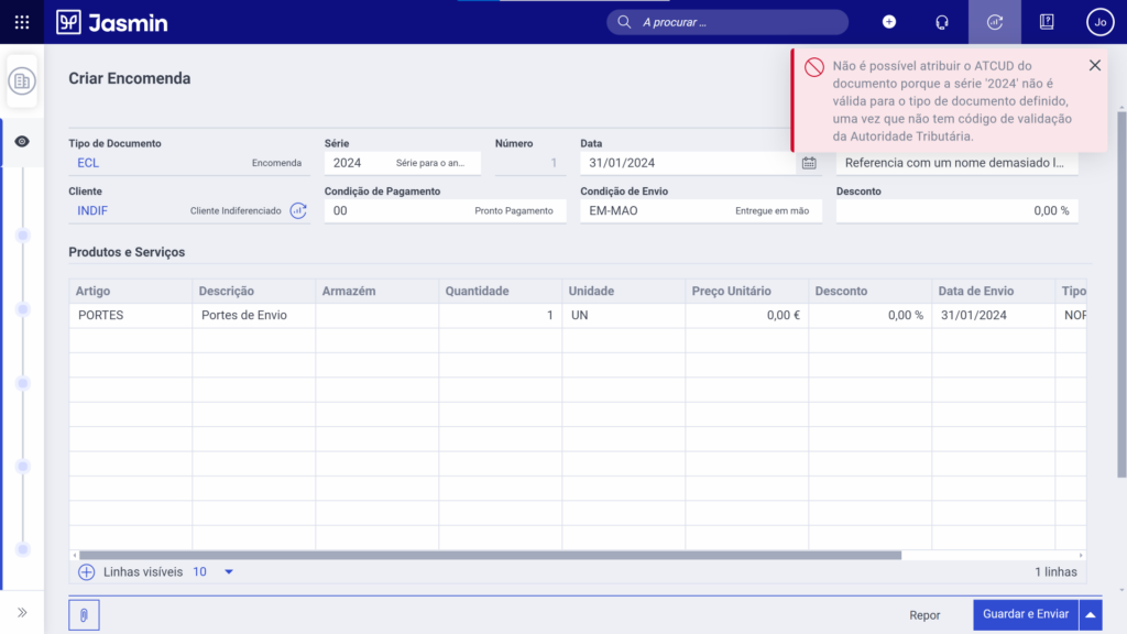
- Toast: Toasts are messages that communicate short and temporary messages towards the user, providing feedback about an executed action.
Let’s take a closer look at them… 👀
Banner
As referred before, banners occupy all the width of the view and located at the top of the screen to have an increased visualization, these are often used for displaying important messages or notifications to the user.
The banner can be within the four types of colors states, which are:
- Informative;
- Success;
- Warning;
- Error.
Furthermore, at this component it can be added from one to two actions to the banner, it can be either links within the text or a button bellow the text. The style of the button shouldn’t be changed.
Finally, these can be stacked as up to two instances. But they need to be represented by two different states.

Contextual Messages
Contextual Messages are used to transmit important information at a key moment, when the users are looking at their dashboards per example. That’s why their always associated with the “Insight” state. This component can neither be moved or be dispensed by the user.
The contextual message are always displayed at the right of the dashboards, sharing the same height with these.
On the other hand, they can have multiple messages or insights, being accessible by the pagination at the bottom right corner of the component. It can be added a button as well, being located just bellow the text.

Inline Messages
The inline messages have a goal, which is to inform the user about a communication or notification message that is key information in the area that they appear.
They can be represented at the top of the page, inside the form, or inside an accordion, which contains informations about a specific field, grid or list.
Furthermore, inline messages can have additional editable elements, which are:
- Icon inside the component;
- Button which the styles cannot be changed, but can be either positioned on the right or bellow the text;
- State Color that represents the type of notification (Informative, Success, Warning and Error).
This component is designed to have a greater visual identification compared to the other notifications components, as the information presented can let the user know that something isn’t right to proceed with the insertion of content in the form.

Notification Panel
This component, as the name says, is a panel where are located the notifications created when using our products. The messages that are presented are the ones that are generated by the system to the users, that can be accessed by clicking the notifications icon, represented by a bell inside the header.
We can as well sort the notifications, either by date, which presents the notifications by the more recent, or by criticality, which will sort the notifications to show in first place the most critical ones. The order of these should be:
- Error: Represents an error message, that have occurred when an operation fails or don’t have the expected result;
- Warning: Represents an alert message, that can be detailed as a deadline to enter certain informations;
- Info: Represents an informative message, this notification is only shown when additional information could be used, or to inform something inside the product to the user;
- Success: Represents a success message, whenever we accomplish a task or the operation reach the expected result a success notification will be delivered.
Each notification, represented by a card are composed by the following elements:
- Title: Short title and related to the notification content;
- Hour: Indicates the hour at what time the notification has been delivered;
- State color: Related color to the state of the notification;
- Content: Description that explains what originated the notification;
- “Discard” button: When hovering the card, a button will be shown to discard the notification in question.
Furthermore, within the “Date” tab, the notifications are divided by group of dates, such as: today, yesterday, last week and older than a month, this division helps the user to have an easier recognition and to clear the notifications in a faster way.

Toast
As referred in the introduction, toasts are messages that communicate short and temporary messages towards the user, providing feedback about an executed action.
These are located in the top right corner of the screen and they disappear automatically after 5 seconds while being possible to dismiss them before. Toasts alike the other notifications components can have the four different state colors (Informative, Success, Warning and Error).
Toasts have two variations which are:
- Closable: Represented by the color of state, an icon and the title of the toast;
- Primary: Has the same elements of the “closable” variation with an additional text and button bellow the toast title. In addition, the text shouldn’t exceed two lines of content.
As a general use, toasts are more commonly used to show positive or informative messages, as the error and warning types are more common within the notifications cards inside the notification panel.
Moreover, various toasts can be displayed at the same time, being organized vertically and chronologically, as the most recent should be displayed in first place. It must taken in count that the toasts are above all the other elements, but these mustn’t hide any mandatory information.

Conclusion
As we seen, each component within the Notifications family as it own propose and use within our products and applications, every one maintaining one goal:
Keep the user informed and with the minimum of doubts 🕵️


