
Dashboards were not designed to be a rainbow or an epic , but rather the perfect balance between readability, usability and design.
Dashboards are a familiar concept in technology. Dynamically presented data and insights, with a pleasant visualization and ideally good usability.
Well-designed and correctly applied, dashboards act as system flags which alert the user to the state of the business and help them analyze the company’s health and make decisions accordingly..
But even these flags COVID-19 has made viral. Every day we were visually immersed in dashboards with all the national and global pandemic statistics. Some of them are true, others just cause panic.
There were several situations in which the media, social networks and personalities published dashboards that lacked information, analysis data that lacked context and, of course, errors in margins and numbers.
In such a difficult situation, the pandemic has also spread an information virus on dashboards, damaging readings and manipulating public opinion, because the truth is that numbers don’t lie.
Nevertheless, we cannot judge a part by the whole, i.e. there have been incorrect and misused dashboards to disseminate important and sensitive information, but there is no denying the importance of applying these elements to transmit data and raise individual and collective awareness of the pandemic situation we were immersed in.
In technological organizations, the virus has not entered this element because there is a set of rules implemented to ensure the immunity of data and insights.
Let’s treat these rules as the flags of the dashboards.
Flag 1: The meaning
For UXers, the dashboard is an important element of the product because it represents in real time a specific set of summarized data, giving an overview of the company.
We use it precisely because it is simple, dynamic and, especially, because it provides organized information that is important for business management.
There are three key points in the dashboard:
- Single point: all the information should be centralized on the dashboard and there should be no attached links that cause the user to leave the interface. Besides losing the overall context, all links to the other data in this element are lost and it hinders the analysis of the variables;
- Dimensional: the aim is not to completely occupy the space of the interface, but it should be designed so that there is a pleasant breadth between information, graphics and text;
- Informative: bringing together the best of three worlds – numbers, graphics and colors. It’s not supposed to be a rainbow or an epic, but the perfect balance between readability, usability and visuals.
It is important that these three characteristics are the pillars of any dashboard so that it conveys security and quality of analysis, decodes complex information and leads to thoughtful decision-making.
Flag 2: The reason
Again, what is important for the user to read/see on the dashboard? Believe me, this is not stubbornness on our part, but the user must always be the ultimate goal.
At Cegid, the aim is clearly to present business data and KPIs that are relevant to the successful management of organizations, which is why all the dashboards are based on this logic. However, in other types of dashboard, the mission may be to present the calendar, upcoming events, tasks, etc..
Regardless of the content, the aim is always to satisfy users’ needs.
Flag 3: The rules
The rules for creating a dashboard immediately spring to mind when we think of a good dashboard: reliable, organized and attractive data. But let’s break them down.
One of the most important flags on the dashboard is the flag that determines the hierarchy of information. If you notice, in our casual readings, we all read diagonally or in F (the first two lines and then we jump from sentence to sentence), but despite this visual disregard, the information has to be planned in order to be accessible and focused.
The inverted triangle is already common sense in these matters, where the main content is the first to be presented, followed by the details and related information.

In the dashboard, in some cases, we won’t have the third level, but it’s important to present the most important insights and then the trends and details.
However, it’s not enough to simply present business data. Besides the fact that we can’t assume that everyone interprets it in the same way, we have to help the user analyze it through insights. Insights and data have different meanings and are understood differently by each user, who doesn’t just want to read them, but visualize them with quality.
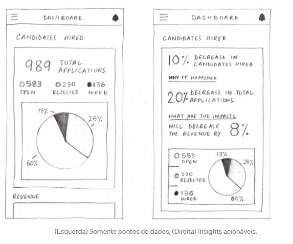
The demographic and market context are preponderant psychological characteristics in the creation of this element, since it wasn’t conceived to show all the information and with great anticipation. We don’t want the analysis to be paralyzed, i.e. a deep, multidimensional analysis of this data.
DWe must be selective when disclosing data, using it as a front door. If the user wants to know more, we’ll give them that information, but through the back door. The front door only serves to present the main data and insights focused on a particular goal.
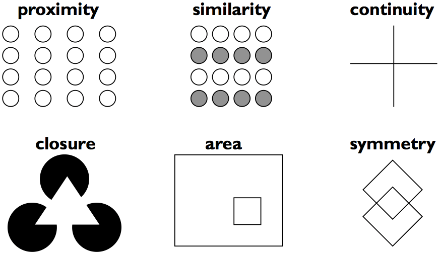
Still on the subject of human psychology, the Gestalt School of Psychology has found six principles to make it easier to interpret information:
- Proximity:our brains can group several elements that are close together;
- Similarity: when there are similar characteristics (size, typography, color, etc.), we will link them even when they are not grouped together;
- Continuity: if the objects are aligned, we interpret them as if they were continuous;
- Closure: when an element/image is incomplete, we create what is missing;
- Area: if they are surrounded by a border/line, we tend to consider them to be in the same group;
- Connection: objects connected by a line will be considered as a group.
Flag 4: The representation
Alongside the questions mentioned above, it is also important how we represent the data. Sometimes this choice can be difficult for some organizations due to the complexity of the data and the large amount of information.
The poor choice of data presentation results in misinterpretations, terrible user experiences and a loss of user confidence.
In the case of Cegid solutions, comparative and distributed standards are used..
In other words, on the one hand, we use dashboards where there is a comparison between data from different months, times of the year and we relate them with budgets, turnover and commercial data. Here, line graphs are the most suitable because they perfectly help with the comparative analysis of the figures.
On the other hand, we use dashboards that present information specific to a certain subject (sales, purchases, etc.) or according to the user’s active profile. In a simplistic way, we present parts of a whole.
Here’s what to avoid:
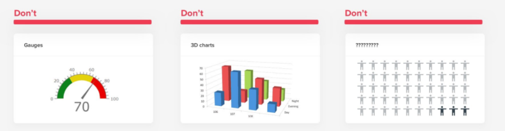
Dashboards that embody real objects, which use 3D and serve no clear information purpose should be avoided. Not only are they difficult to develop and maintain, but they also have little or no readability.
COVID-19: the example
One of the good examples of dashboards related to the pandemic was produced by the Público newspaper, which used several types of dashboards to convey different messages.
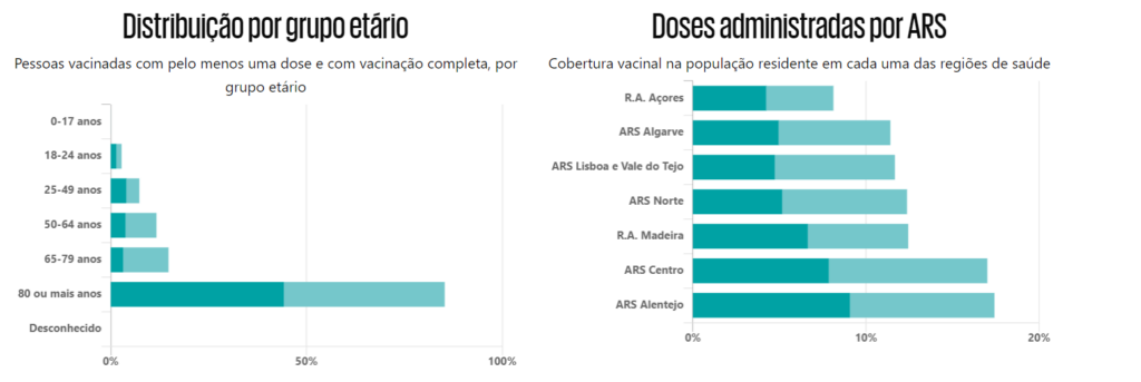
In addition to the several types of dashboards, it used other types of elements to frame data and dates and thus make it easier to interpret the information.
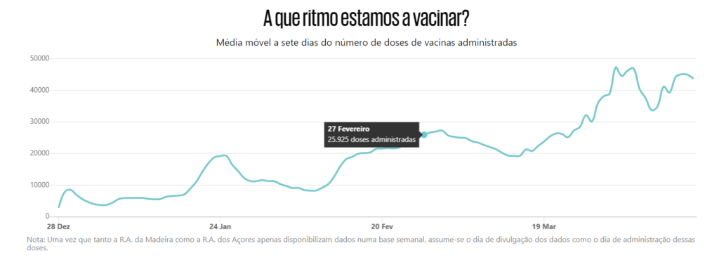
It should also be noted that, in terms of the hierarchy of information, it has divided the content according to its subject (vaccination). Besides this division already being known to the public, the newspaper took advantage of it to condense textual and visual elements and, therefore, the reader only sees the desired information.

In summary,
The aim of a dashboard doesn’t just involve visually displaying data and information, but also the message it conveys. In essence, looking at a dashboard is like reading a billboard. We notice the design, the font, the image, the colors and we read the message (without there being any guarantee that we’ve interpreted it the way they wanted us to).
This process of analysis is just like analyzing a dashboard. Every detail is decisive for the user’s interpretation, and it is very important to make sure that it is usable and simple.
Due to the complexity and large amount of data, it is sometimes difficult to make this element as simple as possible. And perhaps this is the great challenge of a dashboard – to design it in such a way that it shows a comparison of all the data from a given period, without making it complex, difficult or visually unbearable.
To make sure the dashboard meets the user’s actual needs, we must strike a perfect balance between all these features. And do it with style.


