
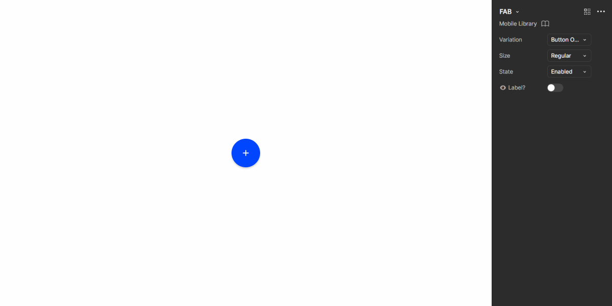
FAB
The FAB is a specialized button that triggers an important action and stays in place as users scroll.

Overview
When designing an interface, the need to implement primary and important actions often arises. Products meant for desktop can easily do this by placing a button in a high-visibility location. However, this isn’t always possible on mobile. The Floating Action Button (FAB) is one the most popular and easiest ways to overcome this issue.
This component is designed to have a fixed location in the screen, which means it is always accessible. As such, it is ideal for interfaces that require extensive scrolling, ensuring that the primary action is always available to users.

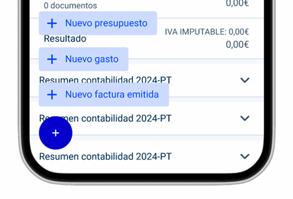
1: Floating Action Button
2: FAB actions
3: FAB icon
Demo
Access the Figma file and inspect the element using Dev Mode.
Guidelines
Usage
The FAB should be used when one wants to highlight an important and primary action. A label can be added to further emphasize its relevance or to make it clearer when an icon isn’t enough.
In some cases, there may be several related actions that are deserve to be highlighted. The FAB has a variation that a group of actions to be displayed using Chips when they are tapped.

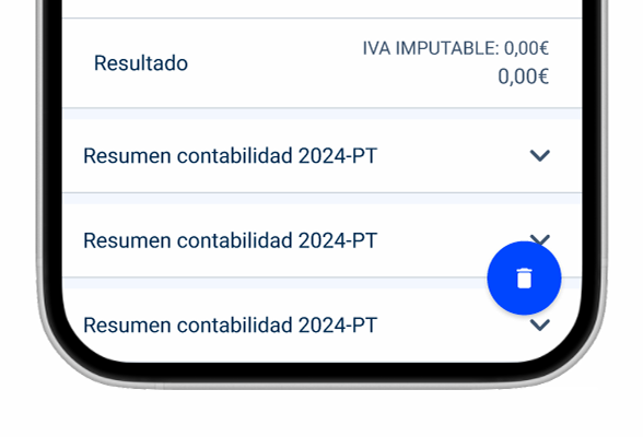
Use FAB for destructive actions.
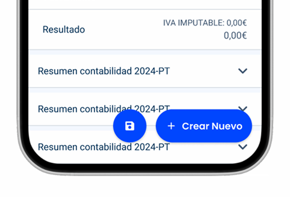
Group multiple FAB together. There should only be one per screen.
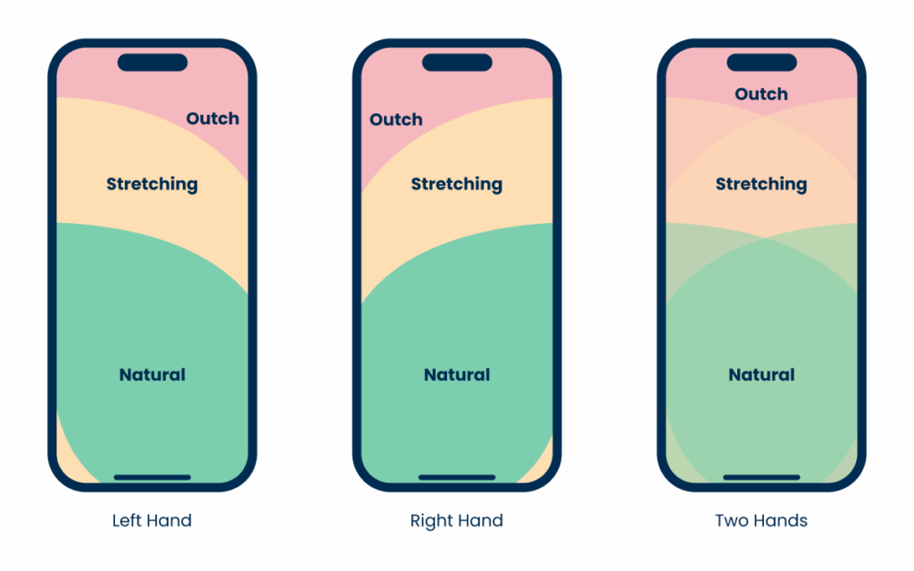
Position
As with most other buttons, the FAB should be placed where it is most convenient for users. In most cases, this will be the bottom right corner of the screen – as it’s easily accessibly for most people – and doesn’t hinder navigation.
Adjust the layout of the component if you move it to a different position.

Place the FAB over important elements, such as those used for navigation.
Related