
Sizings
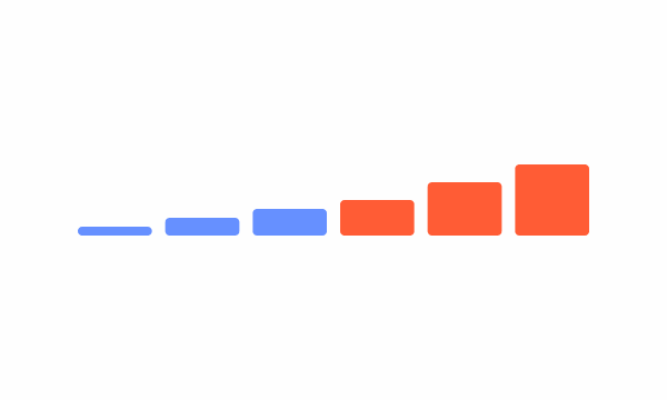
Compose uses standard sizes and spacing created from increments of 8 to create consistency between UI elements, with metric values ranging from 64, 48, 32, 24, 16 and eight for easy reference.

- Overview
- Specs
- Guidelines
Usage
Our sizing scales have been chosen to keep the proportions between icons, images, avatar, banners and graphic elements the same when using them.

Benefits
Integrating sizings as variables in design systems ensures consistency, scalability and maintainability, resulting in cohesive user interfaces. By standardizing measurements like margins, paddings, and element sizes, it promotes uniformity throughout the interface and simplifies adjustments. This approach also facilitates scalability and responsiveness, and streamlines maintenance.
Core sizes
We provide six predetermined sizes in our scale that range that vary from 64, 48, 32, 24, 16, eight for easy reference.
Note that not every asset should be displayed in every size. In this example, we don’t show an an X-small avatar, as its readability would be compromised.

Last Update
- Updated Do’s and Don’t under the Guidelines section.
Related
Sizing tokens
Use these radius tokens to change the corner radius on elements.
| Token | Value |
|---|---|
| X-Small | 8 pixels |
| Small | 16 pixels |
| Regular | 24 pixels |
| Medium | 32 pixels |
| Large | 48 pixels |
| X-Large | 64 pixels |
Useful links

Consult our Figma file to access our assets and inspect them in dev mode.

This component is or will be provided by the Polygon framework. See its documentation to learn more.

This element is in line with the guidelines of the CDS (Cegid Design System). Find out more.
Polygon FW
The following variables are from Polygon Framework. They are optimised to work from pixels to rem values and ordered from the larger to smaller sizes.
| Polygon Variable | PX to REM |
|---|---|
| $size-1 | 1 |
| $size-2 | 2 |
| $size-4 | 4 |
| $size-8 | 8 |
| $size-12 | 12 |
| $size-16 | 16 |
| $size-20 | 20 |
| $size-24 | 24 |
| $size-28 | 28 |
| $size-32 | 32 |
| $size-36 | 36 |
| $size-40 | 40 |
| $size-44 | 44 |
| $size-48 | 48 |
| $size-52 | 52 |
| $size-56 | 56 |
| $size-60 | 60 |
Get all Polygon SCSS styles here.
Use sizings other than those provided.
If you need to use values beyond 60 px, make sure they are all multiples of four.

The shape of an element will have a direct impact on the space it occupies. Make sure you adjust its size accordingly.
Case Studies

Creating Context-Aware Notifications for a Better Experience

Read Mode: Making Content Feel Effortless and Understandable
