
Password
A password component in UX facilitates the creation and input of secure passwords.

- Overview
- Specs
- Guidelines
Component
A Password component, in UX, serves as a crucial interface element designed to streamline the process of creating and inputting secure passwords.
One of the key features of a Password component is the inclusion of Password strength indicators, which offer visual cues to users regarding the robustness of their chosen passwords. These indicators typically assess factors such as length, complexity, and the presence of special characters.
Additionally, Password components often incorporate visibility toggles, giving users the option of revealing or hiding their password entries as they type.

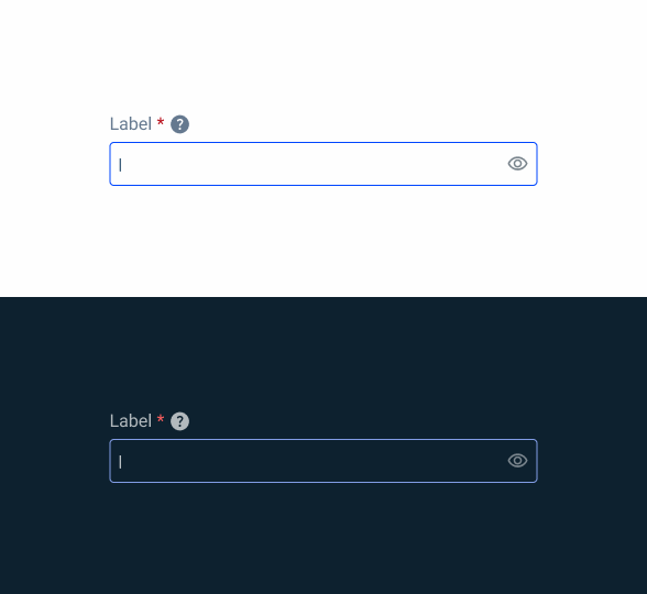
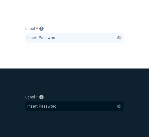
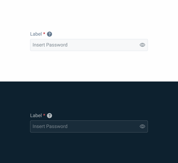
1: Label
2: Placeholder/Input
3: Visibility Toggle
4: Strength Checker
5: Password Requirements

Used for:
Security enhancement
Implementing a Password component ensures that users create strong and secure passwords, reducing the risk of unauthorized access and data breaches;
Usability improvement
By providing features such as Password strength indicators and error feedback, a Password component helps users create passwords that meet security requirements;
User confidence
Offering users a robust Password creation and input mechanism instills confidence in the security measures of the application, enhancing trust and user satisfaction;
Data protection
Strong passwords generated through a Password component contribute to the protection of sensitive user data, safeguarding it against unauthorized access.
Don’t use for:
Alternative authentication methods
If the application offers alternative authentication methods such as biometric authentication or two-factor authentication (2FA);
Common fields
For common fields, such as text-fields, using the Password component may not be the most appropriate;
Resistance to change
Users may resist the introduction of a Password component if they are used to the existing authentication methods or if the implementation disrupts their established workflows.

Demo
Access the Figma file and inspect the element using Dev Mode.

Last Update


- Updated label color;
- Updated password requirement presentation;
Related
Label

Company Configuration
States
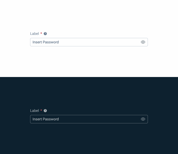
Enabled

.enabled {
label: var(--grey-8);
password-border: var(--grey-5);
password-background: var(--grey-1);
icon: var(--grey-6);
placeholder: var(--grey-7);
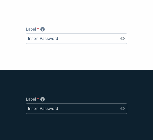
}Hover

.hover {
  label: var(--grey-8);
  password-border: var(--grey-6);
  password-background: var(--grey-1);
  icon: var(--grey-6);
  placeholder: var(--grey-7);
}
Focus
.focus {
  label: var(--grey-8);
  password-border: var(--theme-100);
  password-background: var(--grey-1);
  icon: var(--grey-6);
  insert: var(--grey-9);
}
Read-only
.readOnly {
  label: var(--grey-8);
  password-border: var(--grey-1);
  password-background: var(--grey-3);
  icon: var(--grey-6);
  input: var(--grey-8);
}
Disabled
.disabled {
  label: var(--grey-8);
  password-border: var(--grey-4);
  password-background: var(--grey-2);
  icon: var(--grey-6);
  placeholder: var(--grey-6);
}
Error
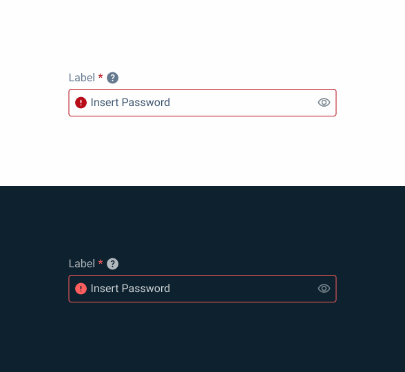
.error {
  label: var(--grey-8);
  password-border: var(--error-100);
  password-background: var(--grey-1);
  icon: var(--grey-6);
  placeholder: var(--grey-7);
}
Size
Small
.small {
  label: var(--label-small);
  input-height: 28px;
  input-border: var(--x-small-radius);
  input-gap: 4px;
  input-padding: var(0, --spacing-8);
  icon: 16px;
  placeholder: var(--label-small);
}
Regular

.regular {
  label: var(--label-regular);
  input-height: 36px;
  input-border: var(--x-small-radius);
  input-gap: 8px;
  input-padding: var(0, --spacing-8);
  icon: 20px;
  placeholder: var(--label-regular);
}
Large
.large {
  label: var(--label-large);
  input-height: 40px;
  input-border: var(--x-small-radius);
  input-gap: 8px;
  input-padding: var(0, --spacing-8);
  icon: 24px;
  placeholder: var(--label-large);
}
Useful links

Consult our Figma file to access our assets and inspect them in dev mode.

This component is or will be provided by the Polygon framework. See its documentation to learn more.

This element is in line with the guidelines of the CDS (Cegid Design System). Find out more.
Behavior
Position
Input-type components must always be placed on grey-1 backgrounds (white) for optimal usability.
Avoid using them on grey-3 backgrounds (grey), as this can compromise the visibility of disabled and read-only states.
If placement on grey-3 backgrounds is necessary, ensure that disabled or read-only states are not utilized in these scenarios.
Avoid placing input-type components on grey-3 backgrounds to maintain optimal visibility and accessibility.
Input-type components should be placed over grey-1 backgrounds for optimal visibility and usability.

Use the component without an icon and/or label.
Show/Hide
In all variations, it is possible to show/hide the Password by clicking on the icon.
By default and for security purposes, the Password is always hidden.

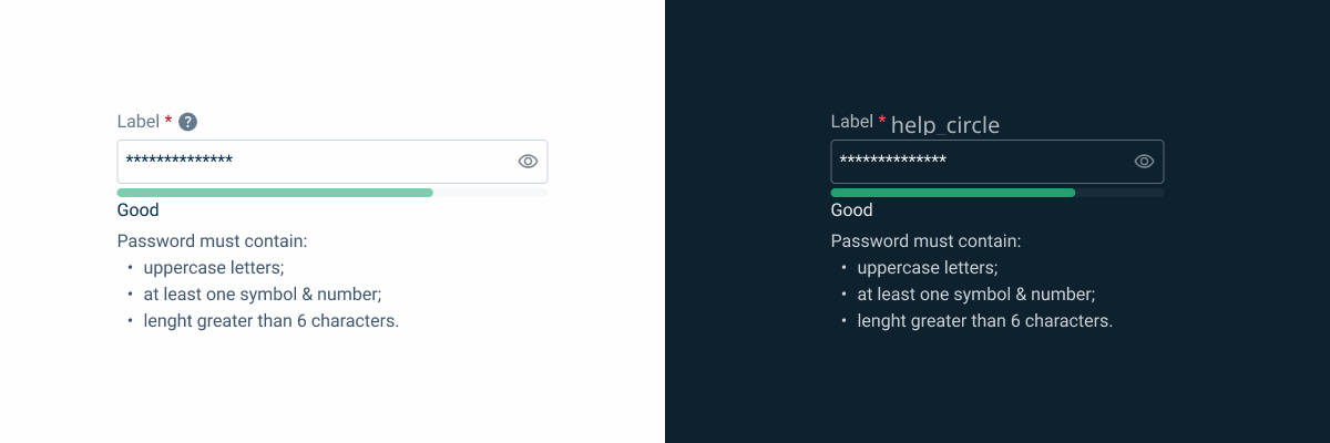
Strength
In the strength variation, as you enter characters, the input validates the security level of the password according to your requirements:
- Weak: one requirement;
- Medium: two requirements;
- Good: all requirements;
- Great: all requirements and one of them is repeated (two numbers, for example).


Information on Password requirements must always be visible in the strength variation.
Case Studies

Handling Background Tasks

Read Mode: Making Content Feel Effortless and Understandable
