
Radio Button
A Radio Button component allows users to select one option from a set of predefined choices, ensuring clear, mutually exclusive selections with immediate feedback.

- Overview
- Specs
- Guidelines
Component
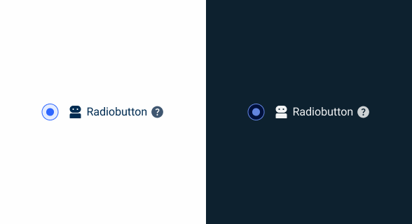
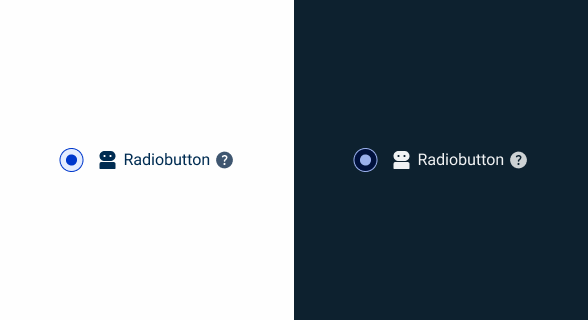
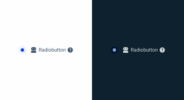
A Radio Button is a UI element used for selecting a single option from a set of mutually exclusive choices. Visually represented by a small circular button that can be filled or unfilled, Radio Buttons offer clear access and immediate feedback to users.
When selected, the button is filled in, providing a visual confirmation of the user’s choice. To ensure accessibility, Radio Buttons should be navigable using keyboard inputs and properly labeled for screen readers, which helps convey the available options and the current selection to visually impaired users.
Keyboard navigation should be supported, allowing users to navigate and toggle Radio Buttons using keys such as Tab and Spacebar.

- Radiobutton
- Add-On
- Label
- Tooltip

Used for:
Single selection from multiple options
Radio Buttons are ideal when users need to select a single option from a list of mutually exclusive choices. This ensures that only one option can be selected at a time.
Visibility of all options
Radio Buttons are appropriate when it’s important for users to see all available options at once. This visibility helps users make informed decisions quickly without having to navigate through drop-down menus.
Immediate selection feedback
Use Radio Buttons when it’s beneficial to provide immediate feedback upon selection. This is useful in scenarios where the selection triggers immediate changes or updates in the UI.
Contextual relevance
When the context requires a single choice that directly impacts the user’s experience or the application’s behavior, Radio Buttons provide a clear and precise way to capture the user’s selection.
Don’t use for:
Multiple selections needed
Radio Buttons are designed for single selections from a group of options. They are not suitable when users need to select multiple options simultaneously. For such cases, checkboxes are more appropriate.
Dynamic and complex selections
In scenarios where the options are numerous, dynamically changing, or hierarchical, Radio Buttons can become unwieldy and clutter the interface. Drop-down menus or other advanced selection controls can better handle complex selections.
Infrequent or optional choices
When the selection is optional or infrequent, a checkbox might be more appropriate. Radio buttons imply that a choice must be made from the options displayed, thus, for optional selections, using a checkbox or a different control can reduce user confusion.

Demo
Access the Figma file and inspect the element using Dev Mode.

Last Update


- Updated typography;
- Updated icon font;
- Updated colors;
Variations
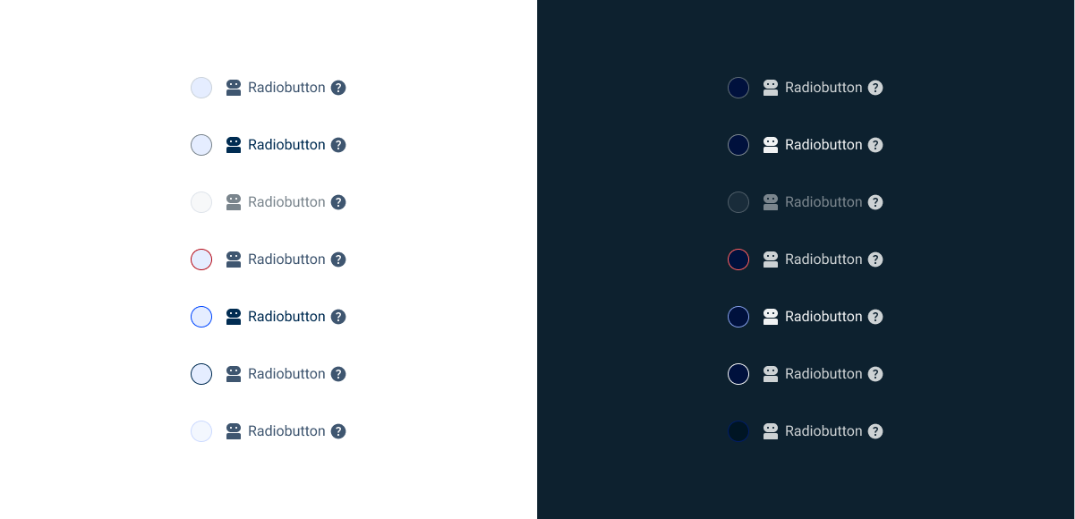
Resting
Enabled

.enabled {
  radio-bg: var(--grey-1);
  radio-stroke: var(--grey-5);
  icon: var(--grey-8);
  label: var(--grey-8);
  tooltip: var(--grey-8);
}
Hover

.hover {
  radio-bg: var(--theme-10);
  radio-stroke: var(--grey-6);
  icon: var(--grey-9);
  label: var(--grey-9);
  tooltip: var(--grey-8);
}
Error

.error {
  radio-bg: var(--grey-1);
  radio-stroke: var(--error-100);
  icon: var(--grey-8);
  label: var(--grey-8);
  tooltip: var(--grey-8);
}
Disabled
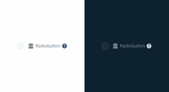
.disabled {
  radio-bg: var(--grey-2);
  radio-stroke: var(--grey-4);
  icon: var(--grey-6);
  label: var(--grey-6);
  tooltip: var(--grey-8);
}
Pressed
.pressed {
radio-bg: var(--theme-10);
radio-stroke: var(--theme-100);
icon: var(--grey-9);
label: var(--grey-9);
tooltip: var(--grey-8);
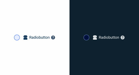
}Focus

.focus {
  radio-bg: var(--grey-1);
  radio-stroke: var(--theme-100);
  icon: var(--grey-8);
  label: var(--grey-8);
  tooltip: var(--grey-8);
}
Read Only
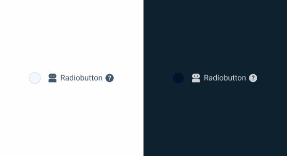
.read_only {
  radio-bg: var(--grey-3);
  radio-stroke: var(--theme-20);
  icon: var(--grey-8);
  label: var(--grey-8);
  tooltip: var(--grey-8);
}
Active
Enabled

.enabled {
  radio-active: var(--theme-100);
  radio-bg: var(--grey-1);
  radio-stroke: var(--theme-100);
  icon: var(--grey-8);
  label: var(--grey-8);
  tooltip: var(--grey-8);
}
Hover
.hover {
  radio-active: var(--theme-80);
  radio-bg: var(--theme-10);
  radio-stroke: var(--theme-80);
  icon: var(--grey-8);
  label: var(--grey-8);
  tooltip: var(--grey-8);
}
Error

.error {
  radio-bg: var(--grey-1);
  radio-stroke: var(--error-100);
  icon: var(--grey-8);
  label: var(--grey-8);
  tooltip: var(--grey-8);
}
Disabled

.disabled {
  radio-active: var(--theme-60);
  radio-bg: var(--grey-1);
  radio-stroke: var(--theme-60);
  icon: var(--grey-6);
  label: var(--grey-6);
  tooltip: var(--grey-8);
}
Pressed
.pressed {
  radio-active: var(--theme-highlight);
  radio-bg: var(--theme-10);
  radio-stroke: var(--theme-highlight);
  icon: var(--grey-9);
  label: var(--grey-9);
  tooltip: var(--grey-8);
}
Focus

.focus {
  radio-active: var(--theme-100);
  radio-bg: var(--grey-1);
  radio-stroke: var(--grey-9);
  icon: var(--grey-8);
  label: var(--grey-8);
  tooltip: var(--grey-8);
}
Read Only
.read_only {
  radio-active: var(--theme-100);
  radio-bg: var(--grey-3);
  radio-stroke: var(--theme-20);
  icon: var(--grey-8);
  label: var(--grey-8);
  tooltip: var(--grey-8);
}
Size
Small

.small {
  radio: 16px, var(--rounded);
  gap: var(--spacing-12);
  gap-content: var(--spacig-4);
  icon: 16px;
  label: var(--label-small);
}
Regular

.regular {
  radio: 20px, var(--rounded);
  gap: var(--spacing-12);
  gap-content: var(--spacig-4);
  icon: 20px;
  label: var(--label-regular);
}
Large

.large {
  radio: 24px, var(--rounded);
  gap: var(--spacing-12);
  gap-content: var(--spacig-4);
  icon: 24px;
  label: var(--label-large);
}
Useful links

Consult our figma file to access our assets and inspect them in dev mode.

This component is or will be provided by the Polygon framework. See its documentation to learn more.

This element is in line with the guidelines of the CDS (Cegid Design System). Find out more.
Behavior
Exclusive Selection
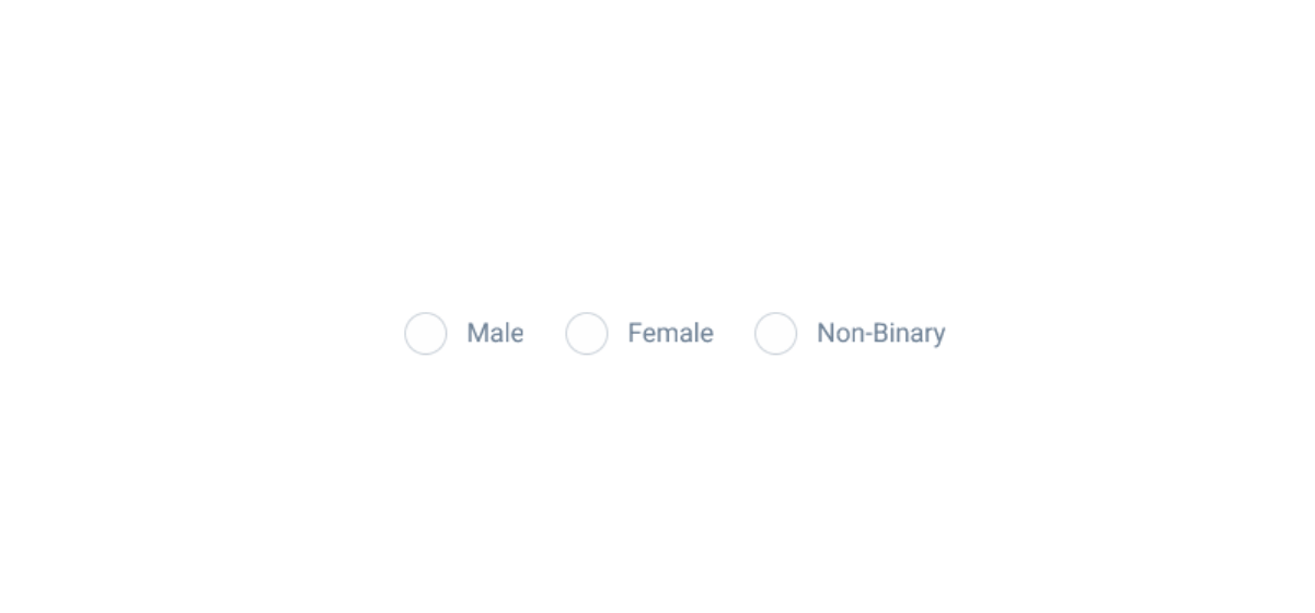
Exclusive selection means that selecting a Radio Button in a group automatically deselects any previously selected option in the same group. This ensures that the user can only select one option at a time, making Radio Buttons ideal for scenarios where a single choice is required. For example, when asking users to select their gender (Male, Female, Other), the use of Radio Buttons ensures that only one option can be chosen.
- Single Choice Enforcement: When a user selects a Radio Button, any other previously selected Radio Button in the same group is automatically deselected. This enforcement prevents multiple selections and ensures clarity in the user’s choice.
- Immediate Feedback: Upon selecting a Radio Button, the interface provides immediate visual feedback by filling in the chosen option. This instant response confirms the user’s action and clearly indicates the selected option.
Radio Buttons must have an associated label, except in situations where there is a clear context.
Don’t use a Radio Button to choose from more than three options. In that case, a select box must be used.
Case Studies

Creating Context-Aware Notifications for a Better Experience

Read Mode: Making Content Feel Effortless and Understandable
