
Checkbox
A checkbox is an essential UI element that allows users to make binary choices.

- Overview
- Specs
- Guidelines
Component
A checkbox is an essential UI element that allows users to make binary choices, typically represented by a small square that can be checked or unchecked. Visual cues such as the check mark and the box itself provide clear affordance, indicating that the element is interactive.
Accessibility is crucial for checkboxes to ensure they can be used by everyone, including people with impairments. Proper labeling is necessary so that screen readers can convey the checkbox’s state and purpose.
Keyboard navigation should be supported, allowing users to navigate and toggle checkboxes using keys such as Tab and Spacebar.

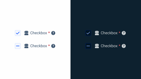
1: Checkbox
2: Add-On
3: Label
4: Required
5: Tooltip

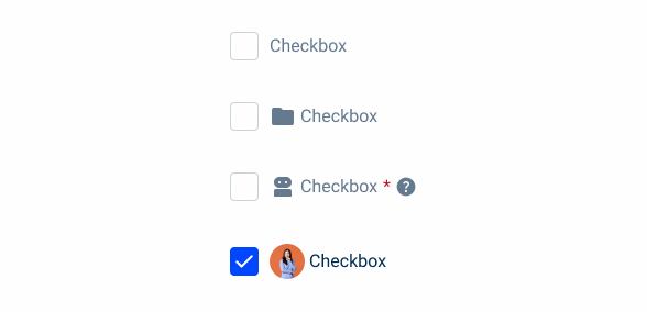
Used for:
Select Box
Within the Multi-select variation, the checkbox is used in those cases.
Drop-down
For the drop-down items, the Checkbox can be one of the variations, and by consequence, the checkbox is the component used.
Consent and agreement
Checkboxes are commonly used to capture user consent or agreement for legal and compliance purposes. This ensures that users actively acknowledge and agree to terms, conditions, or privacy policies.
Data Grid
Checkboxes in a data grid serve as an indicator for bulk actions, since when selected, bulk actions can be used.
Don’t use for:
Single selection
Checkboxes are not suitable for situations where only one option should be selected from a list. In such cases, radio buttons are more appropriate.
Binary choices with immediate action
For binary choices where an immediate action is required upon selection, toggle switches or buttons are more appropriate.
Confirmations and critical actions
Checkboxes are not suitable for actions that require immediate confirmation or have significant consequences. Buttons or dialogs with explicit confirmation messages are better for these scenarios.

Demo
Access the Figma file and inspect the element using Dev Mode.

Last Update


- Updated typography;
- Updated icon font;
- Updated colors;
Related
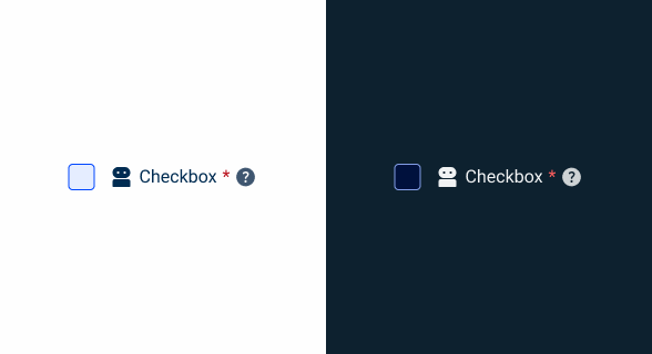
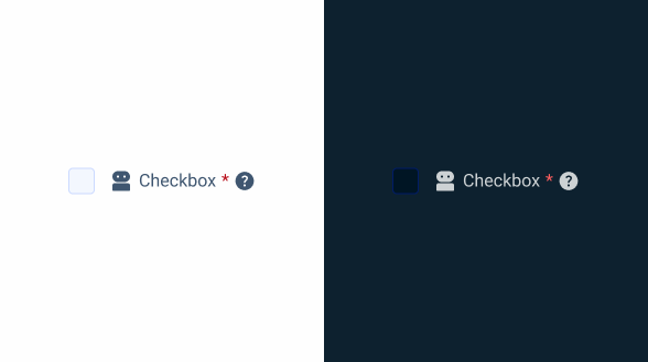
Variations
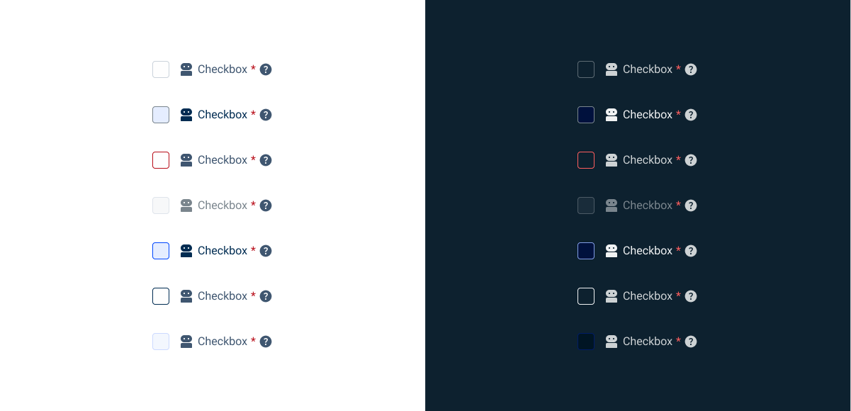
Resting
Enabled

.enabled {
  checkbox-bg: var(--grey-1);
  checkbox-stroke: var(--grey-5);
  icon: var(--grey-8);
  label: var(--grey-8);
  required: var(--error-100);
  tooltip: var(--grey-8);
}
Hover

.hover {
  checkbox-bg: var(--theme-10);
  checkbox-stroke: var(--grey-6);
  icon: var(--grey-9);
  label: var(--grey-9);
  required: var(--error-100);
  tooltip: var(--grey-8);
}
Error

.error {
  checkbox-bg: var(--grey-1);
  checkbox-stroke: var(--error-100);
  icon: var(--grey-8);
  label: var(--grey-8);
  required: var(--error-100);
  tooltip: var(--grey-8);
}
Disabled

.disabled {
  checkbox-bg: var(--grey-3);
  checkbox-stroke: var(--grey-5);
  icon: var(--grey-6);
  label: var(--grey-6);
  required: var(--error-100);
  tooltip: var(--grey-8);
}
Pressed
.pressed {
  checkbox-bg: var(--theme-10);
  checkbox-stroke: var(--theme-100);
  icon: var(--grey-9);
  label: var(--grey-9);
  required: var(--error-100);
  tooltip: var(--grey-8);
}
Focus

.focus {
  checkbox-bg: var(--grey-1);
  checkbox-stroke: var(--theme-100);
  icon: var(--grey-8);
  label: var(--grey-8);
  required: var(--error-100);
  tooltip: var(--grey-8);
}
Read Only
.read_only{
checkbox-bg: var(--grey-3);
checkbox-stroke: var(--theme-20);
icon: var(--grey-8);
label: var(--grey-8);
required: var(--error-100);
tooltip: var(--grey-8);
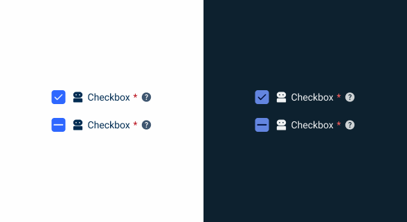
}Active/Indeterminate
Enabled

.enabled {
  checkbox-bg: var(--theme-100);
  icon: var(--grey-8);
  label: var(--grey-8);
  required: var(--error-100);
  tooltip: var(--grey-8);
}
Hover
.hover {
  checkbox-bg: var(--theme-80);
  icon: var(--grey-8);
  label: var(--grey-8);
  required: var(--error-100);
  tooltip: var(--grey-8);
}
Error

.error {
  checkbox-bg: var(--grey-1);
  checkbox-stroke: var(--error-100);
  icon: var(--grey-8);
  label: var(--grey-8);
  required: var(--error-100);
  tooltip: var(--grey-8);
}
Disabled

.disabled {
  checkbox-bg: var(--theme-60);
  icon: var(--grey-6);
  label: var(--grey-6);
  required: var(--error-100);
  tooltip: var(--grey-8);
}
Pressed

.pressed {
  checkbox-bg: var(--theme-highlight);
  icon: var(--grey-9);
  label: var(--grey-9);
  required: var(--error-100);
  tooltip: var(--grey-8);
}
Focus

.focus {
  checkbox-bg: var(--theme-100);
  checkbox-stroke: var(--grey-9);
  icon: var(--grey-8);
  label: var(--grey-8);
  required: var(--error-100);
  tooltip: var(--grey-8);
}
Read Only
.read_only {
  checkbox-bg: var(--grey-3);
  checkbox-stroke: var(--theme-20);
  checkbox-icon: var(--theme-100);
  icon: var(--grey-8);
  label: var(--grey-8);
  required: var(--error-100);
  tooltip: var(--grey-8);
}
Size
Small

.small {
  checkbox: 16px, var(--x-small-radius);
  gap: var(--spacing-8);
  gap-content: var(--spacig-4);
  icon: 16px;
  label: var(--label-small);
}
Regular

.regular {
  checkbox: 20px, var(--x-small-radius);
  gap: var(--spacing-8);
  gap-content: var(--spacig-4);
  icon: 20px;
  label: var(--label-regular);
}
Large

.large {
  checkbox: 24px, var(--x-small-radius);
  gap: var(--spacing-8);
  gap-content: var(--spacig-4);
  icon: 24px;
  label: var(--label-large);
}
Useful links

Consult our figma file to access our assets and inspect them in dev mode.

This component is or will be provided by the Polygon framework. See its documentation to learn more.

This element is in line with the guidelines of the CDS (Cegid Design System). Find out more.
Behavior
Checkbox Group
A checkbox group is a collection of checkboxes organized to allow users to make multiple selections within a specific context. In more complex interfaces, checkbox groups can be nested up to two levels deep and include an indeterminate state to enhance usability and clarity.
The indeterminate state is a visual cue used to indicate that not all child checkboxes within a group are selected, but at least one is. This state helps users to unambiguously understand the partial selection of items.
This hierarchical structure and the indeterminate state provide users with a clear and intuitive way to manage complex selections, ensuring they understand which options are fully, partially, or not selected at all.

Checkboxes must have an associated label, except for situations where there is a clear context.
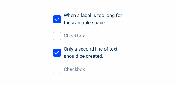
When a label is too long for the available space, only a second line of text should be created.
Case Studies

Handling Background Tasks

Read Mode: Making Content Feel Effortless and Understandable
