
Status Indicator
Status Indicators provide visual cues to convey the status of an element or system, helping users to understand actions or conditions.

- Overview
- Specs
- Guidelines
Component
Status Indicators use colors and symbols to create user-recognizable meanings throughout the product.
These are the existent variations applied:
- Dot: represented by a simple dot;
- Icon: represented with the status background and an icon;
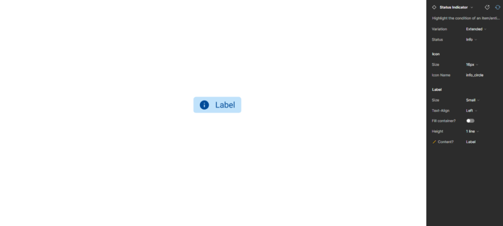
- Extended: represented exactly like the Icon variation, but with an additional text.
These variations can be found in the following colors: Info, Positive, Warning, Negative and Neutral.

A : Dot
B: Icon
C: Extended
1: Icon
2: Label

Used for:
Informative
Represented by the color blue and the information icon. This variation should be used to reflect the following statuses: informative, active, in use and published.
Positive
Represented by the color green and the checkmark icon. They should be used in the following statuses: positive, approved, success and new.
Warning
Represented by the color orange and the warning icon. They should be used in the following statuses: alert, in approval, pending, scheduled, synchronizing, processing and uploading.
Negative
Represented by the color red and the error icon. They should be used in the following statuses: negative, error, rejected, failure and deleted.
Neutral
Represented by the color grey. They should be used in the following statuses: neutral, archived, deleted, paused, draft, not started, complete and finalized.
Don’t use for:
Minimal status variation
If there are minimal or negligible changes in the status of elements, using Status Indicators may clutter the interface without providing significant value.
Ambiguous status
When the status of the elements cannot be clearly defined or is subject to interpretation, using Status Indicators may lead to confusion rather than providing clarity.
Unnecessary redundancy
If the status of elements is already conveyed through other means, such as text labels or contextual cues, adding Status Indicators may create redundancy.
Dynamic content
In interfaces with dynamic or rapidly changing content, using Status Indicators may be ineffective as they may not accurately reflect the current status of the elements in real time.
Overwhelming complexity
In interfaces with a high number of elements or complex interactions, using status indicators for every element may overwhelm users and hinder comprehension.

Demo
Access the Figma file and inspect theelement using Dev Mode.
Last Update


- Updated icons and colors;
- Updated typography;
Variations
Dot

.statusIndicator {
    width: 8px;
    height: 8px;
}
Icon Only

.statusIndicator {
    width: 24px;
    height: 24px;
    padding: var(--spacing-4);
    icon: 16px;
}
Extended

.statusIndicator {
    height: 24px;
    padding: var(--spacing-4, --spacing-8);
    gap: var(--spacing-8);
    icon: 16px;
    label: var(--label-small);
}
Status
Informative

.info {
    dot: var(--info-100);
    background-color: var(--info-20);
    icon: var(--info-100), 'info_circle';
    label: var(--info-100);
}
Consult label component for more specs.
Positive

.positive {
    dot: var(--success-100);
    background-color: var(--success-20);
    icon: var(--success-100), 'check_circle';
    label: var(--success-100);
}
Warning

.warning {
    dot: var(--warning-100);
    background-color: var(--warning-20);
    icon: var(--warning-100), 'error_circle';
    label: var(--warning-100);
}
Error

.error {
    dot: var(--error-100);
    background-color: var(--error-20);
    icon: var(--error-100), 'error_circle';
    label: var(--error-100);
}
Neutral

.neutral {
    dot: var(--grey-7);
    background-color: var(--grey-4);
    icon: var(--grey-7), 'block';
    label: var(--grey-7);
}
Useful links

Consult our Figma file to access our assets and inspect them in dev mode.

This component is or will be provided by the Polygon framework. See its documentation to learn more.

This element is in line with the guidelines of the CDS (Cegid Design System). Find out more.
Behavior
Trimming
When the text is too long, a new line should be created. And if there is no space for a new line, the text should be truncated and displayed on hover.
Only use a Status Indicator/icon in small spaces, e.g. in tables.
If needed, add a second line of text.
Case Studies
Why Web Accessibility Matters – And How to Start
Writing for Everyone: Every Word Counts in Accessibility