
Skeletons
Skeletons serve as visual placeholders that guide user expectations while content is loading, enhancing the perceived responsiveness of the interface.

- Overview
- Specs
- Guidelines
Overview
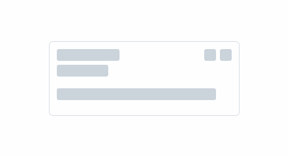
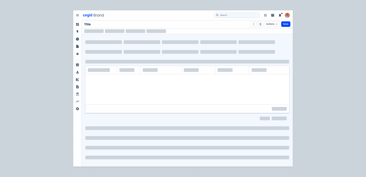
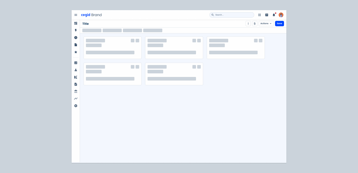
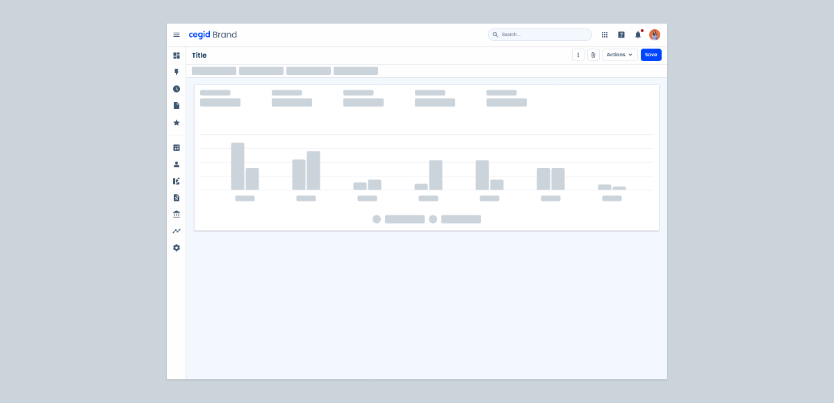
Skeletons are placeholder elements that represent the layout of content that is still loading. Instead of displaying a spinner or leaving an empty space, skeletons show a simplified visual structure that mimics the layout of the page.
The purpose of skeletons is to improve perceived performance by giving users a sense of progress and maintaining visual stability while asynchronous data is being fetched. They help set expectations and avoid layout changes, especially in interfaces where the structure is known and consistent.

Last Update
- Added to Design System;
Animation
- The animation should be triggered when the content loading time exceeds 1 second.
- Shimmer effect should run from left to right to achieve a vertical effect.
- The duration per loop should be between 1.2 and 1.5 seconds.
Colors
.animation-start-color: --grey-5 100%;
.animation-end-color: --grey-5 0%;Useful links

Consult our Figma file to access our assets and inspect them in dev mode.

This component is or will be provided by the Polygon framework. See its documentation to learn more.

This element is in line with the guidelines of the CDS (Cegid Design System). Find out more.
Skeleton guidelines
- Apply skeletons only when the final layout is known and the content takes noticeable time to load;
- Use for loading times longer than 1 second;
- Use in high-visibility areas where the user’s focus is expected;
- Apply only to the content area within the component frame, not to the entire page or layout;
- Show skeletons in the order content will appear to simulate a natural load;
- Avoid creating skeletons that exactly match the detailed layout of the content.

Composition
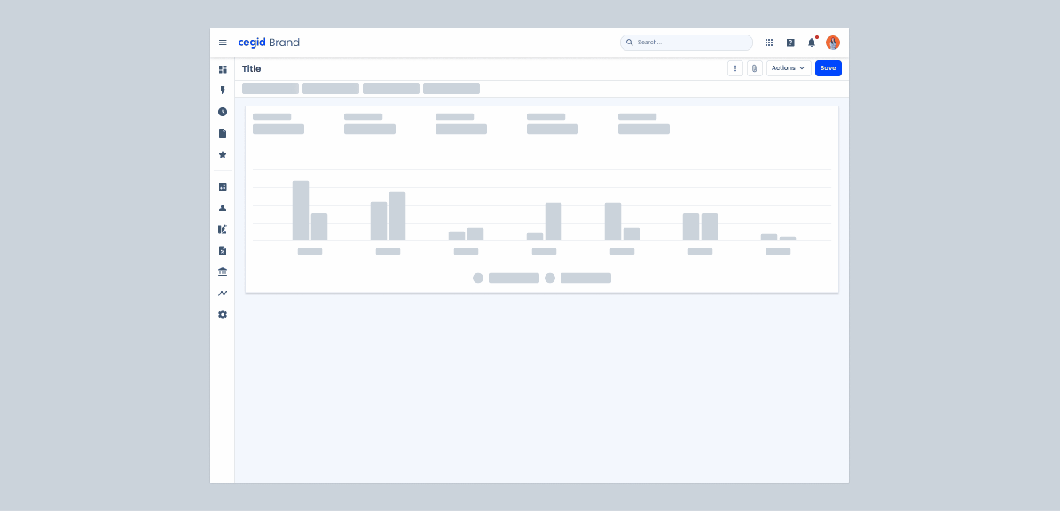
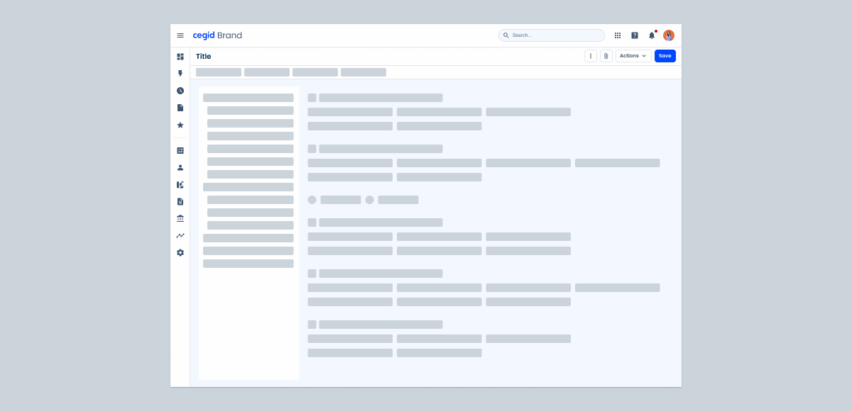
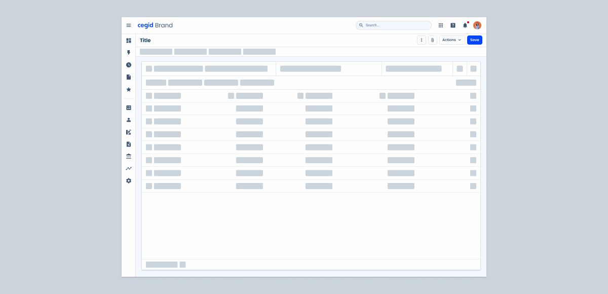
Skeletons should be applied to lists or grids of repeated content (Tree View, Data Grid, Forms, Cards and Dashboards).
Case Studies

Handling Background Tasks

Read Mode: Making Content Feel Effortless and Understandable
