Introduction
In the context of UI design, illustrations can be drawings, sketches or graphic designs. They are used to clarify, decorate or visually represent complex text or ideas.
Just like any other part of an interface, illustrations are functional elements and not mere decoration. They should make messages and interactions easier and clearer – also more elegant, why not?
Illustrations have the power to clarify complex concepts and processes in a visual way. But more than that, illustrations help digital products create an emotional connection with users. We’re all emotional beings, it’s no secret. And if an interface manages to help the task and still make them smile? That’s extraordinary!
Here are 4 reasons why illustrations help improve the user experience:
The illustrations quickly convey the necessary information
Good UX design starts with understanding the behavior, goals and expectations of users. Most people perceive images faster than text. According to a study, the human brain processes visual data 60,000 times faster than textual data.
Because of their explanatory potential, illustrations facilitate understanding. For this reason, they are often used on onboarding pages, tutorials and tooltips. In this context, illustrations are used to clarify a specific step or encourage the user to take action.
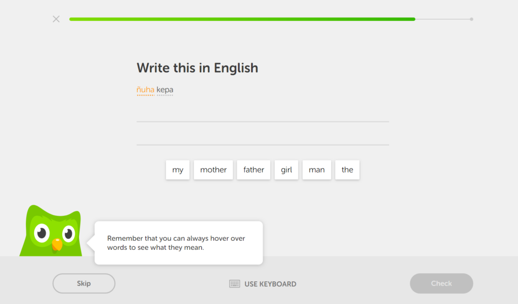
For example, Duolingo uses animated illustrations to show the user tips. Thus, when a user is using the application for the first time, they can easily understand what their options are.
What’s more, illustrations are great for the kind of users who ignore text and therefore rely on visuals to find what they’re looking for. They are also a way of making the content universal, when the audience is from different parts of the world.
However, speed of perception is not the only important thing. People can perceive illustrations quickly, but if the message isn’t clear, it won’t be a positive experience. experience. In this case, it’s just a quick perception of the image and not recognition or understanding. For there to be recognition, it’s important that the message is conveyed correctly to the user.
The illustrations engage the user
When a user interacts with a website or application, they are looking to fulfil a specific task. The steps they take to fulfil that task form the “user journey”. It is possible to design interfaces in such a way as to enhance the user experience, using illustrations.
In this way, illustrations can help engage the user and make the process less painful. This is particularly useful for long or complex situations, such as onboarding processes and error messages.
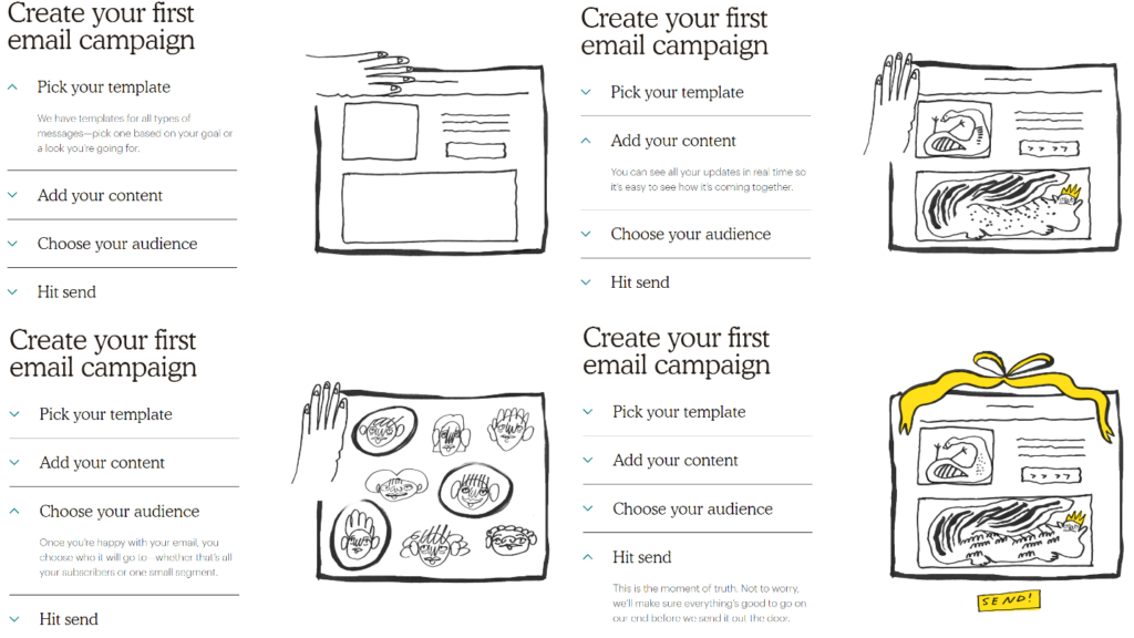
Mailchimp uses a sketch illustration style to explain, in an organised way, the onboarding process. This illustration style is characteristic of the brand and is easy to understand.
Slack, on its Security at Slack page, presents this illustration that lets the user know that the Slack team takes security seriously.

The illustrations create dynamic experiences
Adding simple animations and micro interactions to illustrations is a simple way of enrich the user experience. Animations make it possible to create memorable and experiences.
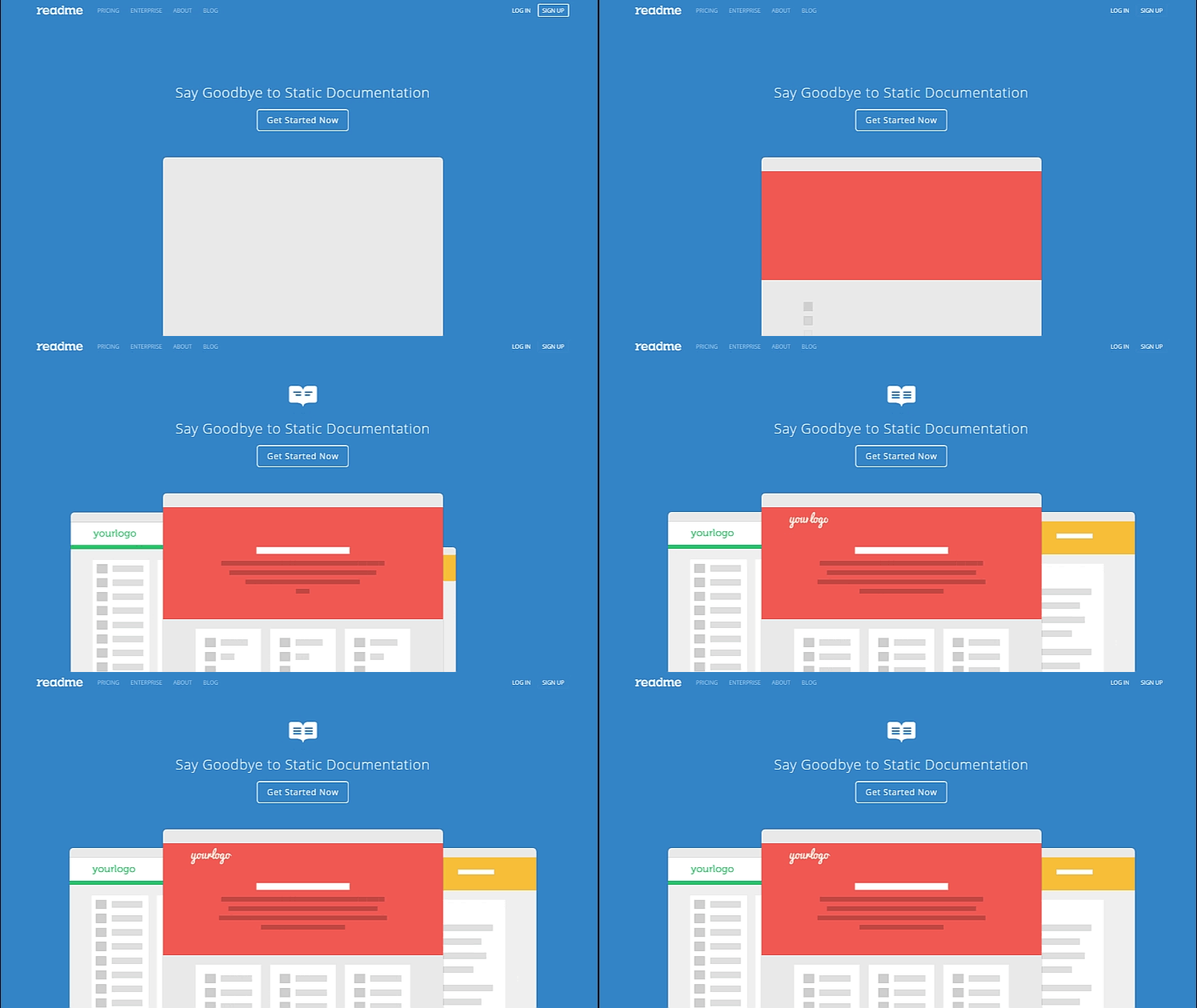
The ReadMe website uses an animated illustration on the homepage that matches the slogan “Say goodbye to static documentation”:
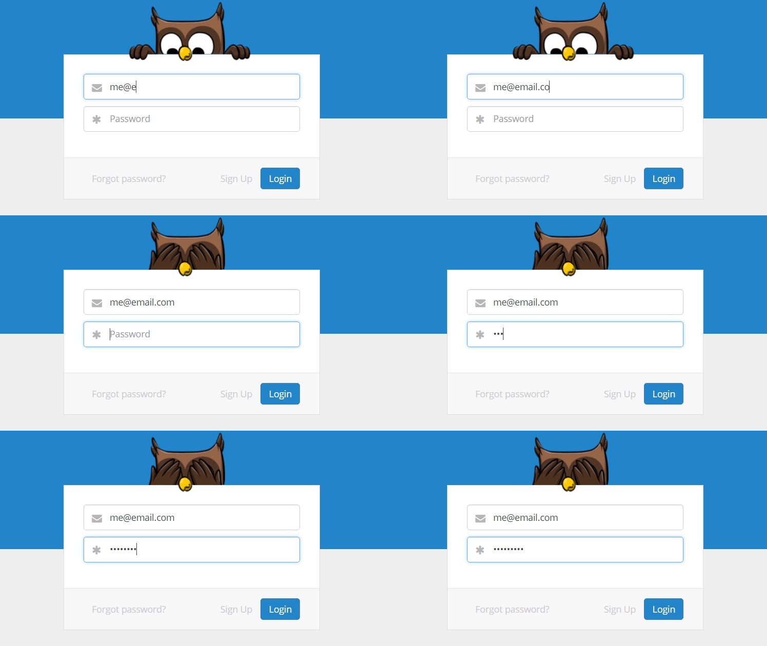
In addition, this site also uses a small animation on the login page. The mascot, an owl, appears at the top of the form and covers its eyes while the user types in the password. password. It’s an excellent example of how a small animation can immediately create a memorable user experience. a memorable experience for the user.
The illustrations strengthen the aesthetic
Most users read texts superficially. That’s why illustrations are an effective way of conveying information or concepts quickly. They improve the experience, even when they are not used to fulfil a specific function.
Some examples of where we can use illustrations:
- To portray the brand’s identity. Using personalized illustrations helps distinguish the brand from others. And, combined with a microcopy that matches the brand message, we can create memorable experiences for users.
- Create a mascot to represent the brand. Mascots are often used in web design to represent brands. In addition to creating empathy with the user, they help to memorize the brand.
- To delight users. When illustrations are integrated with the general theme of the site, they create a specific atmosphere that the user feels during the initial interaction.
Illustrations that immediately define the theme of a site offer the opportunity to visual metaphors and establish strong brand associations. See the examples below:
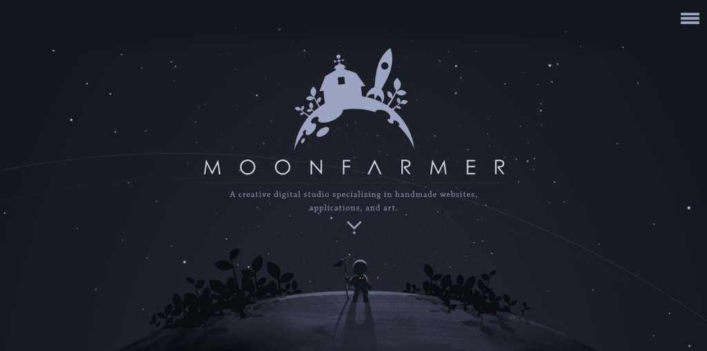
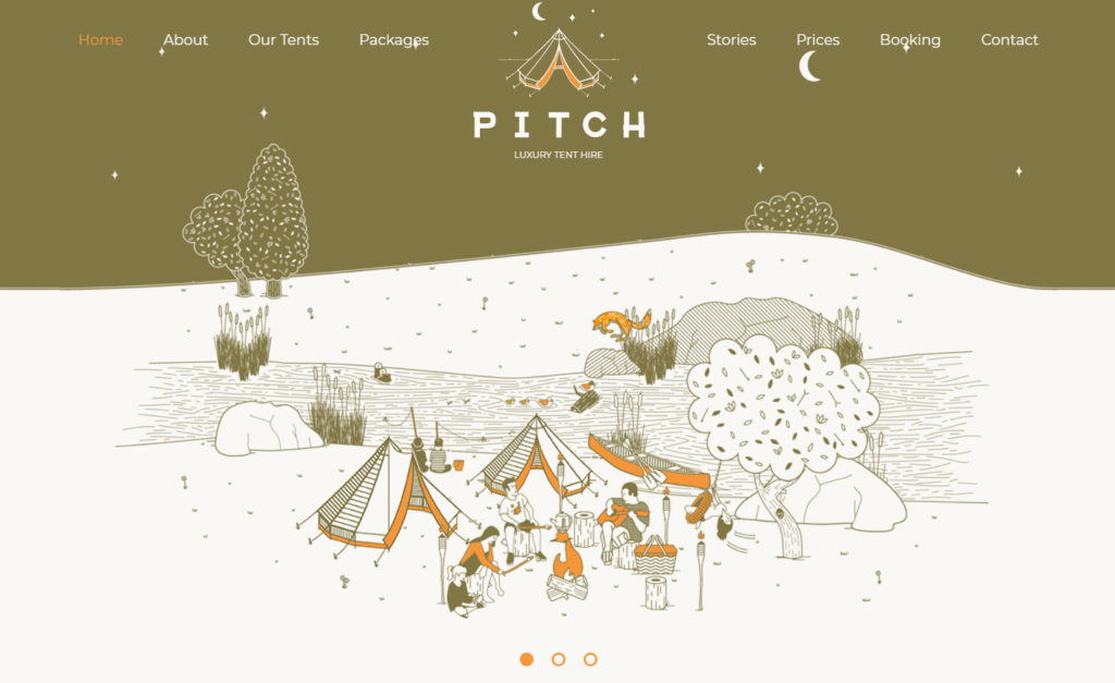
Mascots leave an impression on the user’s mind and give them an idea of the brand. Mailchimp presents its mascot like this: “Freddie’s always winking because he has a great attitude.”
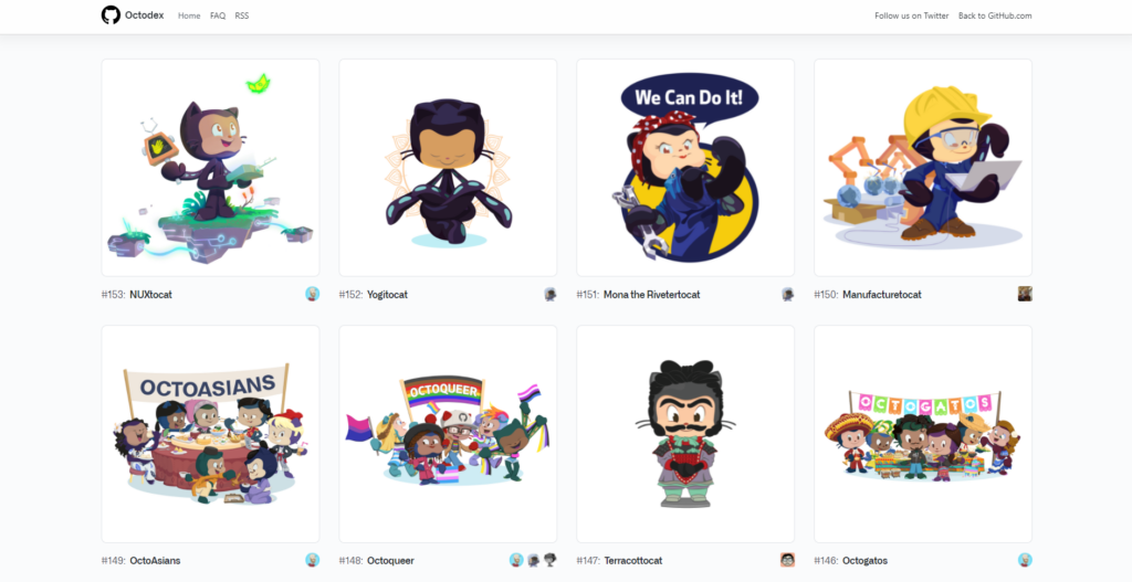
The Octocat, GitHub’s mascot, is one of the best-known symbols in the technology industry.

Octocat also has several versions, inspired by festive dates, pop culture or simply new characters. Each user can create their own Octocat. (myoctocat.com).
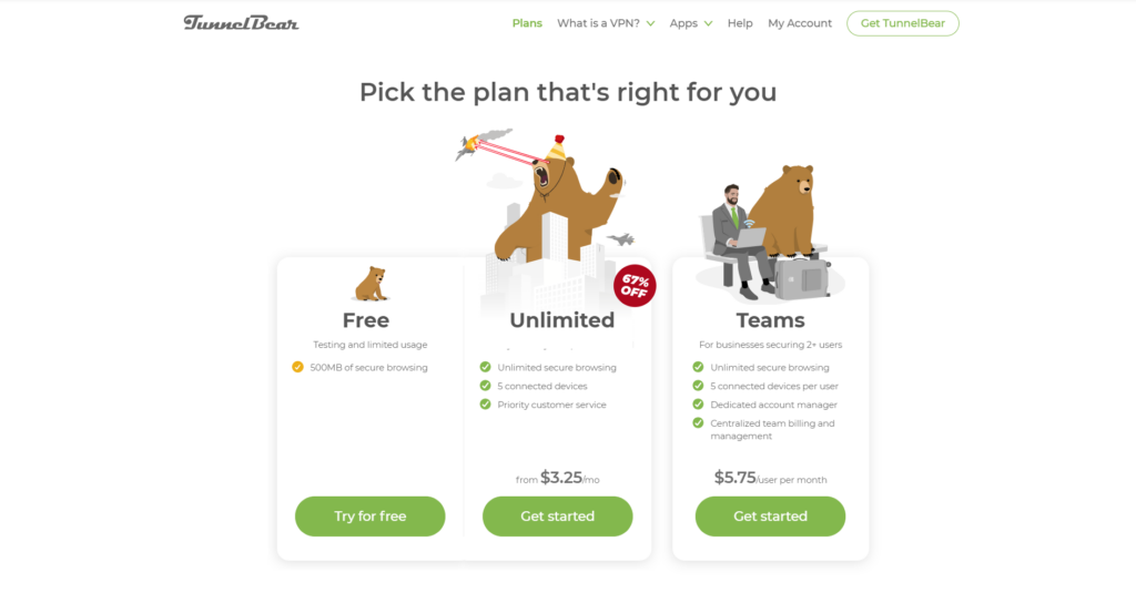
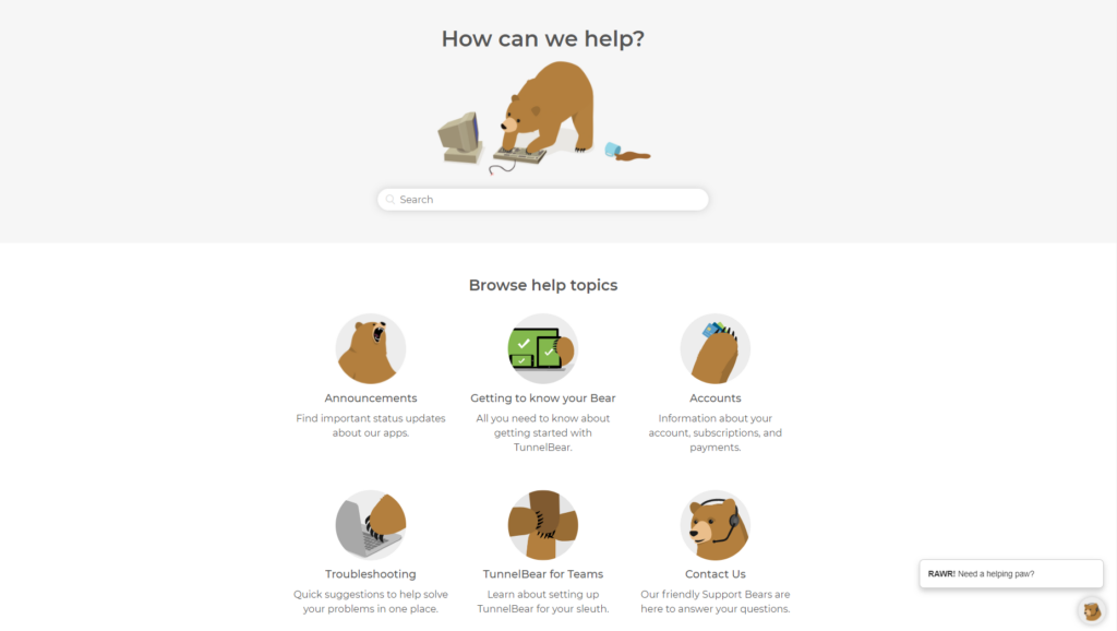
TunnelBear’s Grizzly mascot is an example of a simple illustration that is used throughout the site to site to explain product features or names, price information and much more.

In conclusion…
It’s clear that illustrations help users build trust with digital products, as they make brands more human and accessible. Giving this idea of human connection, in a world is what really helps build trust.
However, we need to keep in mind that we shouldn’t use illustrations just to embellish the interface, without context or specific function.
Illustrations have a unique potential to add emotion, clarity and beauty to the user interface. user interface. And this should be the main objective: to create a connection, build a narrative and enable a smooth user experience, where making a decision is easy.


