

When designing interfaces, it’s often important to restrict certain actions to users. This can be done by simply hiding the related UI element, ensuring users are limited to the actions they should interact with.
However, there are many cases where these elements are expected and their removal can lead to confusion. This normally applies to familiar components like settings menus, or action buttons such as Submit and Next at the end of forms.
In situations like these, it’s best to use the disabled state, which preserves the expected layout and gives users a clear signal that the action exists but is not currently available.
Disabling Elements
The need to disable interactable components is a frequent occurrence when designing interfaces. Some common situations that can cause the disabling of related actions are:
- Incomplete forms;
- Changes to a product’s settings;
- Tasks interrupted by a loading process.

In these examples, the disabled state provides feedback to users about their tasks and the product’s limitations.
It’s important to bear in mind that non-interactive items take up space in an interface and can make it unnecessarily cluttered. Moreover, without sufficient context, they can frustrate users who don’t know why they can’t access certain actions. When unsure whether to omit or disable items, there are two key factors that make the disabled state a preferable approach:
- The user may be able or expected to interact with the disabled content, but doesn’t fulfill a required condition (e.g. a Next button on a form with incomplete fields);
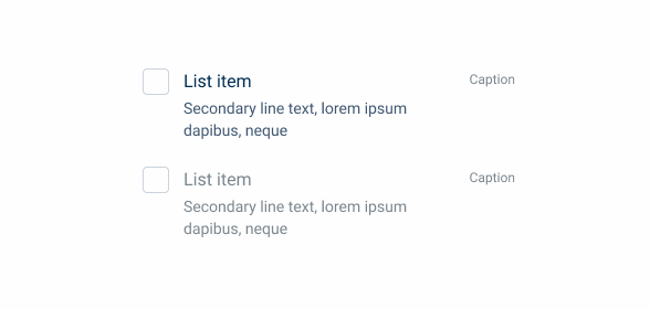
- The user is not expected to interact with the disabled content, but benefits from its visibility (e.g. an item in a list that is not available).
Behavior
When an item is disabled, it loses all of its intractability. This means that other states, such as pressed or focused, cannot be used. In addition, clicking on this item does not trigger any action, and therefore the cursor shouldn’t change when hovering.
Since disabled items are not interactable, there’s no WCAG standards they need to comply with. This means that they can be represented with colors that contrast less with the background, which helps to reduce their relevance in the hierarchy of an interface. Please note that this is not always ideal. Consider using Read Only variations when visibility is important.
Guidelines
The disabled state is used in many of our Design System’s assets. We have established guidelines that help ensure it remains consistent across all of our components and patterns.
Main Content
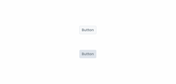
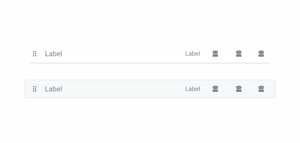
Text, icons and other key elements should all be represented in Grey 6. This is the main color used in disabled items and is present in all of them.
Secondary Content
Button backgrounds and decorative elements, such as borders, should use Grey 4.
Backgrounds
By default, disabled items should use Grey 1 as their background. Components with borders use Grey 2 instead.
Selected Components
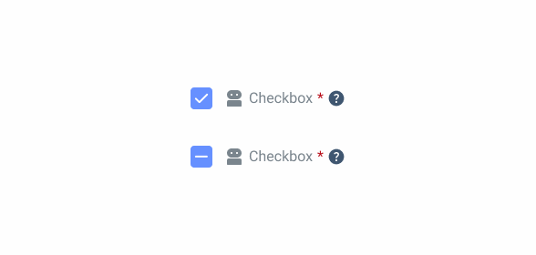
Some components, such as the checkbox, can be disabled when selected. It is important that this information is conveyed to users, which can be difficult using exclusively greyscale tones. In these cases, use Theme 60 and Theme 20.
Nested Components
Some patterns that can be disabled contain components that cannot. In these cases, the component must keep their original appearance.
Conclusion
Limiting the actions users have access to will have a big impact on their experience, which can be good or bad. Before choosing to disable an item, be sure to:
- Make sure it’s the right choice. Sometimes, hit may be preferable to hide the item or use the read-only variation.
- Check that the state s being applied correctly and that it follows all the guidelines, so that users don’t get confused.
References
Medium – The disabled state in UI design


