

Introduction
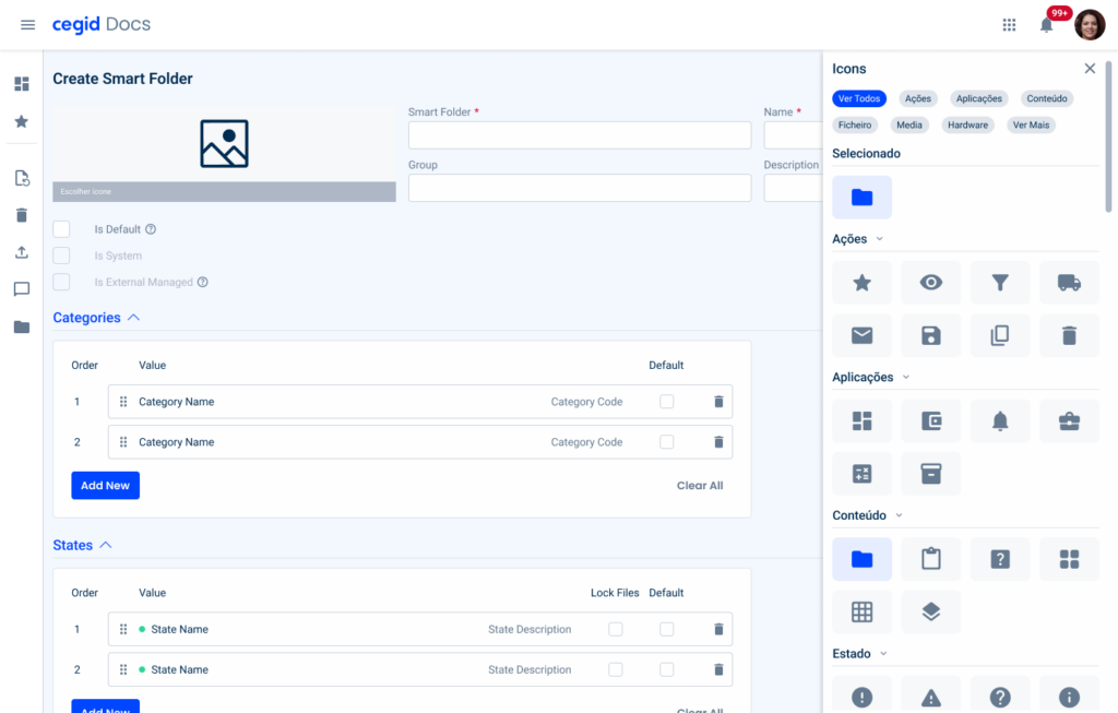
Image previews provide users with a visual representation of the items or content within the flyout menu, making it easier for them to identify and select the desired option at a glance.
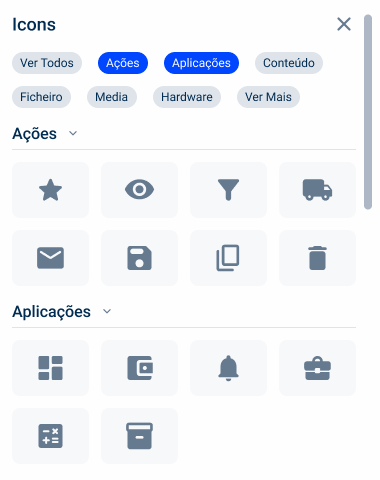
This type of flyout presents a list of icons or components that can be selected. It should be used when you want to focus the user’s attention on the task at hand.

Advantages
There are some advantages to using this type of flyout, such as:
Quick Access
This flyout allows quick access to all available images, increasing user efficiency and productivity.

Efficient Navigation
Users can quickly scroll through image previews to find the item they are looking for, reducing the time and effort needed to locate specific content.
Better Decision Making
Image previews give users more context about items or content, allowing them to make more informed decisions.
Categorization
By organizing icons/components into categories, the flyout can help users navigate content more easily, reducing cognitive load and improving usability.
Behavior
You can close the flyout at any time by clicking on the close button in the top right-hand corner.
Accordions
By default, accordions appear closed. This way, users can open only the category they want.
To select an image, simply click on it and you don’t need to submit it to apply it. When an item is selected, a new accordion appears showing the selected icon.
Thumbnail
The thumbnail is optimized for vector images, with a size of 32px.
Chips
Chips allow you to filter by category. You can select more than one at the same time.
The “See All” chip always appears in the first position and, when selected, opens all the accordions, allowing you to see all the images. When selected, this option clears all the other ones selected.
When the user selects a specific chip, they can always go back to all of them by clicking on that chip.


