

404 – Page Not Found
Error pages can be frustrating for users, but for a UXer they can be an opportunity to turn lemons into lemonade.
It’s normal for things to go wrong, but when they do, the least the interface can offer is some useful information.
An error page is not the page the user wants to find, which can be a frustrating and negative experience. So it has to be treated with empathy. It should help the user understand why the error happened and direct them to a real page. To be effective, you need to strike a balance between concise but light and pleasant information.
Therefore, error messages should be designed so as not to have a negative impact. In other words, they should be:
- Written in simple language, without codes;
- Short and to the point, they should explain what went wrong;
- Constructive, so that users realize what they need to do to correct the problem.
Anatomy of an error message
When designing an error page, it can help to think about the answer to the following questions:
- Who caused the error?
- What was the error?
- Why did it happen?
- When will it be resolved?
- How can it be resolved?
Shopify’s Design System (Polaris) shows a great example of an error message, answering the questions mentioned above, which can be applied to any error page.

Users will still want to access the page they were looking for, so error pages should guide them to a way out or at least offer some suggestions.
According to the Nielsen Norman Group, an error page should include:
- Search bar;
- Common links, including the home page and the help page.
How to integrate messages into error pages
Avoid using technical language
Most of the time, for users, error codes are just that: codes. So they don’t help them solve the problem. Users are already frustrated at not being able to access the page they want, imagine encountering yet another obstacle…
“It’s not you, it’s me”
NEVER make the user feel that it’s your fault or that you’ve done something wrong. Assume the error and apologize, being transparent: “We’re sorry, but we couldn’t find the page you’re looking for.” Tip: words like “Oh no!” or “Oops” increase the level of empathy and are endearing.
Be short, sweet and as specific as possible
Error pages are a great opportunity to add fun and enjoyable things, but before that, they must address the problem. Therefore, messages should be short, to the point and as informative as possible. For example, if you know the cause of the error, such as a page not found or a session that has expired.
Don’t forget the brand’s tone of voice
Error pages can be an opportunity to engage users with the brand, while turning a frustrating experience into a pleasant one. To ensure consistency, it’s important to remember the target audience and brand identity. For example, it’s a good idea to write your error messages in language aimed at people who use your products.
Include useful guidelines
Where possible, we should include some way of resolving the error. Sometimes this is as simple as adding a back button or giving small instructions, such as refreshing the page and clearing the cache.
Entertainment
Here’s the fun part. We’ve already built the message with relevant content for the user; we’ve been short and clear, explained what happened and offered some solution. Now we can add an extra dose of entertainment. For example, add fun images, humor, jokes, puns or even memes to make users laugh. Here it’s important to take into account the target audience and the brand’s voice, for example if the company has a mascot, this is a great place to use it.
There are several ways to make error pages less frustrating and even fun, thus improving the user experience. Here are a few examples:
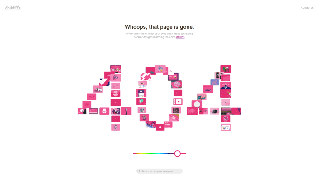
Dribbble – Although it doesn’t give any reason for the error, it does offer the option of choosing a colour and viewing jobs according to that colour. It also offers three suggestions: go back to the Homepage, contact us and the search bar. You can access this error page here:
www.dribbble.com/shots/3856128-1/attachments/874023
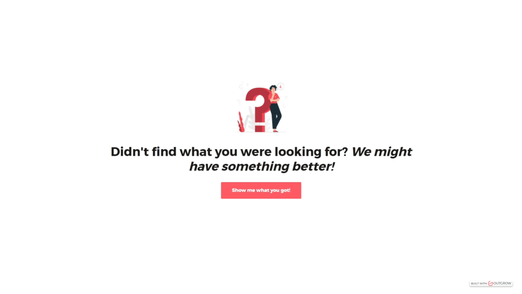
Outgrow – is a platform that allows you to create interactive content. Therefore, the 404 error page is in line with this idea. It features an interactive page that lets you choose a category and directs you to relevant blogs in that area. Interactive content is a more effective solution for attracting people’s attention than static content.
You can access this experiment here: premade.outgrow.us/quiz-for-404-page
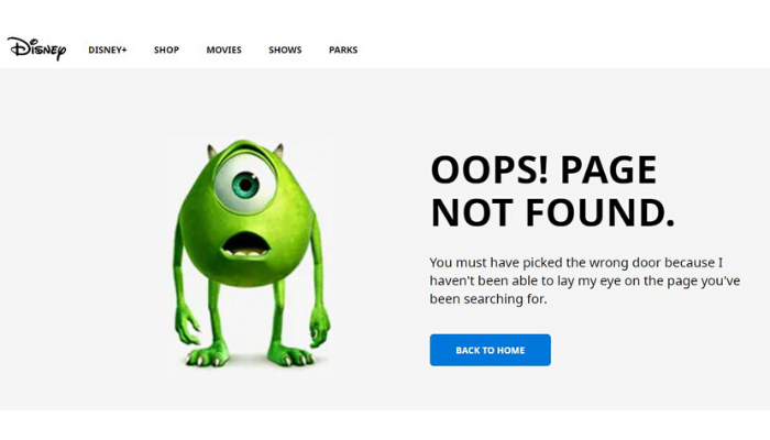

Disney & Pixar – They use a character from one of their films, combined with messages referring to that film. They are therefore pages entirely aimed at their audience. You can see Disney’s page here: www.disney.pt/error-404 and Pixar’s here: www.pixar.com/404
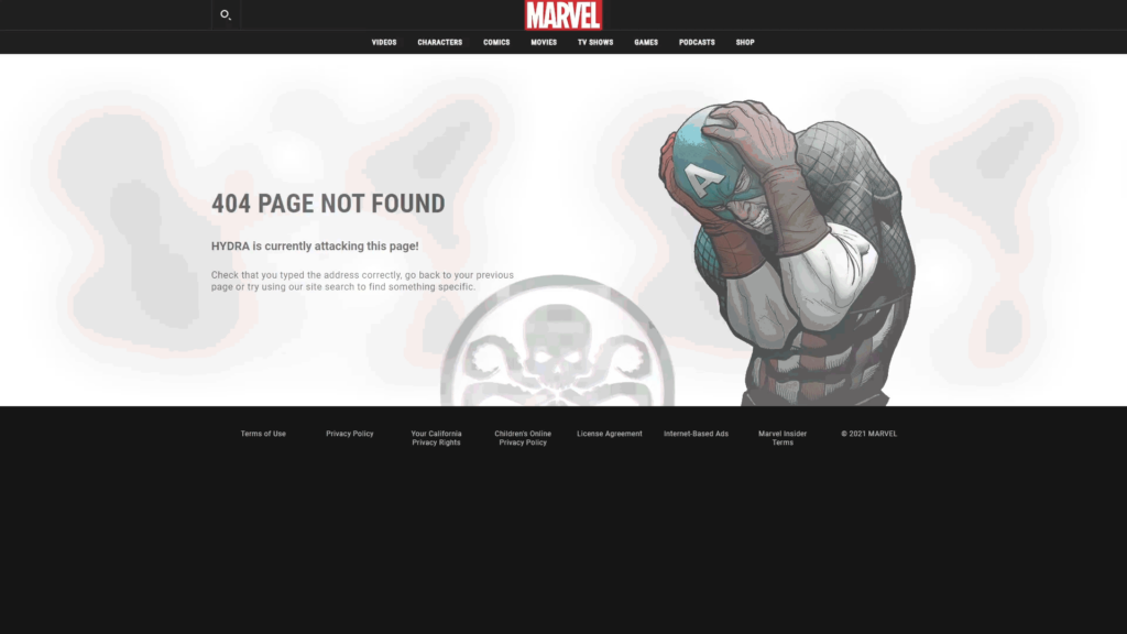
Marvel – Tell a story. Use a story from the Marvel universe and create the error page around it. And it’s never the same! The character varies, as does the story. This is very much geared towards their type of audience, involving them even more in the products. You can try it here: www.marvel.com/404
Conclusion
There is no such thing as a 100% perfect error page, but it is important to follow a few rules:
- Provide information that is relevant to the user;
- Use simple and direct language;
- Make the page pleasant and, if possible, fun;
- Take into account the brand’s identity;
- Provide some output from the error page.
Basically, error pages are an opportunity to add fun and enjoyable things to products. Even though it’s an error page, we can offer the user a pleasant experience by informing them about the error in a good-humored way and guiding them.


