These days, driving to a new destination without a GPS seems like a tremendous challenge, not to mention downright risky. It would take us hours, we might not even get to the right place and we would certainly have to resort to the old strategy of opening the window and asking a passer-by.
Similarly, software also requires orientation to guide users through its forms, interfaces and operations. Ideally, all features should be easy to interpret and use, however, we know there are scenarios in which, no matter how much we try to simplify, there is always something legal, functional or technical that can increase complexity for the user.
In this context, having help systems/guides that explain the actions in the product can help demystify doubts and increase form adoption. Users don’t use forms/features they don’t understand.
That’s why, via Userpilot (currently), we are able to create walkthroughs on features and guarantee these two cornerstones: helping and contributing to adoption. But how do we do it?
Walkthrough Concept
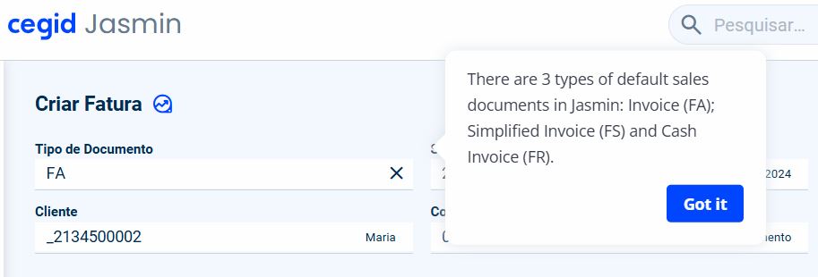
A walkthrough helps the user in the context of the application, explaining field by field what information is required and guiding the user to quickly meet the objective. These guidelines are triggered when the user opens a feature, they are short and precise ( to avoid overloading the user) and they have actions (either to move forward or to close the experience).
Besides this educational aspect, walkthroughs encourage the integration of users into the application, whether new or existing ones, since they can be done at any time:
- we can create an experience for new users to get to know the whole application;
- whenever we launch a new feature, we can create a walkthrough to explain its purpose.
These elements also reduce the need for users to resort to support, since the explanation of how to do it is fully contextualized.
Walkthrough in Theory
As we know, there are thousands of forms in our applications. Therefore, there must be a set of rules to define when we use these elements. To do so, we always analyze the form/feature/operation on three levels: Complexity, Adoption Strategy and Product.
1.1 Complexity
We must analyze whether there is: it’s n
- a large number of fields and icons: forms with many fields can be difficult to navigate and make it hard to understand what is important to fill in. Furthermore, not all users have the same perception of the icons. When there are icons that can generate doubts (for example: context operations), it is useful to explain the icon and what operations it conceals;
- a difficult interpretation of the fields: when the fields require specific technical knowledge or contain terms that are difficult to understand (jargon);
- difficulty in filling in advanced data: there may be scenarios in which information is difficult to find or provide, as well as forms that require the user to search for other data in other views, making the process more time-consuming;
- a lack of visual organization: sometimes there are forms with a confusing design, without a logical structure and without a clear hierarchy of information.
1.2. Adoption Strategy
A walkthrough should be evaluated when:
- we make a new form available;
- we launch significant improvements to a given form ( whether it’s functional breadth, design or performance improvements);
- we have forms with a legal impact: there are features, such as series creation and communication (typically in January), which are mandatory to be able to work on the product;
- the product’s key features.
1.3 Product
If the product is not integrated with any adoption platform (such as Userpilot), it is not possible to carry out these experiments.
First and foremost, investment in walkthroughs always depends on the strategy of the Cegid application portfolio.
Walkthrough in Practice
There is a set of transversal practices that we use to build this kind of experiences:
1. Content
1.1 Split information
- Clear and short steps: breaks are important not to overload the user with information;
- One step at a time: focus on a single task, for instance: explain what the Invoice Type field is and only then the available options.
1.2 Writing clearly
- Simple instructions: avoid jargon or technical terms and use simple, clear language;
- Focus on the action: indicate exactly what the user has to do, for instance: Enter a description without spaces.
1.3 Adding tooltips
Additional tips: create tooltips with links to the help documentation so that access to help is always available.

2. Design
2.1 Identifying the persona
- Knowing your audience: before designing a walkthrough, it’s important to understand the persona in order to know their level of product/business knowledge;
- Customizing the experience: adapting content to each type of user.

2.2 Visually highlighting
Use focus mode to make a field stand out from the rest. This way, the user has no doubt as to where they need to fill in certain information.

2.3 Presenting the progress
Whenever possible, we should show the total number of steps in the walkthrough so that the user knows the progress of the help. However, if there are too many steps, we should omit them to avoid closing the experience or when the steps are split between different pages or tabs.

3. Experience
To ensure a good walkthrough experience, the following best practices must be followed:
- Size: create tooltips symmetrically;
- Framing: always be framed in the field/section being addressed;
- Closing the Experience: always give the possibility of closing the experience;
- Button: Clicking on the experiences buttons indicates the success of the experience itself. That’s why we should always have them;
- Background: can be used when justified. However, if a tooltip has it, all of them will have to have it.


Conclusion
Having walkthroughs allows you to increase the retention rate of new users, because they feel supported in the first moments of interaction with the product.
To retain current users, you need to continue to generate value, even in the later stages of the user journey. Onboarding new users is not enough. Interactive guidance will also help you increase adoption rates and improve the use of new features.


