

Introduction
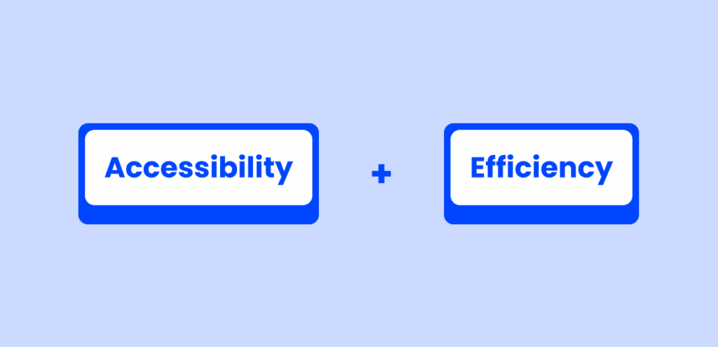
Keyboard accessibility and efficiency are vital for inclusive, user-friendly digital experiences. Many users—whether due to impairments or preference—rely on keyboard navigation to interact with interfaces. Well-implemented navigation and shortcuts improve usability, reduce effort, and support accessibility standards.
Power users benefit from faster workflows through shortcuts, while users with mobility impairments depend on keyboard access to use products at all. Designing for both ensures intuitive and equitable experiences.
This article outlines core principles for effective keyboard navigation and shortcuts—distinct but complementary tools that together enhance speed, accessibility, and user satisfaction.
Understanding the difference
Before diving into design principles, it’s important to distinguish between keyboard navigation and keyboard shortcuts—two tools that serve different but complementary purposes.
Keyboard Navigation
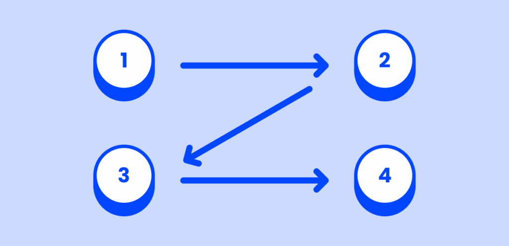
Keyboard navigation refers to moving through the interface using keys such as Tab, Shift+Tab, Arrow keys, and Enter. It allows users to explore the UI element by element, typically in a linear order. This is essential for users who rely solely on the keyboard, particularly those using assistive technologies like screen readers.
Use keyboard navigation to:
- Allow users to sequentially access every interactive element (buttons, form fields, menus).
- Ensure a logical and predictable focus order.
- Support users who are discovering or exploring the interface for the first time.

Keyboard Shortcuts
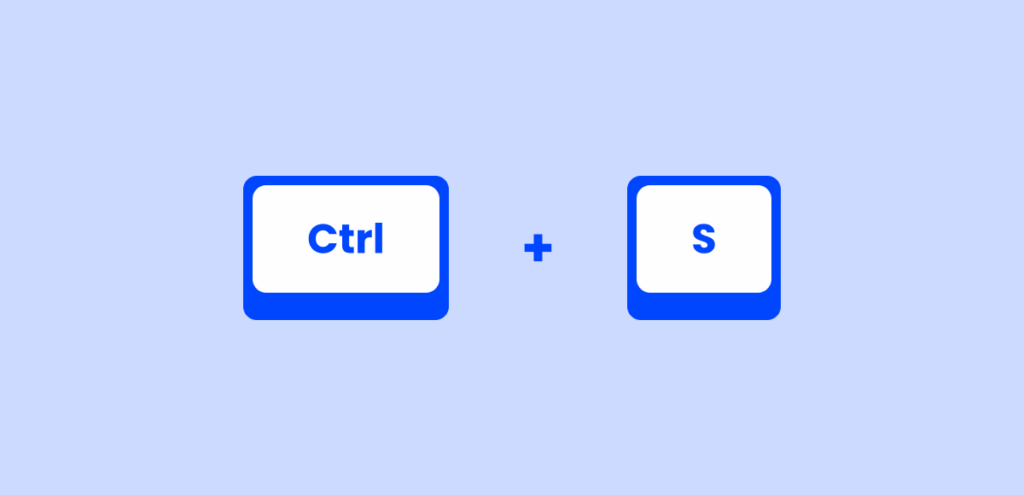
Keyboard shortcuts are key combinations (e.g., Ctrl+S or Alt+Shift+F) that trigger specific actions without navigating to them. They are designed for speed and efficiency, ideal for repetitive tasks and for experienced users who want to streamline their workflows.
Use keyboard shortcuts to:
- Provide quick access to frequently used functions (save, search, switch views).
- Minimize the need for repeated navigation.
- Boost productivity for power users.
Why Both Matter
Keyboard navigation ensures accessibility, making sure users can reach all parts of the interface regardless of their physical abilities. Keyboard shortcuts enhance efficiency, helping users complete tasks faster once they’ve learned the system.
Together, they create an inclusive and empowering experience for all users—from those with disabilities to those who simply prefer a keyboard-centric workflow.
Keyboard Navigation Principals
Logical Focus Order
Ensure the tab order follows the visual and functional hierarchy of the interface.
A well-structured focus order is one of the most fundamental aspects of keyboard accessibility. When users press the Tab key, they expect the focus to move in a predictable and meaningful sequence that mirrors the visual layout and task flow.
Match the visual and logical order:
- The focus should move top-to-bottom and left-to-right (in left-to-right languages).
- Group related elements together. For example, focus should stay within a form section before jumping to the sidebar or footer.
Design accessible modals:
- Set initial focus to the first meaningful element when a modal opens (e.g., the first input or button).
- Trap focus within the modal while it’s open, but release it back to the triggering element when it closes.
- Avoid allowing background elements to remain focusable while the modal is active.
Make menus keyboard-friendly:
- Menu items should be navigable with arrow keys and Tab where appropriate.
- Support Enter or Space to activate items.
- Ensure submenus open in response to keyboard input and can be closed with Esc.
Build structured forms:
- Tab order should follow the natural progression of the form.
- Group inputs with related controls (e.g., radio buttons and labels).
- Use fieldset and legend elements for semantic clarity in multi-question sections.
⚠️Common Pitfalls to Avoid:
- Don’t skip elements: All interactive UI components must be reachable via keyboard.
- Avoid random tabindex values: Use
tabindex="0"for custom elements that should be in the tab order. Usetabindex="-1"only to programmatically focus elements without including them in the tab sequence. - Beware of focus traps: Unintentionally looping focus on an element or section (like a modal with no exit) can confuse or block users.
By maintaining a logical and consistent focus order, you create a smoother and more intuitive experience for keyboard users—especially those who rely on screen readers or alternative input devices.
Visible Focus State
Ensure all interactive elements have a clear and consistent focus indicator.
A visible focus state is essential for users navigating with a keyboard. It confirms where the current point of interaction is, making interfaces usable and accessible—not just for users with disabilities, but also for power users who prefer fast, efficient input.

✅ Why It Matters:
- For navigation: Users need to see where they are to move confidently between elements (links, buttons, inputs, etc.).
- For shortcuts: A visible focus helps confirm when a shortcut has triggered an action and what element is affected.
- For accessibility: People with visual or cognitive impairments rely on strong visual cues to orient themselves.
- A visible outline or highlight that contrasts with the background.
- A consistent style across all similar elements.
- No visible indicator at all (
outline: none;) - Inconsistent styles (e.g. some components show focus, others don’t)
💡 Best Practices:
- Use a consistent focus style across your product or design system.
- Avoid removing outlines unless replacing them with a strong custom indicator.
- Test on multiple screen sizes and color settings to ensure visibility.
- Ensure contrast: The focus indicator should meet WCAG contrast ratios (at least 3:1 against adjacent colors).
- Include focus for all UI components, including:
- Form fields
- Menu items
- Dialog buttons
- Icons with actions
- Chips, cards, and custom components
Skip Navigation Options
Provide ways to bypass repetitive content and jump to key sections quickly.
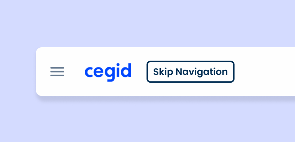
Skip navigation options are essential for both accessibility and user efficiency. They enable keyboard users to bypass repetitive interface elements—such as headers, sidebars, or long navigation menus—and jump directly to the main content. This greatly enhances the user experience, especially for those relying on keyboard navigation. A good example of this in practice is YouTube, which offers a “Skip Navigation” link when users start navigating via keyboard.
✅ Why It Matters:
- Accessibility: Users with mobility impairments or screen readers often struggle with repetitive navigation. Skip links let them jump directly to the page content without tabbing through dozens of links.
- Power users: Keyboard-savvy users benefit from being able to jump directly to core functionality, especially in dense apps.
- Efficiency: Reduces friction and improves speed when using keyboard-only navigation.
💡 Best Practices:
- Add a “Skip to main content” link as the first focusable element on the page.
- Ensure the link becomes visible on focus, even if it’s visually hidden by default.
- Use ARIA landmarks (e.g.
main,nav,aside) in combination with jump links. - In web apps, offer custom skip links to major UI components like:
- Data tables
- Search/filter panels
- Main action areas (e.g., form body or workspace)
📌 Benefits Recap:
- Reduces keyboard fatigue by minimizing unnecessary tab stops.
- Improves compliance with WCAG 2.1 success criterion 2.4.1 (“Bypass Blocks”).
- Makes applications friendlier for both assistive technology users and efficiency-driven users.
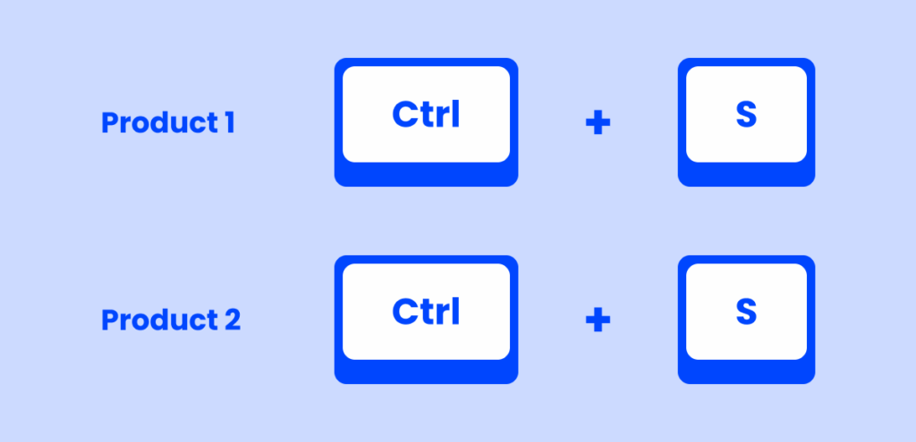
Consistency Across Products
Ensure a unified keyboard experience across your product ecosystem.
In platforms with multiple products, modules, or micro frontends, inconsistency in keyboard navigation and shortcuts can create frustration and cognitive overload. A user should not have to relearn how to navigate or trigger actions when switching between parts of the same ecosystem.
✅ Why It Matters:
- Predictability builds confidence—users know what to expect.
- Efficiency increases as users develop muscle memory for frequent tasks.
- Accessibility improves when interaction patterns remain familiar across contexts.
- Reduces support and training costs by eliminating product-specific quirks.
💡 Best Practices:
- Define and document a shared keyboard interaction model across products (e.g. how to open dropdowns, move through modals, trigger buttons).
- Use consistent keybindings for common actions like:
Enterto activateEscto cancel/closeArrow keysfor navigating lists, menus, and tab panels
- Standardize focus behavior, ensuring all products use the same visual focus indicators and logical tab order patterns.
- Apply a centralized design system that includes keyboard interaction specs.
- Test for consistency with real users who rely on keyboard-only navigation.
📌 Examples of Consistency:
| Interaction | Module A | Module B | Result |
|---|---|---|---|
| Open dropdown | Enter | Space | ❌ Confusing |
| Close modal | Esc | Esc | ✅ Consistent |
| Navigate tabs | Arrow keys | Tab | ❌ Inconsistent |
| Focus style | Blue ring | No visible style | ❌ Poor UX |
Shortcut Principles
Provide Shortcut Support for Frequent Actions
Empower users to perform key actions faster with intuitive keyboard shortcuts.
While keyboard navigation ensures accessibility and inclusivity, keyboard shortcuts boost efficiency, especially for power users who rely on speed and muscle memory to work effectively. Shortcuts reduce reliance on mouse interactions and help streamline common workflows.
✅ Why It Matters:
- Increases productivity for users performing repetitive tasks.
- Reduces interaction time and cognitive load.
- Supports users with motor impairments or screen reader reliance by minimizing navigation steps.
- Improves overall usability and satisfaction for both novice and expert users.
💡 Best Practices:
- Identify high-frequency actions such as:
- Save (
Ctrl+S/Cmd+S) - Create new item (
Ctrl+N/Cmd+N) - Search (
Ctrl+F/Cmd+F) - Open help (
F1) - Navigate between panels or views (
Alt+ arrows orCtrl+Tab)
- Save (
- Follow platform conventions whenever possible:
- Mac: Use
Cmdkey - Windows/Linux: Use
Ctrl
- Mac: Use
- Avoid conflicts with browser/system shortcuts.
- Provide a shortcut reference page, accessible via a help icon or dedicated settings panel.
- Allow users to customize keybindings if possible, especially in advanced or enterprise apps.
- Display discoverable hints, like:
- Tooltip labels:
Save (Ctrl+S) - Menus that show associated shortcuts
- Onboarding overlays with shortcut tips
- Tooltip labels:
📌 Examples of Effective Shortcut Design:
| Action | Shortcut | ✅ Notes |
|---|---|---|
| Save | Ctrl+Alt+S / Cmd+Option+S | Works across systems |
| Open Search | Ctrl+Alt+F / Cmd+Option+F | Matches browser convention |
| Create New Item | Ctrl+Alt+N / Cmd+Option+N | Familiar to most users |
| Toggle Sidebar | Ctrl+Alt+B | Avoid if browser uses same key |
Customization and Discoverability
Make keyboard shortcuts easy to learn, and empower users to adapt them to their needs.
Even the best-designed shortcuts won’t help if users can’t find or remember them. Supporting discoverability ensures users are aware of available shortcuts, while customization respects personal preferences, accessibility needs, and workflow optimization.

✅ Why It Matters:
- Users have different expectations and habits—customization supports accessibility and personalization.
- Discoverable shortcuts reduce learning curves and encourage adoption.
- Screen-reader users and users with memory or cognitive differences benefit from clear, persistent cues.
💡 Best Practices:
- Allow keybinding customization:
- Let users reassign shortcuts to avoid conflicts or adapt to assistive technology.
- Offer profiles for different user types (e.g., “Emacs-style”, “Power User”).
- Use discoverable UI patterns, such as:
- Tooltip hints: Show shortcut in tooltip (e.g., “Search (⌘ + K)”).
- Contextual overlays: Display shortcut hints in modals or menus.
- Keyboard shortcut cheatsheets: Accessible from the help menu or via a shortcut like
?orCmd+/.
- Make hints screen reader-friendly:
- Ensure ARIA labels and live regions announce both the action and the shortcut.
- Avoid hiding shortcuts visually from assistive tech.
📌 Examples of Good Discoverability:
| Feature | Implementation Example | Accessibility Tip |
|---|---|---|
| Tooltip Shortcut Labels | Hover over “Search” shows “Ctrl + K” | Use aria-describedby for screen readers |
| Command Palette | “Press Ctrl + K to open commands” hint | Announce the palette using live regions |
| Shortcut Help Overlay | Show on pressing ? | Include heading structure and focus trap |
| Rebinding Controls | Keyboard settings page in app preferences | Support keyboard-only navigation |
In our products
Shortcut Keybinds
To maintain consistency and prevent conflicts with existing shortcuts, all custom shortcuts must start with Ctrl + Alt, establishing a standardized framework that allows users to quickly learn and apply these new commands.
Navigation Shortcuts:
| Title | Shortcut | Function |
|---|---|---|
| Back to Dashboard | Ctrl + Alt + Home | Quickly return to the main dashboard from any section of the application. |
| Next Page | Ctrl + Alt + Pg Up | Move forward to the next page within a document or a list of entries. |
| Previous Page | Ctrl + Alt + Pg Down | Navigate back to the previous page. |
| Access Root Level (Inside Sidebar) | Ctrl + Alt + M | Open the root level of the sidebar for easy access to main sections. |
| Search | Ctrl + Alt + F | Open the search bar to find specific entries, documents, or data within the application. |
Entry Management Shortcuts:
| Title | Shortcut | Function |
|---|---|---|
| New Entry | Ctrl + Alt + N | Create a new entry quickly, whether you’re in the dashboard or viewing another entry. |
| View Entry | Ctrl + Alt + V | Open and view a specific entry in detail. |
| Change to Creation of Entry (When in read mode/edit mode of an entry) | Ctrl + Alt + N | Switch to creating a new entry directly from read or edit mode. |
| Change to Edit Mode | Ctrl + Alt + E | Toggle to edit mode to modify the current entry. |
Actions Shortcuts:
| Title | Shortcut | Function |
|---|---|---|
| Save | Ctrl + Alt + G (or Ctrl + Alt + S in English versions) | Save changes made to an entry or document. |
| Reset | Ctrl + Alt + R | Reset the current entry or form to its original state, discarding unsaved changes. |
| Close Modal (Canceling the operation): | Esc | Close any open modal window or dialog, effectively canceling the operation. |
Standardizing the way shortcuts are created across our products helps users more easily learn and remember them. This builds on progress highlighted in a recent survey with a pool of users and their responses related to shortcut usage. Notably, 71% of respondents found the existing shortcuts easy to remember.

Discoverability
In our products, for example, a dedicated entry in the personal area links directly to the shortcuts page in the help center. This provides a consistent, cross-product solution without requiring additional development.

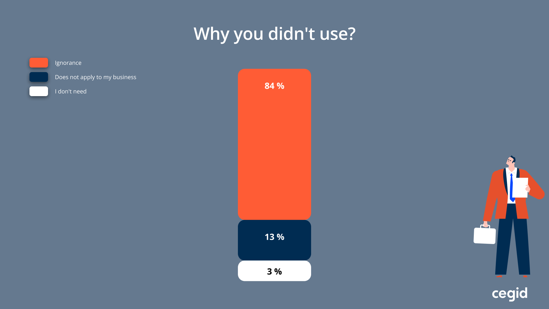
Additionally, consider incorporating interactive tutorials or onboarding experiences to introduce users to key shortcuts. In the survey mentioned earlier, 84% of users who didn’t use shortcuts said it was simply because they weren’t aware of them. This highlights a major opportunity: beyond consistency, we need to improve shortcut visibility and provide effective onboarding to increase adoption.
Conclusion
Designing for both keyboard navigation and shortcuts is essential for building accessible, efficient, and user-friendly interfaces. Logical focus order, visible focus states, consistent patterns, and well-implemented shortcuts work together to support a wide range of users—including power users and those with mobility impairments.
Integrating these principles early in the design and development process not only improves accessibility compliance but also enhances overall usability and product quality. Prioritizing keyboard support helps create a more inclusive experience for everyone.
For further guidance, refer to established accessibility standards and best practices, such as:
MDN Web Docs: Keyboard Accessibility
W3C Web Content Accessibility Guidelines (WCAG)


