In today’s fast-paced digital world, delivering a seamless and intuitive user experience is paramount for the success of any product. A robust design foundation is the cornerstone of achieving this goal. This article explores the concept of a design foundation, its components, and its critical role in enhancing usability.
What is a Design Foundation?
A design foundation is a set of basic guidelines and principles that help create a consistent and effective look and feel for a product or brand. It includes things like color schemes, typography, spacing, and design patterns that ensure all parts of the product work well together and are easy for users to understand and use. It’s like the building blocks that designers use to make sure everything they create looks good and works well.
What are the benefits of having a Design Foundation?
These elements serve as the building blocks for creating consistent, cohesive, and scalable designs across a product or brand. By providing a unified framework, a Design Foundation ensures that all design work aligns with the overall vision and maintains a high standard of quality and usability.
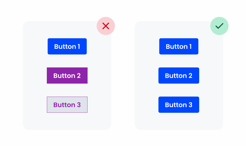
The Core Features of CEGID Design Foundation
A key component of a design foundation is a unified visual language, which ensures that all design elements across different platforms and devices share a consistent look and feel. This visual language includes a carefully defined color palette that reflects the brand’s identity and is used consistently across all UI elements.
Typography also plays a vital role, with standardized fonts and a clear typographic hierarchy that ensure readability and uniformity. Additionally, a cohesive set of icons aligns with the brand’s visual style and enhances usability by providing familiar visual cues. This unified visual language reduces cognitive load, making it easier for users to navigate and understand the interface.
Reusable Components Library
Another crucial element of a design foundation is a library of reusable components. This library includes standardized buttons, pre-designed form elements, and consistent navigation bars, all of which ensure uniformity in user experience across different parts of the product.
Reusable components save time and resources by allowing designers and developers to implement pre-built elements rather than creating them from scratch. This not only speeds up the development process but also ensures that every part of the product maintains a consistent look and feel, further enhancing usability.
Comprehensive Documentation and Guidelines
Detailed documentation and guidelines are crucial for aligning all team members with the same design goals. These guidelines include core design principles that guide decisions and ensure alignment with the brand’s values. They also offer detailed instructions on how to use each component, highlighting best practices and common pitfalls to avoid.
Accessibility standards are another critical aspect, ensuring all components meet the necessary requirements to make the product usable by everyone. Well-documented guidelines facilitate clear communication, reduce misinterpretation, and ensure a cohesive design process.
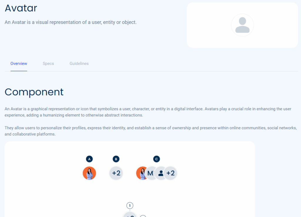
Multilingual Glossary for Easy Reference
Working in design and development often means dealing with a wide range of abbreviations and specialized terms. To support our diverse team and global user base, we have created a comprehensive glossary. This glossary is a centralized resource where you can quickly look up definitions and explanations of common abbreviations and industry-specific terminology with clear definitions in three languages: Portuguese, Spanish, and English.
By offering this extensive and multilingual glossary, we aim to enhance communication, ensuring everyone on the team is on the same page, and supporting learning by providing a valuable educational resource. This glossary saves time by providing quick access to definitions, allowing team members to focus on their tasks without getting bogged down by unfamiliar terms.
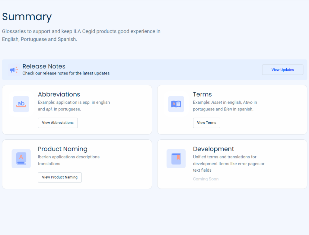
The Advantages of using a Design Foundation
A design foundation is a set of core guidelines and principles that ensure a consistent and effective look and feel across all aspects of a product or brand. Here are some key advantages of having a strong design foundation:
Consistency
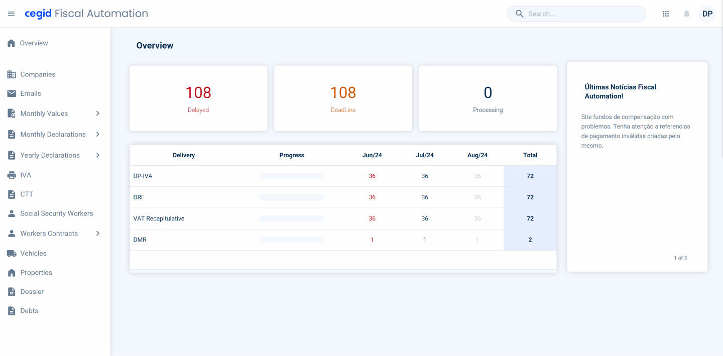
A design foundation provides a unified set of standards for colors, typography, spacing, and design patterns. This ensures that every element of your product looks and functions harmoniously, creating a cohesive user experience. Consistency in design builds trust and recognition among users, making your product more intuitive and enjoyable to use.
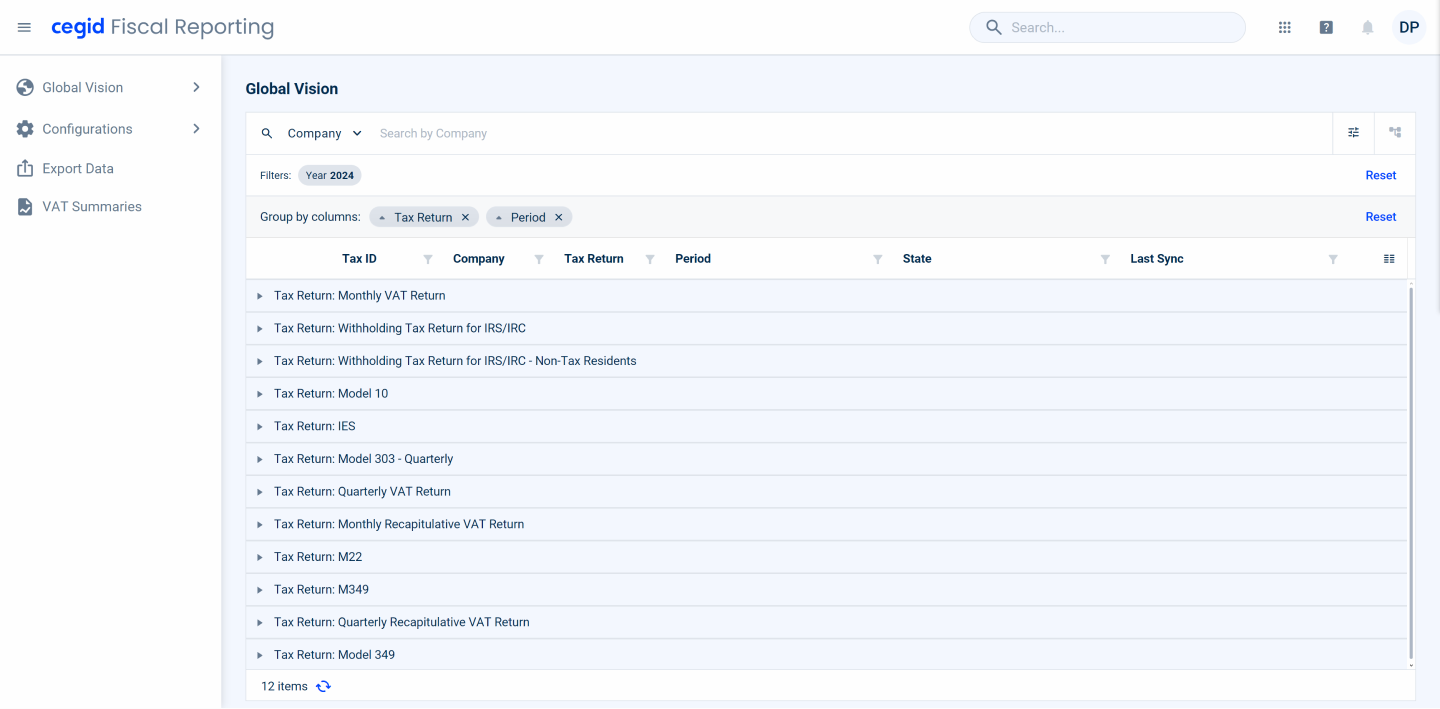
Scalability
As products evolve and grow, maintaining a coherent design becomes increasingly challenging. A design foundation provides a scalable framework that can easily adapt to new features and updates without compromising the overall user experience. This scalability ensures that the product remains visually and functionally consistent over time.
User Satisfaction
A well-implemented design foundation leads to a more intuitive and seamless user experience. When users can navigate and interact with your product easily and without confusion, their satisfaction increases. Happy users are more likely to return, recommend your product, and engage with it more deeply.
Implementing and maintain a Design Foundation
Implementing a design foundation effectively requires close teamwork between designers and developers. Regular communication and collaborative tools help ensure that design ideas are accurately turned into code.
An iterative design process, including usability testing and user feedback, is crucial for refining the design foundation. This approach helps teams identify and fix usability issues early, ensuring the foundation evolves to meet user needs.
A design foundation shouldn’t be static. It needs regular updates and improvements to keep up with changing user expectations and technological advancements. Continuous improvement ensures the design foundation stays relevant and effective.
Conclusion
The usability of a design foundation is a critical factor in delivering a seamless and intuitive user experience. By establishing a unified visual language, creating a library of reusable components, and providing detailed documentation and guidelines, organizations can ensure consistency, efficiency, and scalability in their design processes. Ultimately, a robust design foundation enhances usability, making products more intuitive, accessible, and enjoyable for users. As we continue to prioritize usability, our products will not only meet but exceed user expectations, leading to greater satisfaction and success in the market.
Got Any Suggestions? We’d Love to Hear Them!
Need support or have a bug or feature request for Compose Design? Our team is here to help and actively reviews all new issues you send our way.

