

Have you ever looked at a screen, felt dizzy, with your eyes hurting and begging for mercy? Have you even thought you were about to faint, and felt the need to ask someone for help? Have you realized it was just the interface that was so confusing, disorganized, and overloaded that it was bothering you? Sound familiar? Then you’re in the right place!
That’s where Read Mode comes in. Read Mode exists to solve this problem. It is the invisible art that transforms disorganized content into a smooth, focused, and effortless read so you have a great experience when consulting information.
In this article, we’ll dive into the best Read Mode practices for design, writing, and voice and show you how subtle adjustments can transform your content into a smooth, enjoyable reading experience.

Design
To offer the best read mode experience, it is essential to follow a few design aspects that ensure a clean, organized interface that makes reading flow smoothly.
By following these best practices, you will ensure that your read mode interfaces will guide your reader’s eyes, providing them with great read mode experiences.
To provide the best experience, the read mode has been divided into two different approaches: with or whithout editing permissions.
With Editing Permissions
This version is aimed at the largest group of users, as it is designed for users with read and edit permissions in our products. For users who fill out forms, the best option is to keep the current layout to avoid a learning curve and different layouts between the reading and editing experiences.
In this variation, we will find the same components with some adjustments, such as text fields without the box field and thumbnails instead of image uploaders.
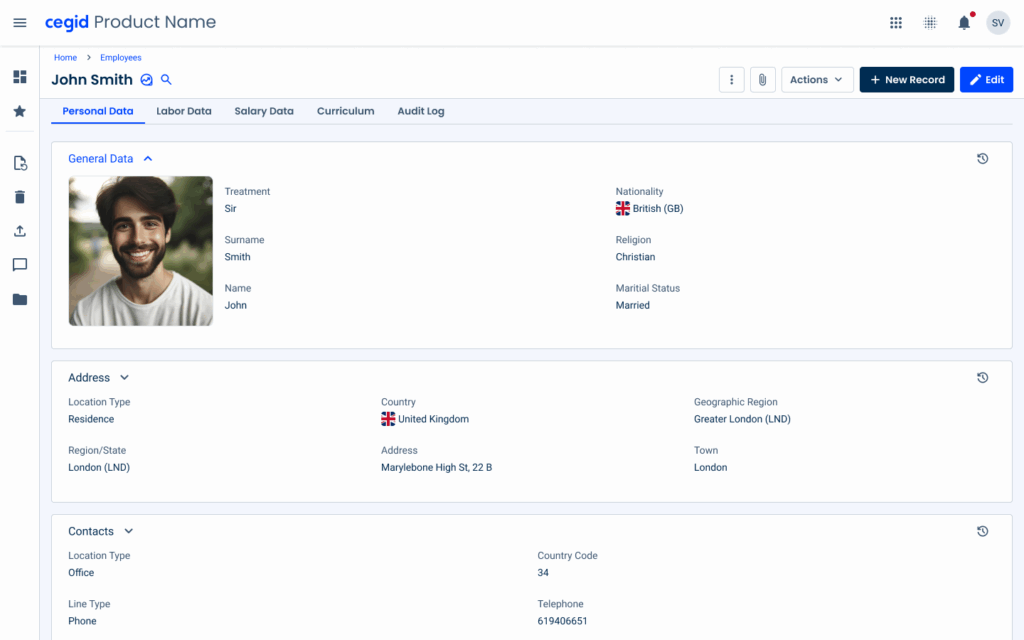
Input Fields
In read mode, input fields, such as Text Fields, Select Boxes, Numerics, etc., should be optimized for readability.
Content should remain distinguishable across different variations.
In terms of layout, borders can be removed, since users do not need to enter data within the fields.
Without Editing Permissions
In cases where we need to meet the needs of users who only have read permissions, we can make the interface easier to understand and more dynamic. That is why the layout is different, since users can only read the information. For this reason, the use of cards and lists is very important, as they are flexible components that adapt to each scenario.
With this variation, the user can easily consult more data in the same space that the usual form uses.
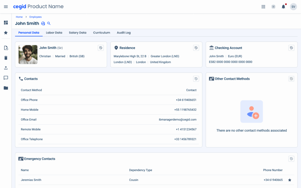
Cards
Cards are key components for organizing and presenting information in a clear and easy-to-assimilate way in read mode.
Their versatility makes them ideal for grouping related content while maintaining a consistent layout.
By visually grouping information into clearly defined blocks, cards improve readability and allow users to quickly locate and understand relevant data.
Cards are flexibile, as each card can contain different types and amounts of content without overloading the interface.

For accounting software, use labels for each field, as the field content may be more difficult to understand without a label.
For customer/invoice information, you can use customer/invoice name as the card title.
Lists
Lists are essential in read mode for displaying structured sets of information that follow a predictable pattern, such as contact details or file records.
They provide a compact, efficient layout that supports quick reading across items.
This structure is also flexible, whether items contain just a label and value or multiple columns with metadata.
Flyout
Flyouts are ideal for displaying additional information without interrupting the user’s current context.
In read mode, flyouts allow users to access additional details, such as activity or history, while keeping the main page visible, thus avoiding overlays that interrupt the user’s flow and maintaining a continuous and focused experience.
Activity
Activity components display the history and changes of different fields within a section.
The different actions that can be found in the activity are:
- Entry creation;
- Field edits;
- State changes (e.g., Pending, Approved, Rejected);
- Marking items as favorites (when applicable);
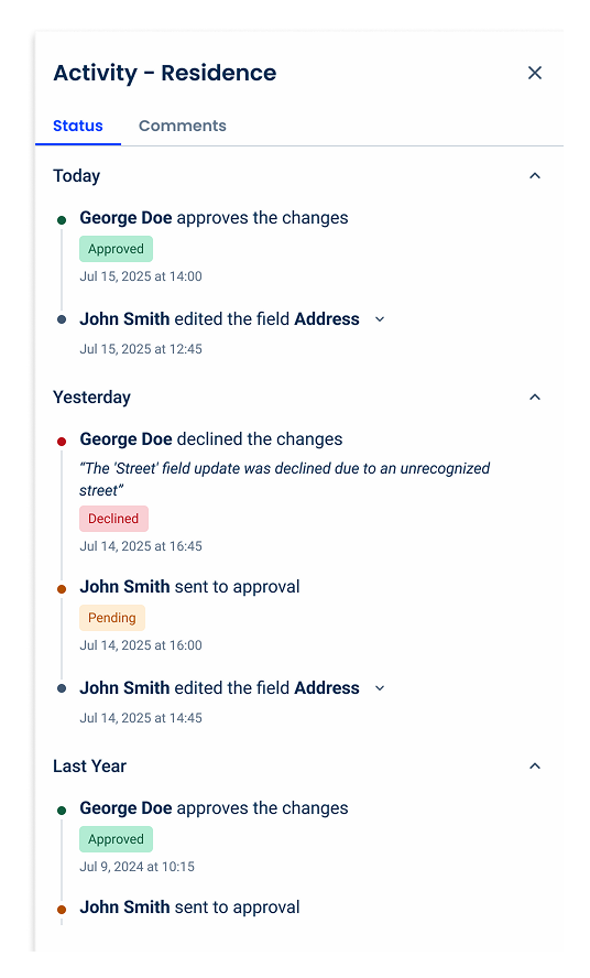
Time Frame
To facilitate navigation through activity or status information, items should be grouped by time period, for example:
- Today;
- Yesterday;
- This Month;
- This Year;
- Last Year;
- Older.
This grouping helps users expand or collapse the section they want to explore.
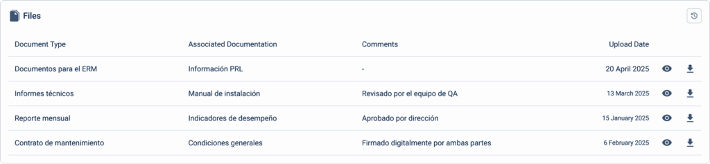
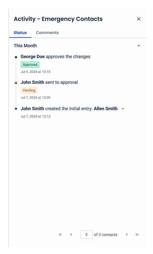
Pagination
When a section contains multiple entries, such as a list of files or a list of emergency contacts, use pagination to help users clearly understand what information is currently visible.
Pagination should be placed at the bottom of the flyout, keeping the interface clean.
Comments tab
For a complete experience within the activity, the comments tab should serve as a dedicated space for contextual discussion, i.e. comments between a employee and their superiors, for example, to clarify declined changes or highlight upcoming changes to certain entries.
Keeping this information divided helps users focus on what they need to do, without requiring users to search through the status of specific fields and conversations with their supervisor regarding that section.
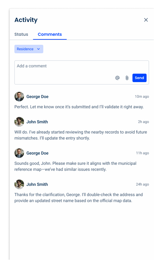
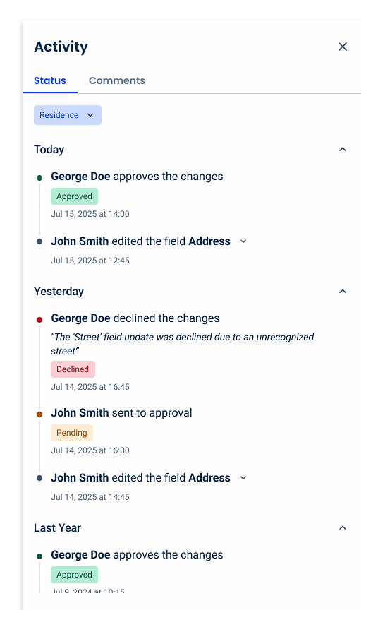
Filtering
To have a centralized location for monitoring activity, it is necessary to have a way to filter the section that will be displayed in the flyout.
To do this, a chip should be used in the selectable variable, located at the top of the content.
By default, the selected value must be the section in which the activity flyout was opened.
Writing and Voice
A clear and consistent tone of voice, combined with concise and clear writing, helps users quickly understand content in reading mode, reducing ambiguity and guiding users through the information, which creates a cohesive experience across the interface.
Clarity
Since users are focused on reading information, which can be very complex, they need concise and direct sentences so that they can quickly understand the information instead of having unnecessary effort and cognitive load.
Keep sentences short and direct, avoiding complexity.
Explain acronyms at first mention.
Avoid jargon.
Structure and Scannability
Well structured content help users quickly navigate and understand information in read mode. Make sure sections are easy to scan.
Use descriptive headers and subheaders to define sections, to avoid ambiguity and make it visually appealing.
Provide one subject per section/topic.
Clearly separate sections of data using descriptive labels, spacing, or brief summaries. For example, make sure the user clearly and unambiguously distinguishes where the employee personal information ends and their job details start.
Make content easier to scan by using lists and bullet points.
Add short summaries for longer sections (“In summary: total expenses were €4,250,000 this quarter”).
Context
The context gives users a complete understanding of the information in reading mode, without ambiguity.
Provide context for all types of information: numbers, dates, names, statuses, etc.
Use, for example, “Invoice status: approved”, instead of just “Approved”; or use “4.500,00 €”, instead of “4500”.
Explain tables, charts or other groups of information when they do not appear in read mode.
Consistency
Use consistent terminology across the sections so users do not get confused and quickly recognize it.
For example, always use ‘Colaborador’ in a Portuguese HR file, do not use ‘Trabalhador’ or ‘Funcionário’ in other sections of an interface.
Voice and Tone
Use a professional, confident, and assertive (but not commanding) tone of voice that presents data clearly and unambiguously, helping users interpret information accurately, without unnecessary words or distractions.
Conclusion
Read Mode isn’t just a feature; it is a whole experience. It is the art of creating content that feels effortless, clear, and approachable.
By thoughtfully combining design, writing, and voice, you guide users’ eyes, reduce cognitive load, and ensure they can quickly find and understand the information they need.
Whether users can edit content or are only allowed to read it, principles such as clean layouts, clear labels, well-structured cards and lists, and contextual explanations transform an overwhelming experience into an intuitive and enjoyable one.
Similarly, ensuring concise writing, consistent terminology, and a professional and confident voice keep users focused and confident as they navigate sometimes complex data.
Ultimately, the goal of Read Mode is to make content clear, scannable, and enjoyable, so that users don’t get confused or lost and can interact with the information without added effort. By following these best practices, you can ensure that your product offers a smooth reading experience, every time.
Small adjustments can have a huge impact on usability.


