Designing the Invisible: How to Make Your Interfaces Work Without a Screen
It’s late at night and you’re driving in thick fog. Visibility is almost zero. You can barely see the road ahead and traffic signs are shrouded in mist. Every turn feels like a guess. You can’t tell if you’re in the right lane, if there’s a curve ahead, or if you’re heading straight for an obstacle or something worse.
Do you feel nervous, frustrated, and lost in the fog?
But it’s just one night out of 365 days a year. Now imagine that this wasn’t just a temporary inconvenience, but your everyday reality. For millions of visually impaired users, navigating websites or apps is like trying to drive in that fog every day.
According to the European Blind Union, there are more than 30 million blind and partially sighted people in Europe, and on average, 1 in 30 Europeans suffers from sight loss.
In this article, we’ll explore the best practices for screen reader compatibility and show you how small changes can make a huge difference to someone’s life.
Illustration of driving in thick fog (AI image generated by ChatGPT on 27/08/2025)
How to Make Your Interface Speak
Designing for screen readers means creating the best experience even when there is no screen to see.
This section shares essential guidelines to help you create truly accessible and understandable components for those who do not have the privilege of being able to visually perceive the interface.
By following these best practices, you will ensure that your interfaces communicate their purpose, status, and feedback in a way that everyone can understand. You will ensure that everyone is able to perform their tasks smoothly, intuitively, and easily. It is up to you to leave no one behind.
Design with Purpose
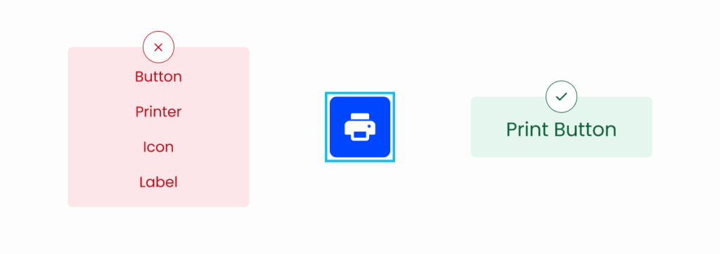
When designing for screen readers, you must never forget to put yourself in the screen reader users’ shoes. You need to think as if you were one of them. That’s why you must convey meaning as never before. Visually impaired users won’t be able to see a button, they’ll just hear it. Therefore, it is utterly important you use clear, descriptive and meaningful labels for UI elements so that users clearly understand their purpose.
If you leave relevant icons alone without text labels, screen reader users will never know they exist. Therefore, you should pair them with text labels to ensure users understand their purpose when it is relevant for performing a task.
Also, be consistent with the wording of related actions. Avoid using inconsistent wording for a pair of actions, for example, do not use the pair “Expand/Close”. Instead use pairs like “Expand/Collapse” to maintain clarity and predictability.
Furthermore, visually impaired users cannot understand the purpose of an element if part of its label or description is visually cut off. Even when the text is visually trimmed, the screen reader has to read the entire label /description so that users receive all the context they need to understand what an element does.
To put yourself in the users’ shoes, ask yourself the following question: “If I couldn’t see this, would I still understand what it does?”
Button purpose
Make Elements Keyboard Accessible
For the use of screen readers, it is essential that all interactive elements can be operated using only the keyboard. Therefore, you must make sure that users are able to:
• Navigate through elements;
• Interact with elements;
• Know clearly which element is in focus.
Keyboard focus
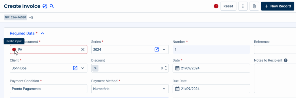
Don’t Rely only on Visual Cues
When designing, it is easy to forget that there are people who simply cannot see the screen, and we often focus all our attention on visual cues such as colors to indicate status, error messages, success messages, feedback, etc.
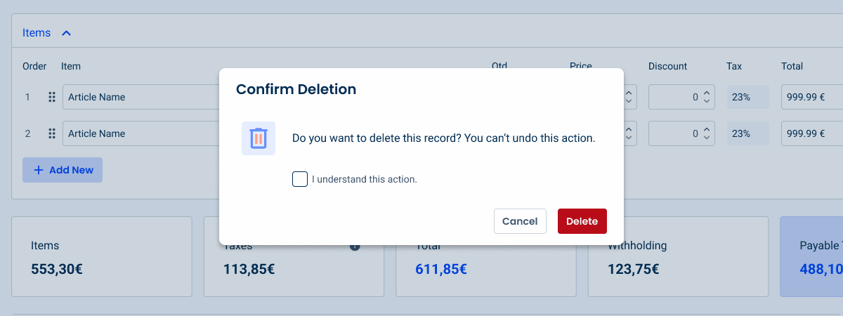
Therefore, our interfaces should not rely only on visual cues alone. They should always be complemented with clear and unambiguous information to ensure that screen reader users also have a good experience when navigating our interfaces. For example, you should provide feedback about errors that may occur, since users cannot see a red border around a form field indicating an error. You should also make sure that these error messages are read by the screen reader.
Proper error feedback
Hide Decorative Elements
Decorative elements, such as purely aesthetic images or icons, should not be announced by screen readers, as they do not provide the screen reader users with any relevant information and do not add any value to the user experience. On the contrary, they cause unnecessary repetition (since icons often have the same alternative text as the element they refer to) and make it take longer for the user to complete their task, causing frustration.
For this reason, these elements should becompletely hidden from the screen reader. This allows screen reader users to better focus on important content.
When in doubt, ask yourself: “Would users miss any critical information if this element was not described?”. If the answer is no, hide it.
Screen reader skipping image
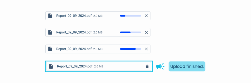
Make Changes Noticeable
When there are dynamic updates in the interface, it is essential to ensure that all users, regardless of their abilities, are aware of their occurrence.
For example, when a user uploads a file or image, they should receive clear and unambiguous feedback on the action, i.e., they should have clear information on the progress of their upload, the occurrence of any errors, or its success.
This real-time feedback gives the user confirmation of their action and, therefore, more confidence in their tasks and navigation.
In addition, make sure that the screen reader announces any changes in dynamic values and that these values are contextualized, i.e., they indicate what they refer to. For example, make sure that a screen reader reads “three euros” instead of just “three,” as the latter leaves the user confused about what the value refers to.
Screen reader real-time feedback
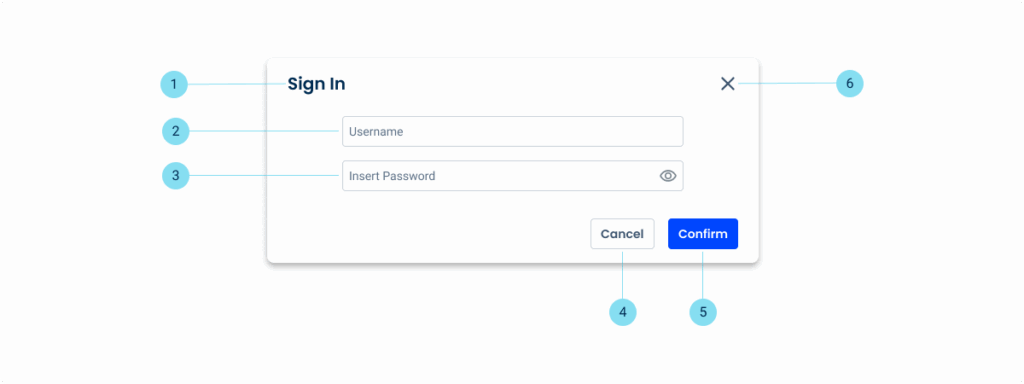
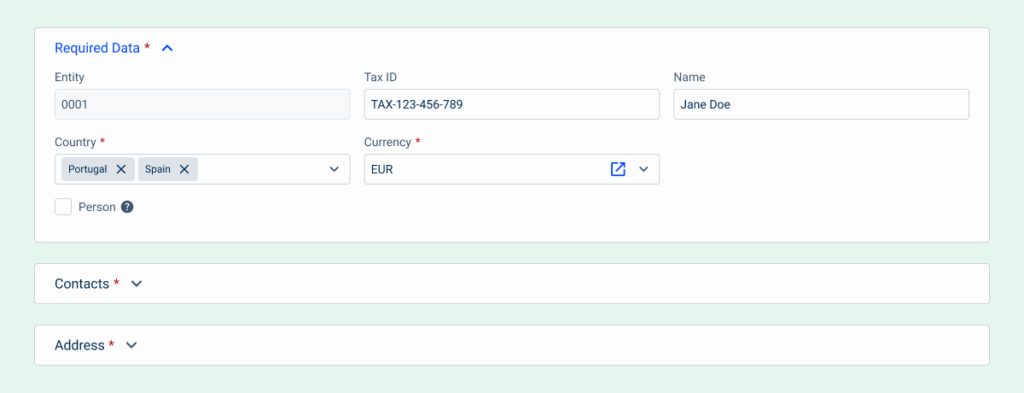
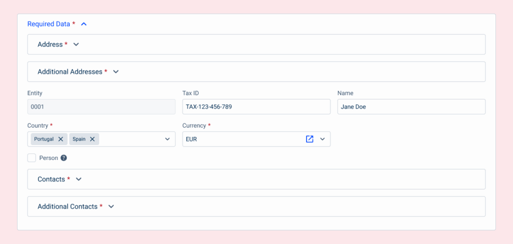
Follow Logical Reading Order
A logical reading order is essential for screen reader compatibility since it ensures a smooth, user-friendly experience.
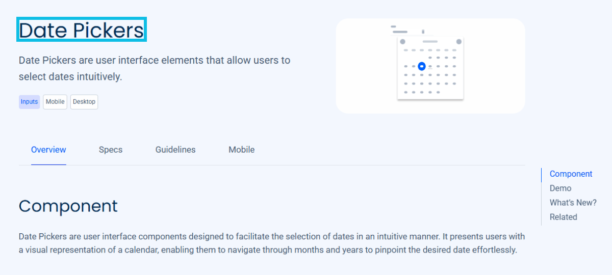
Ensure that the information is read by screen readers in the same sequence as it appears visually (e.g.: title, content, actions).
The screen reader should read from top to bottom, row by row, and from left to right, but priority should be given to maintaining an intuitive and predictable sequence.
If an element is missing or unavailable, ensure that the screen reader moves to the next element in the hierarchy. This prevents interruptions or dead ends during navigation.
Avoid placing elements in unpredictable positions, as this causes confusion and hinders navigation. For example, don’t make a screen reader read the Close button before the title of a modal.
Screen reader logical reading order
Let Users Stay in Control
Control should be a fundamental part of the user experience for every user, regardless of their abilities or limitations. Just because some users can’t see the content doesn’t mean they shouldn’t have full control over how they interact with it.
For example, avoid features that block focus or elements that move focus without warning, as they can disorient users, especially those who rely on screen readers. Instead, give all users the ability to open, close, or navigate dynamic elements as needed. This ensures that everyone can interact with the interface at their own pace and on their own terms.
User control on an interface
Don’t Hide Important Content in Hover-Only States
Hiding key information or interactive elements in hover-only states can create significant accessibility barriers.
Users who rely on screen readers may never be able to access essential content or critical features and be therefore prevent from completing their tasks, which often are product base features.
Taking this into consideration, make sure that all important content is accessible without requiring a mouse hover. Ensure that the available interactive elements work correctly for all users, regardless of how they interact with the interface.
Important information in hover state
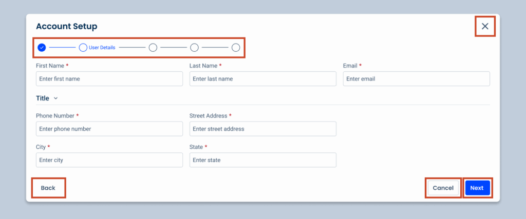
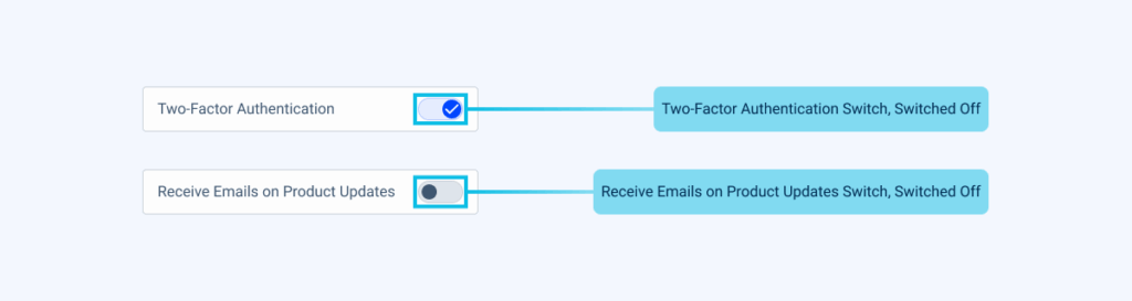
Announce Roles and States Clearly
For a seamless experience, it is essential to ensure that screen readers clearly announce the roles and states of all interactive elements, otherwise the user will feel lost, leading to frustration and an inability to complete their task.
It is necessary to make screen reader users aware not only of the role of each element, but also of its state, for example, indicating whether an expander is expanded or collapsed; whether a checkbox is selected; whether an option is enabled or disabled, etc.
This information is crucial for screen reader users and allows them to interact with the interface with the same clarity and ease as sighted users, while still being contextualized in order to facilitate the completion of their tasks.
In addition, it should always be clear to the user which action is primary and which is secondary. For example, in a dialog with “Save” and “Cancel” buttons, the primary action (“Save”) should be explicitly identified so that users can understand the hierarchy of actions and make decisions without uncertainty.
Roles and states announced by a screen reader
Organize Content Logically
A well-structured interface is essential for a positive experience, and even more so when we are talking about screen readers, given that there are no visual cues to understand the structure of the interface. When content is organized clearly and grouped in a logical way, users can more easily understand how information relates, which greatly helps them navigate pages that are sometimes complex and move confidently between sections.
Therefore, it is essential to separate related content into clear sections so that users can easily understand which pieces of information are related to each other. This helps screen reader users navigate and identify context more easily.
Designing for screen readers isn’t an extra task, it’s part of the design from the start. It is about creating a more inclusive, intuitive experience for all.
By following these guidelines, you ensure your interfaces are accessible and usable regardless of how people interact with your design.
True inclusivity means everyone, regardless of their abilities, can access and navigate your content.
You have the power to ensure that a visually impaired user will complete their task effortlessly, as they deserve, and will not feel trapped or frustrated in any way.
Just because a man lacks the use of his eyes doesn’t mean he lacks vision.
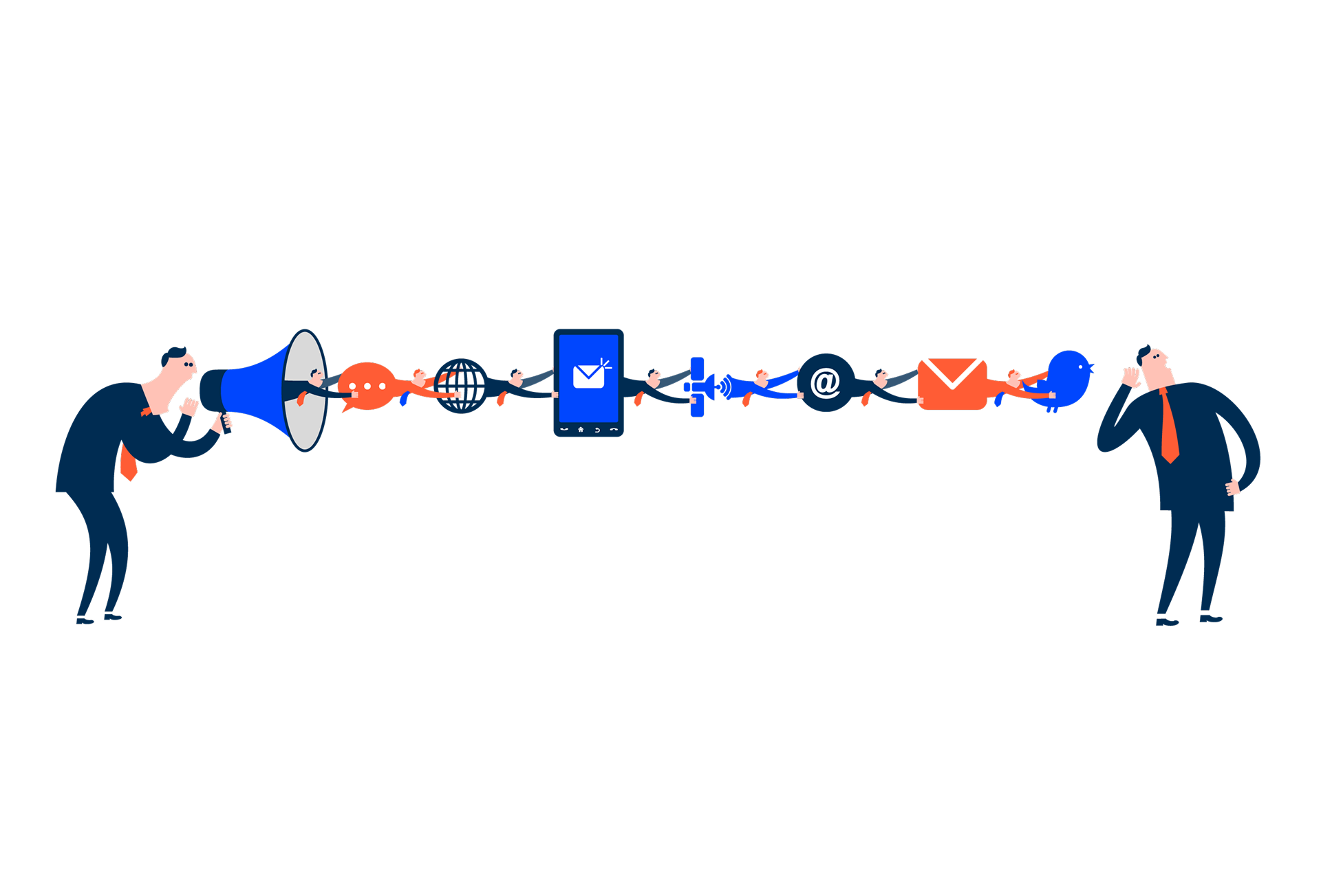
Illustration of an inclusive world
Experience Architecture
We are a team from Iberia at Cegid, dedicated to crafting end-to-end solutions that our users will love.
Designing for screen readers means creating the best experience even when there is no screen to see. This article shares essential guidelines to help you create truly accessible and understandable components.


